To add another part to the promotional campaign, I decided to design some billboards. I felt that although the gaming community are usually based online, I should still include some external designs to reach a wider audience. If not gamers, then potentially friends and family members could see these billboards and recommend the software to their loved ones who game. Aside from reaching more users, I wanted to create billboards in order to demonstrate my capabilities in print design. As this project is mainly based online, I felt that it was necessary to include within the outcomes, in order to cover a variety of promotional locations.
Design inspiration:
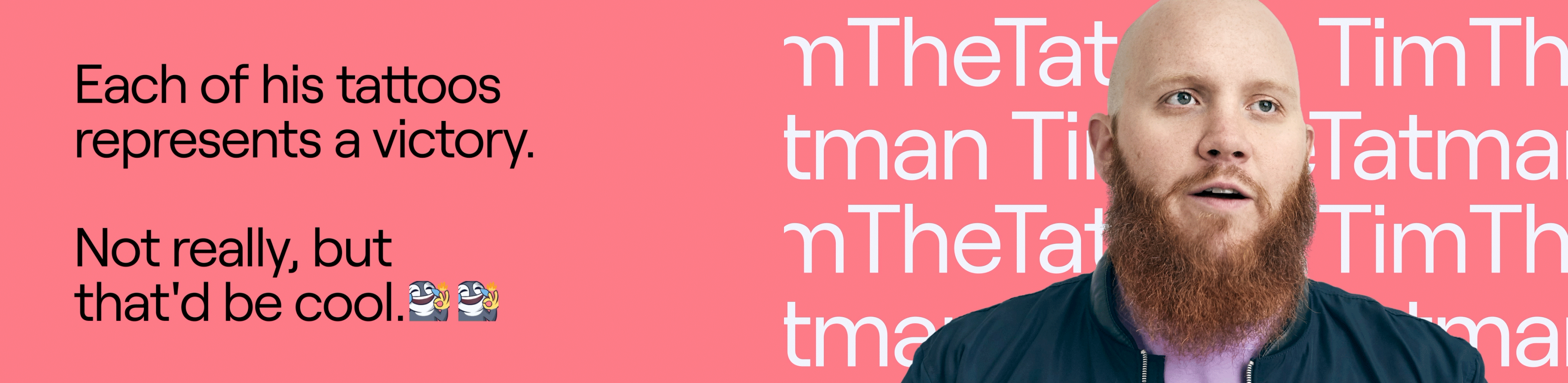
Once again, I turned to Twitch for some inspiration as I had noticed within my research that they too use billboards to promote their site. (I would have looked to Steam/Battle.net too but they do not currently have any external promotional designs). By looking at these designs, I was instantly drawn in. They appear to section out their billboards like multiple posters – which is interesting and different. I liked this because it allows the viewer to focus on one thing at a time and doesn’t clutter the overall design. Its simplicity also ensures that passers by do not need to focus on the billboard much as they are able to read the message quicker. I admired these design choices as I wanted to communicate the information regarding my software in an easy yet effective way. In relation to hierarchy, it is clear to see that Twitch put heavy emphasis on their logo as it is the element they want viewers to remember the most. Again, this is another design feature I intended on achieving.

Final Billboard Designs
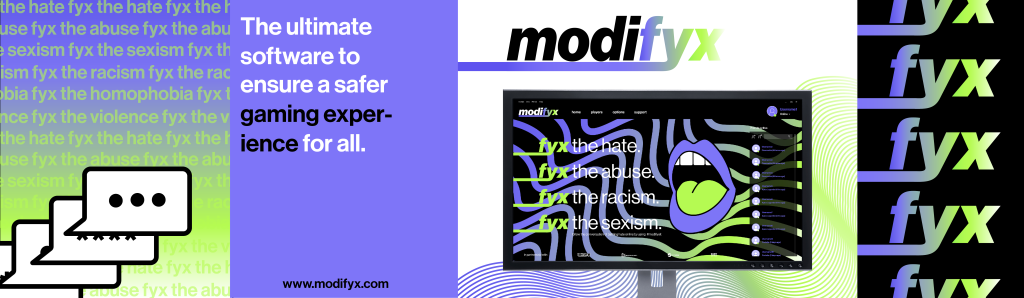
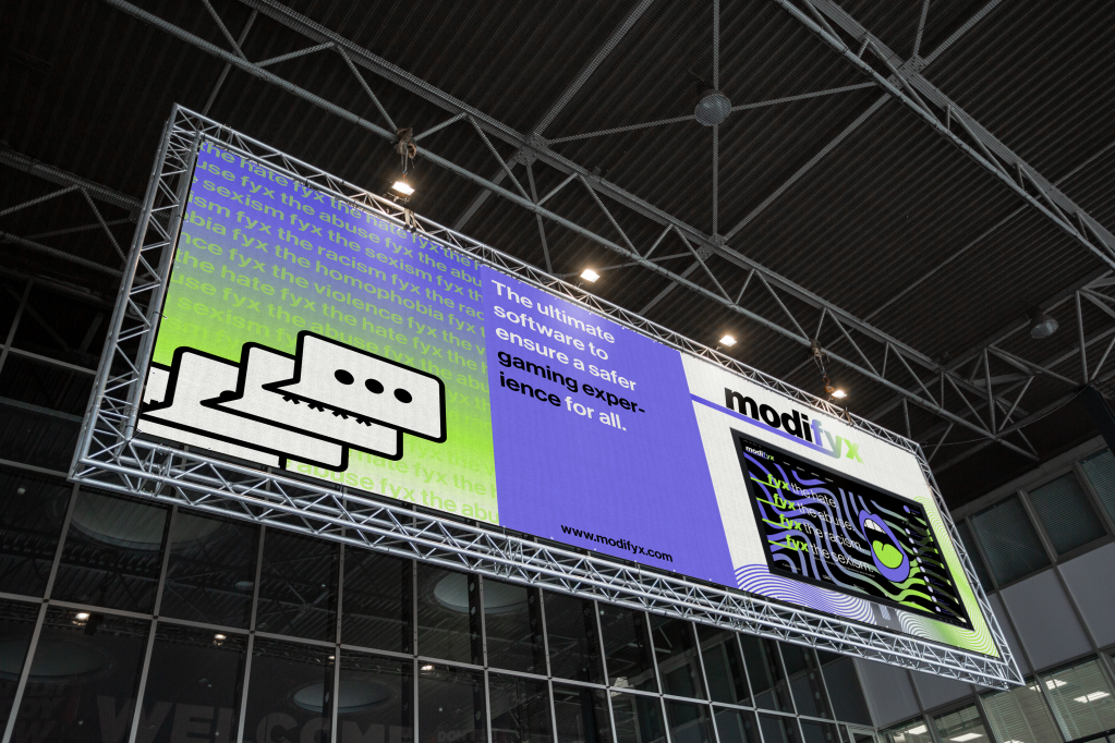
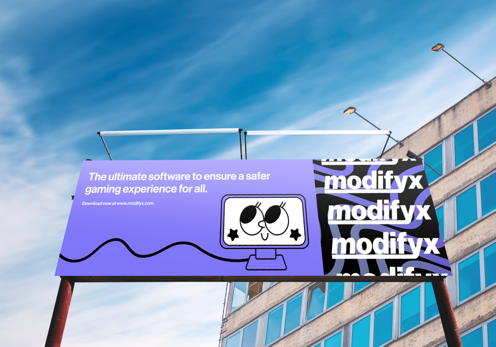
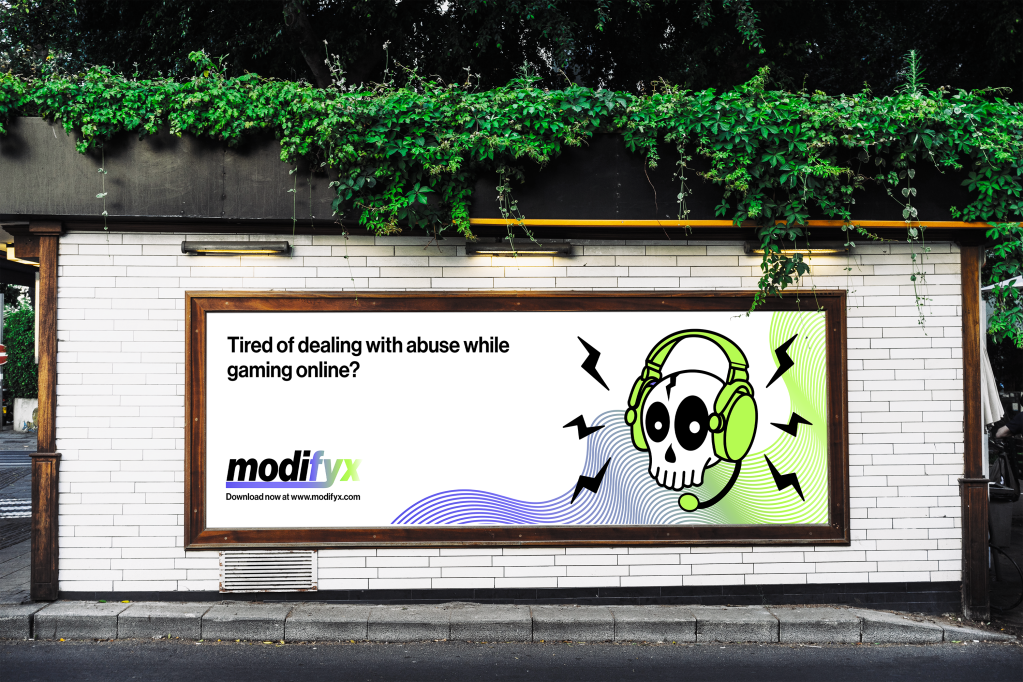
My final designs achieved a sophisticated yet modern design, with its bold colours and sectioned information/visuals. In some ways, I designed multiple small posters within one billboard – which allows the design to appear more visually stimulating and appealing. Using this method also helps display a variety of different information and visuals as they don’t need to necessarily relate to each other much. To achieve an effective result, I made sure to consider hierarchy. This can be seen as the brand’s logo is the main visual feature, followed by the software’s description, then the brand message.
Within the design, I ensured that I carry the brand’s visual guidelines throughout in order to ensure that the designs connect well with other promotional outcomes. I relied on the bold colours and youthful aesthetic to attract a youthful audience. For visuals, I included the various illustrations I had previously designed. This would create a contrast to the text and convey a more interesting appearance for viewers. I ensured that these illustrations complimented the information conveyed as they somewhat relate to its context. For example, the second billboard says “The ultimate software to ensure a safer gamer experience for all” (which can also be seen on the software’s landing page), therefore I used a jolly looking monitor to match – thus creating a narrative within the design.
Overall, I am extremely happy with what I was able to achieve with these billboards. They demonstrate the software’s purpose/message accurately and easily in a modern way. I believe these outcomes are very effective and remain cohesive with the other designs within my FMP.