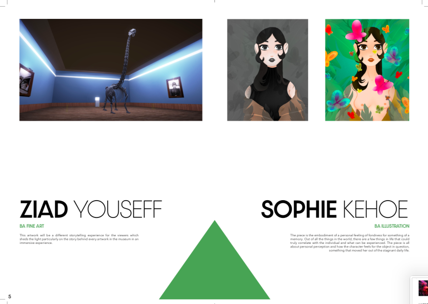
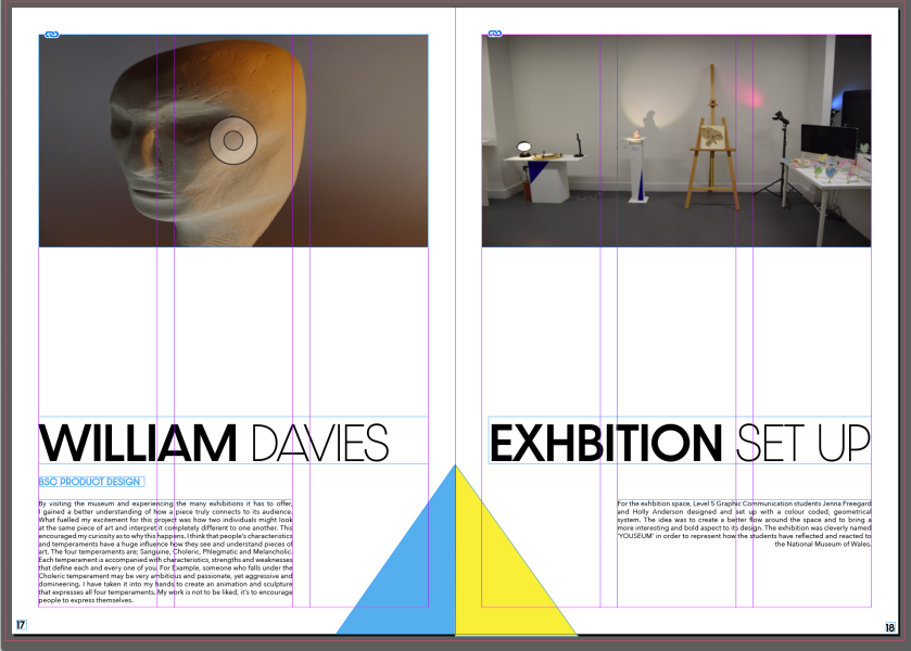
In my opinion my experience of the field project ‘Moving the Museum’ was different and exciting but also very challenging. Through the project, I have learned how difficult the curation process can be and how graphic design comes into the set up and organisation. To me, it was an interesting way to explore my design skills further and how to transition from plan to practice. I believe I have shown how much work is required to complete such a large and difficult task of branding and curating an exhibition as I have applied my design skills effectively. The thing I enjoyed most during this experience was being able to work with Jenna Freegard (fellow graphics student) as we both supported each other through this challenge. We personally asked if we could work together as it made sense for us to share the workload and we felt as though the overall field course was lacking its collaborative aspect. I definitely believe this project has allowed me to understand the importance of communication when working with a large group of people as it was lacking outside of Jenna and myself. It was difficult to receive much contact from others and this was very important for the both of us as our work relied on the responses of other students. Although this was a struggle, I believe Jen and myself did the best with what could receive and I am very proud of what we managed to achieve through this issue.
Due to the fact that I am a very visual person, I was most excited to create the visuals for the branding and exhibition space. Usually in our graphic design course, we remain stuck behind laptops and our work is later printed. But it was nice to do something out of our comfort zone (like interior design) and to have our ideas come to life in a space. Throughout the process Jen and I shared our ideas and designs to share the workload fairly and effectively. Not once did we have a disagreement on any part of the work as we were very much on the same page when it came to the overall styling of the brand and set up. It was our mission to put all of our effort into displaying everyones work in the best quality possible and with much thought and care, which I hope our fellow students appreciated. In my opinion, Jen and I put our blood, sweat and tears into the our work to ensure the happiness and acceptance of our fellow students and lecturers.
The whole process definitely taught me how to overcome issues and that plans aren’t always as simple as they may seem. It allowed us to learn how to quickly adapt to unexpected elements and that it is still possible to achieve great work after making last minute changes. It was very rewarding to see all of our ideas come together in the space, posters and catalog considering how hard we both had worked throughout the five weeks. In my opinion, we effectively represented our fellow students and ourselves through our work as we ensured everyones work was displayed with its own unique touch. We ended up transforming quite a bland space into an interesting and inviting display of creativity.
In the brief, it was mentioned that it was important to explore outside of your usual discipline, and we achieved this through our interior styling. I definitely believed that I have learnt new skills within that department and achieved the end result I was hoping for, which to me, suggests that I had completed my task successfully.
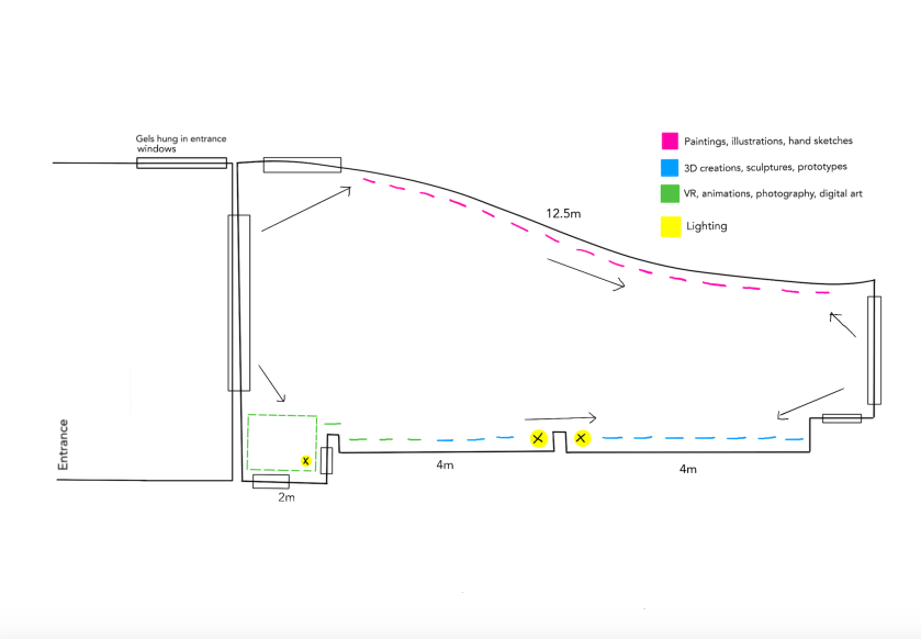
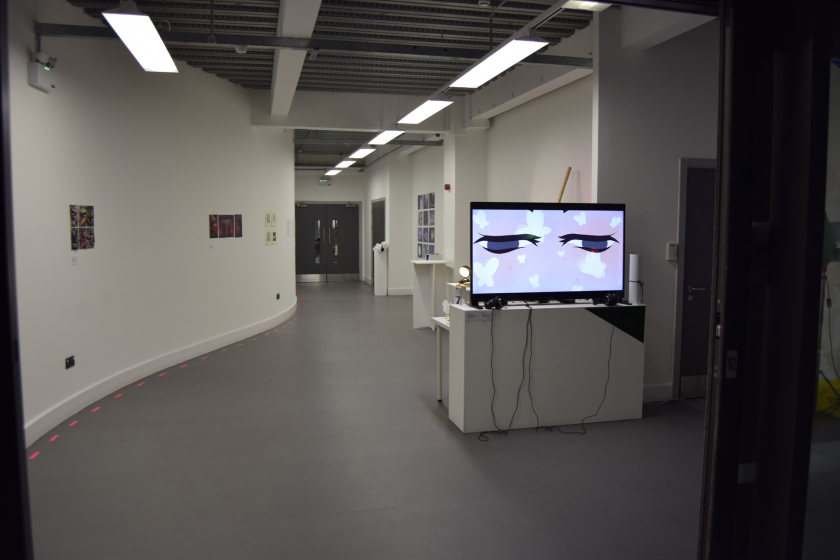
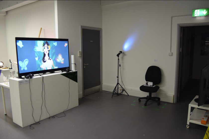
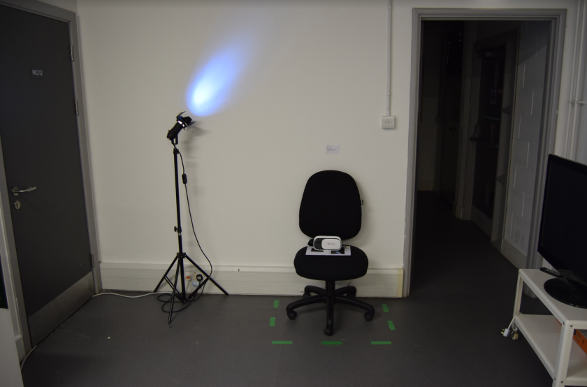
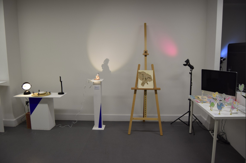
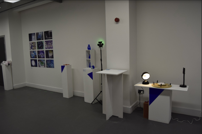
In order for us to get a better idea of the space, Jen and I measured the space and created a floor plan. We wanted to be as prepared as possible for the busy day when we would be setting the space, therefore we wanted a guide to keep on hand during that day. Our idea for the main entrance was to place coloured lighting gels in our branding colours on the windows and door leading into the exhibition space. Lighting gels are transparent, therefore they would reflect the light from the window into the room. For the main exhibition space we planned to place the pink category artwork (which is paintings, illustrations and hand sketches) along the left wall as it is very long which would leave plenty of space between each piece. It was our goal to ensure everyone had their enough room to properly display their piece in order for them to receive their own moment in the lime light. We then decided that the perfect place for the blue category (3D creations, sculptures and prototypes) would be along the right wall as the wall isn’t flat and has small indents to place stands and pedestals out of the way. It was important to us that we use the space effectively and that we don’t cramp structures together or place things in the way of walkways. Finally, for the green category (VR, animations, photography and digital art) we wanted to place those together in the front right corner of the room. In this corner there is a large indent as there is a storage cupboard located there. For this extra space we believed it would be the perfect area for the VR set up and animation TV as they would require a large amount of room and power outlets. We would then place the digital art work on the small section of wall next to it, which would then lead onto the blue category. Along the right wall our plan was to also include lighting set ups in order to add colour into the space, specifically the colours of our categories and branding (pink, blue, green).
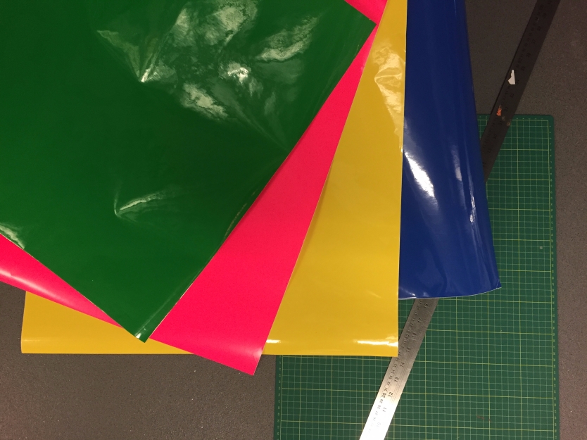
In order to have the specific amount and colour of lighting gels we needed for the space’s design, Jen and I had to purchase them from a professional lighting company in Cardiff. It was our responsibility to call them to reserve and travel to pick up these gels which took a while to properly organise and receive before the exhibition set up day. But we were lucky enough to receive funding from the university as the scraps would be reused by them in future.
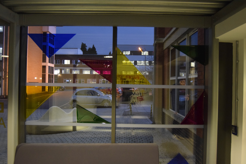
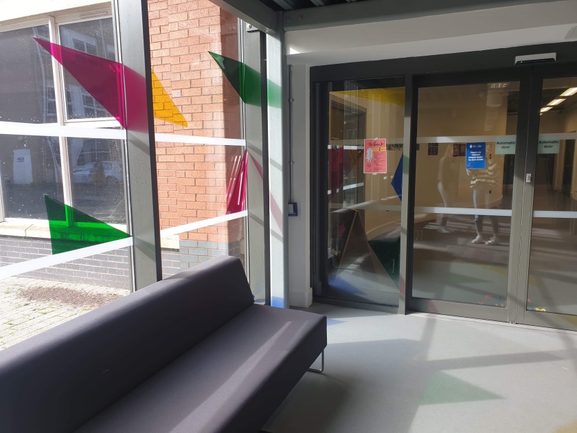
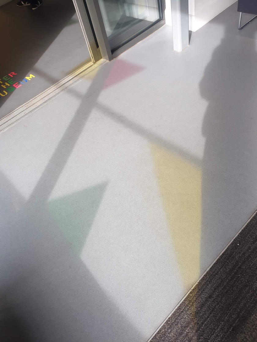
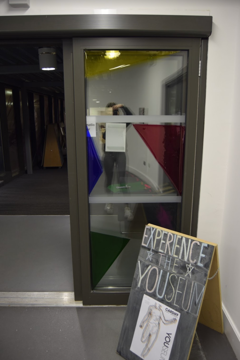
In the images displayed below, you will see our final set up if the lighting gel placement on the entrance windows and door. We went for a geometric design with the triangles as they are seen throughout our branding and in the catalog. We specifically used the colours seen throughout the branding and colour categories. In the day you can see them at their full potential as they reflect the light through the colours which then transfer onto the rest of the room.
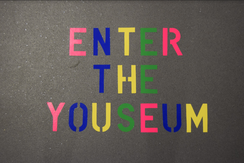
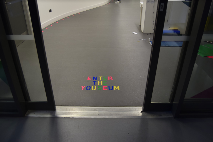
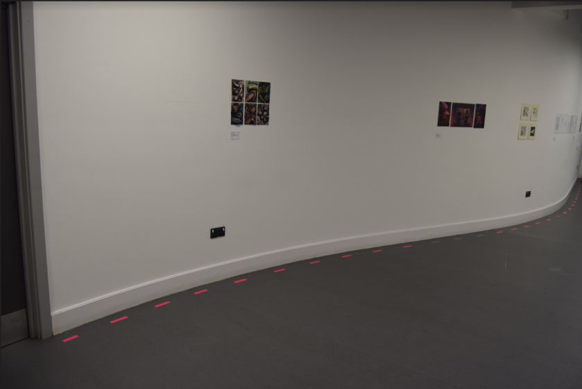
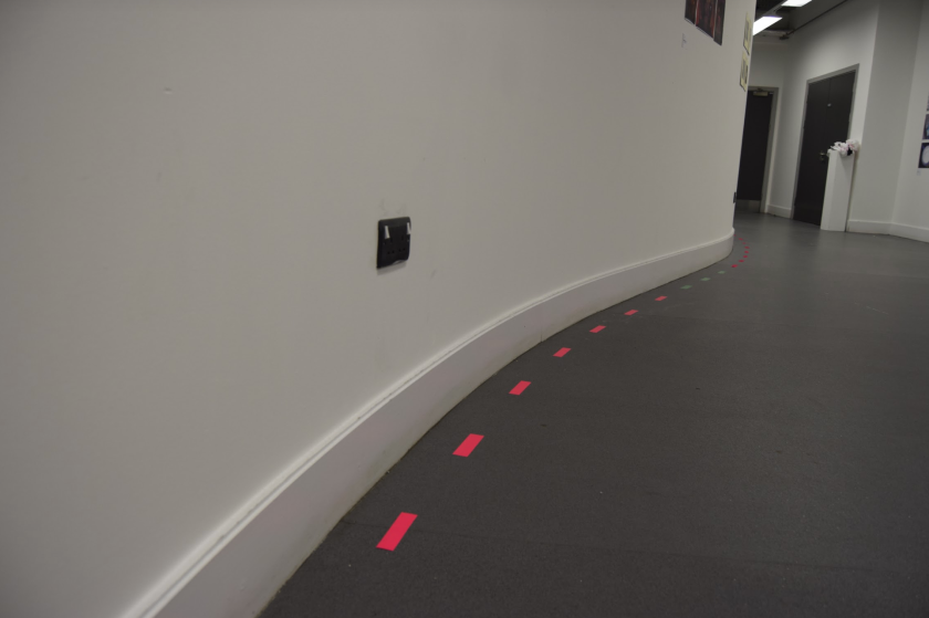
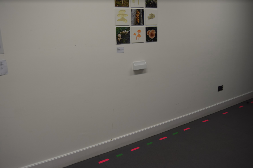
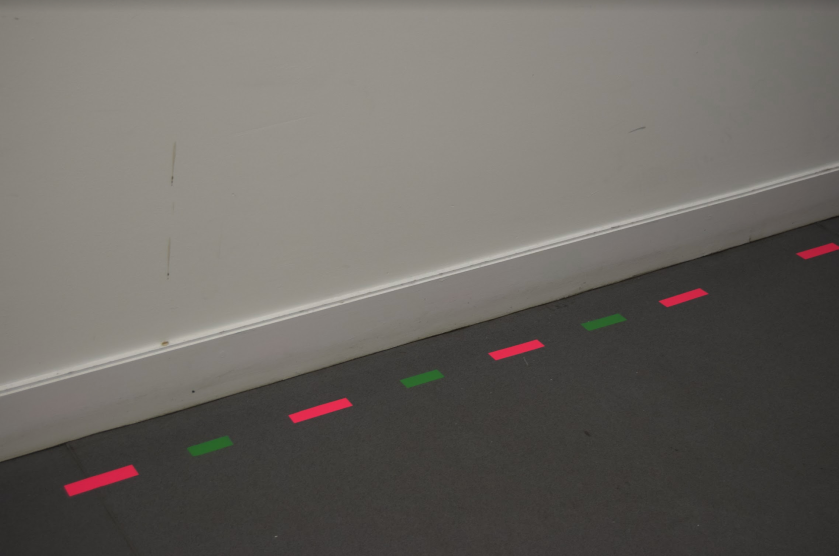
To mark the space and the entrance to the exhibition, we made a sign using a chalkboard and including our poster and a basic slogan. We also used coloured vinyls to stick on the floor in the doorway of the room in order to welcome guests and visitors in to the space. In our opinion these factors were important to include as they brand the space itself and allow viewers to understand the exhibit more.
Images of the set up and first view:
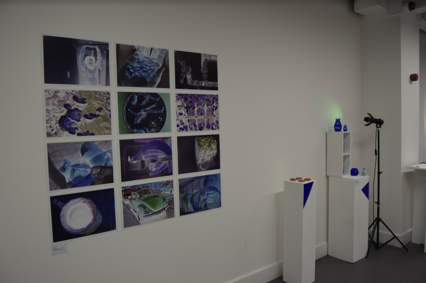
The images below displays the green category section:
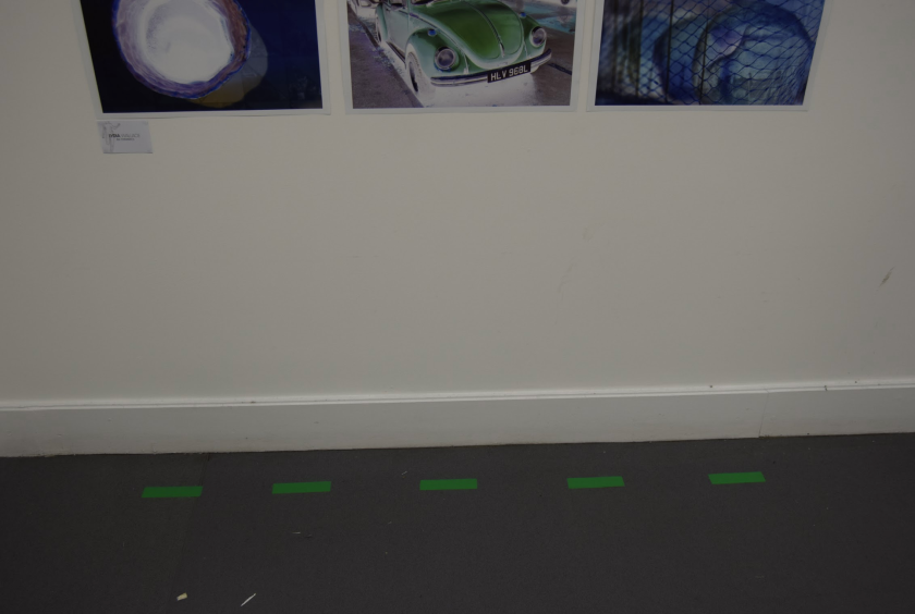
As shown in the image below, we used strips of coloured vinyl to colour code and section out a piece of work. This allows viewers to easily identify which colour category the work belongs to.
We also used this method for the left side wall as we believed it was the most efficient way to colour code the artworks without distracting from the students creations.
For individuals who fit into two colour categories, we used a mix of the two colours in the vinyl strips below their work.
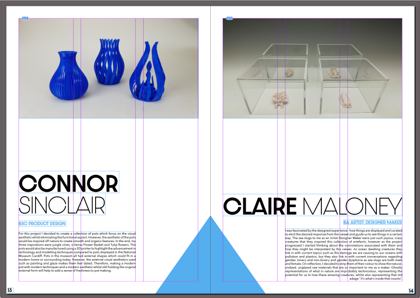
As you can see through these images of the overall display of the right side wall, we added coloured triangles of the lighting gels onto the plinths. We did this in order to efficiently colour categorise the blue category work without taking any attention away from the creations but still keeping with the brand of the geometric shapes. You can also see the lighting set ups we used to bring more colour into the space.
Finally, to add an extra touch of the branding to the space, we designed name cards for the students to place next to their work. We did this in order to add a cohesiveness to the works and art set up. We also believed that creating our own would come across in a more professional way instead of asking students to write them by hand. To match the name tags with the brand, we included the imagery used on the posters and catalog, along with the same typefaces.
For the posters layout, we tried a number of different methods to achieve our end result. It was important to us to keep the design simple and legible so everything can be as clear as possible. We believed that it wasn’t necessary to include a lot of text as we didn’t want to distract from the imagery and make the poster too busy. Our aim was to include as little as possible, therefore we ended up narrowing down the text to the date, an explanation and logo. We removed the slogan as we didn’t think it added anything to the poster and had no real purpose.
After printing out a test of the version above, we could see that the logos design didn’t translate properly. The small fuzzy effect on the ‘You’ didn’t come out as prominent as we would’ve liked and appeared disconnected with the imagery and added too much unnecessary effect too the overall appearance. That was when we decided to remove the effect and keep a simple design of using only the typeface to design the logo. It made the poster appear cleaner and more sophisticated as it created more attention for the imagery. As we had so little space to work the text around, we saved space by placing a short exhibition date under the logo itself. This also added a more seamless flow around the poster and makes the date as important as the exhibit name.
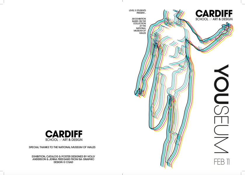
When we finally selected a layout, we added the the simple black body outline on top of the collage design to make the two images connect better. It also added more texture and another dimension to the poster. It also allowed us to include an illustrative feature to the poster as the collage imagery only contains paintings and sculptures.
For the second poster, we copied the same layout as the first poster to keep consistency, therefore we simply had to place the second image in the collage’s place. In the end, this poster became our favourite as it appeared more modern and professional. We decided that this would be the imagery we would use on our booklet.
Booklet
The booklet was tricky to design as we had to rely on the students to send us images of their piece and a short summary of their work. For the majority of people who were included in the booklet they had sent us what we had asked a couple of hours before we had asked (which was the day before the deadline). We struggled with this as we didn’t have a lot of time to refine details and get professional printing. In the end we were forced to use average printing and we had to bind it ourselves. Over ten individuals didn’t send us any work or images therefore they weren’t included in the booklet. This was sad for us as we wanted to represent everyones work and wanted to be able to have a fully finished result. The overall communication wasn’t great but Jenna and I were still very proud of its outcome with the time restraint we had.
As I’ve discussed, we decided to use the second poster design as our booklet cover as we wanted it to match the brand and it would be easily recognisable. On the back cover of our booklet we decided to include the university’s logo along with a special thanks to the National Museum of Wales and a credit for ourselves as the designers.
The image below displays the short explanation we included on the cover:
The image below displays the credits we added to the back cover:
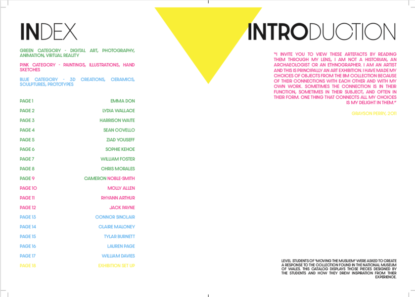
Like many longer booklets, we decided to include an introduction and index. We believed this would be important as we wanted all students to get a better understanding of the exhibitions purpose and would easily be able to find an individuals work easily. Through our colour coding system we were also able to show viewers where the artists work would be categorised and how they would be sectioned.
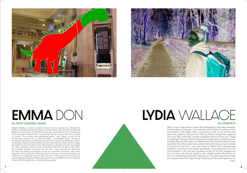
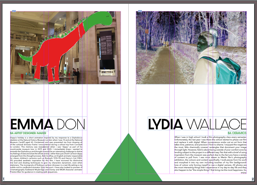
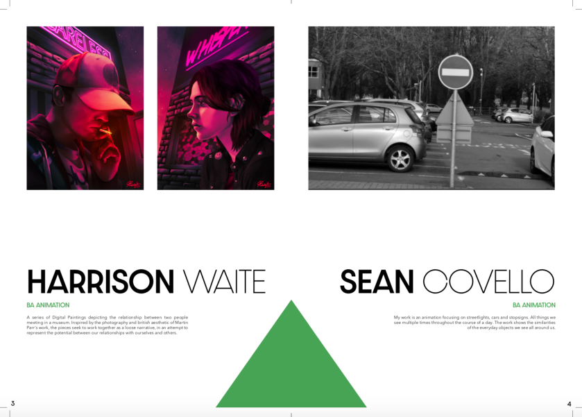
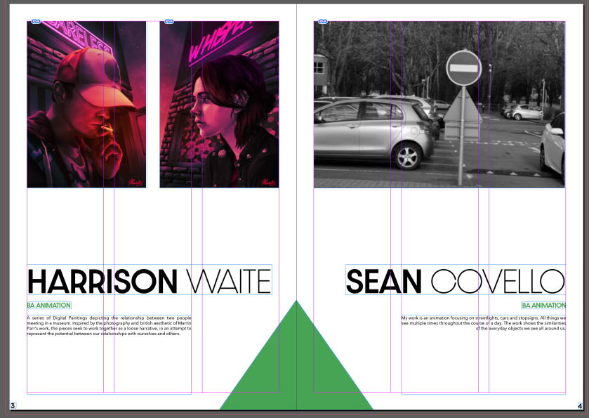
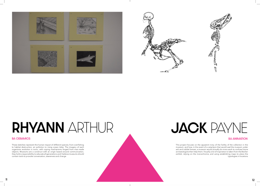
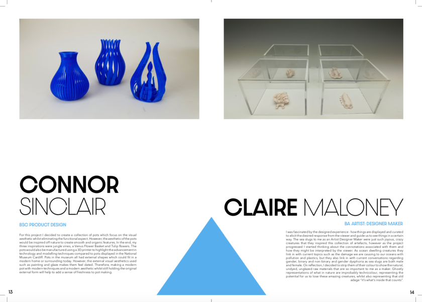
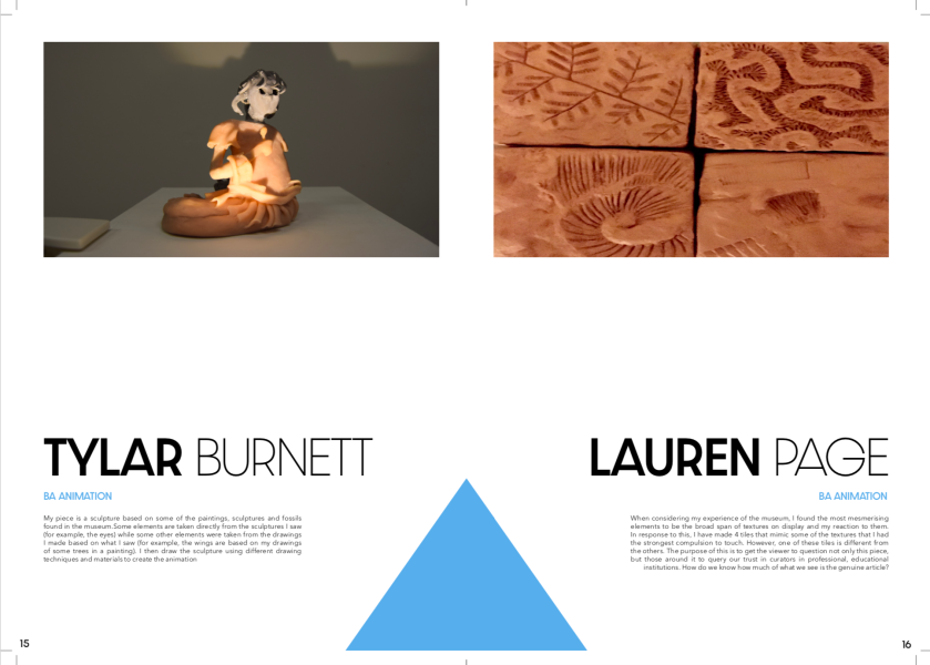
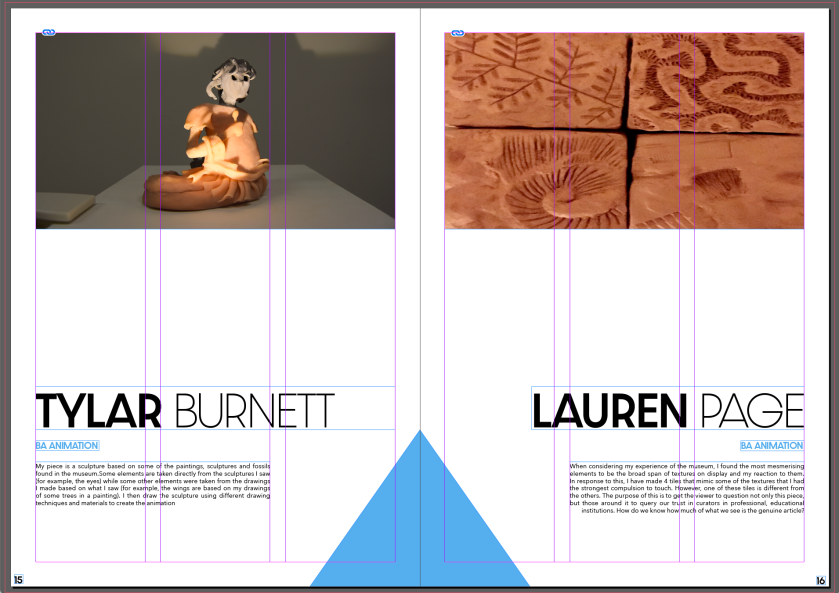
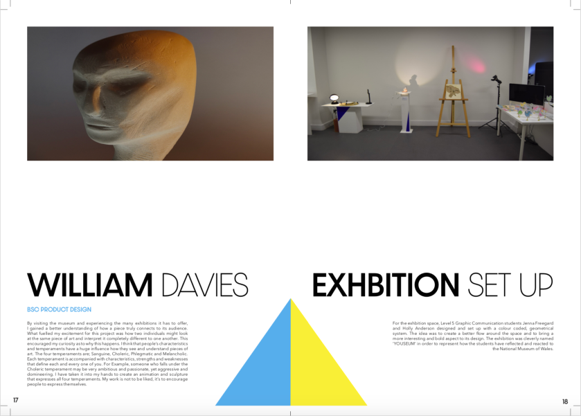
For each of the artists/students page we wanted to keep the layout simple in order for them to be clear and easily repeatable. We kept the typeface the same throughout but added ‘Avenir’ for the main body text. In our opinion, it was important that we include each persons discipline underneath their name to ensure they are properly represented. This was coloured green along with the triangles at the bottom of the page to indicate which creative category they have been place in for the exhibition. For example, Emma Don created an animation, therefore she was placed into the green category which represents digital creations.
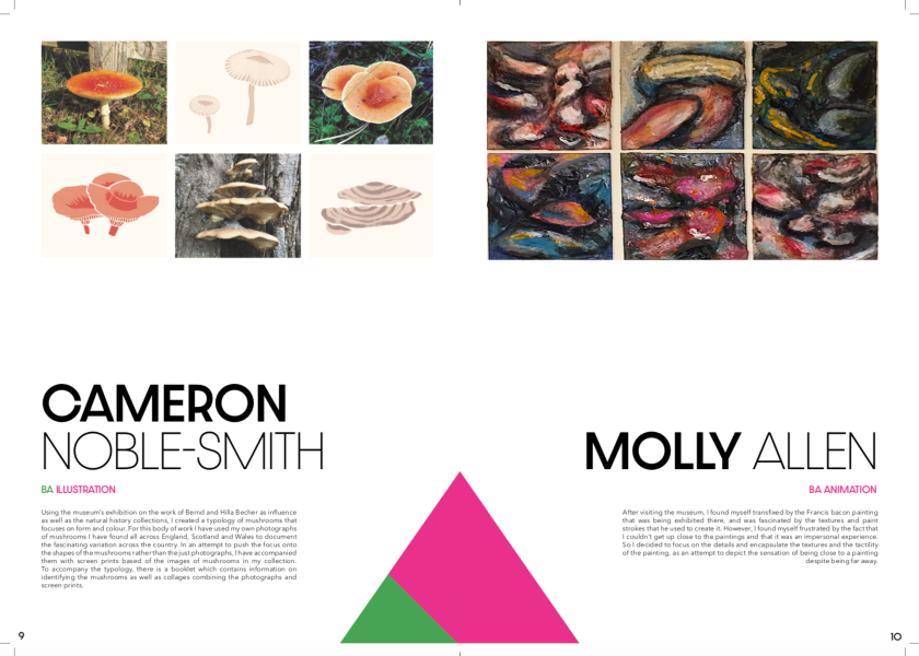
As you can see in the image below, Cameron has a half pink and green triangle. We did this as Cameron’s final piece fitted into both categories as she gad made both drawn illustrations and photography for her final art work.
Through our research and idea development, Jenna and I had decided to use collage as our main creative method. We spent one of our free days in the week to return to the museum in the hopes that we could take some pictures of our own to include in our imagery. Our aim was to almost replicate the ‘Birth of Venus’ poster design we saw through research by taking images of body parts from different art pieces, and then bring them all together to form one body.
Here are the images we took:
This slideshow requires JavaScript.
The images we used:
After taking the photos, we narrowed down the images to the four displayed in the collage below. These images were picked as they fitted each other the best and made a fuller and most accurate body. Although we took photos of a few different head/facial options, we chose not to include one as none of the ones we took fitted nicely with the rest of the body and made the imagery look strange and sometimes silly. Due to the fact that we wanted our colour coding system to be the main focus of our imagery, we decided to try colouring each individual image. This draws more focus to each body part too and also creates a more connected visual.
Even though the imagery was interesting it still appeared flat and didn’t really have any texture or dimension. To fix this, we used photoshop to experiment with filters (similarly to our logo design process) and colouring. We manipulated the contrast and brightness in order to add more vibrancy and shadows to allow the image to pop more. I also tried using the paint pot tool to include patches of white in an attempt to add more texture and dimension. This effect came out really well as it also managed to eliminate the overly structured form by adding negative space to remove the boxiness. The difference between our first untouched collage to this imagery displayed below is very minimal but it had an effective outcome. The overall image now looks bolder and jumps off the page more with its eye-catching vibrancy and dimensions. After our experiments, this eventually became one of our final results for the imagery.
As Jen and I were completing this project as a pair, we decided to create two different posters to add more variety to our work. For the second poster image, we transferred the collage onto an iPad to trace the outline of the image’s body. At this point we were just experimenting but its result was interesting. We liked how the linear design was minimalistic as it gave it a modern appearance. It also displays how well our different body part images linked together as they seamlessly formed a believable looking body shape. Due to the fact that we were creating two posters, we new that we wanted them to have similar features in order for people to link the two with ease.
We wanted to still include our continuous colour scheme to keep it recognisable, therefore we made duplicates of the black outlined body and changed their colour to include a pink, blue, green and yellow. Layering them together is similar to the collaging method used in our first image and gives texture and depth to the imagery. It almost creates a 3D illusion as your eyes combine the colours naturally. This experiment became another one of our final images used in our posters and booklet. Although we experimented with the paint splatters also, we weren’t too keen on its appearance as it came across too cheesy and predictable.
For the name of the exhibition we went through a number of ideas but we decided to choose the name ‘Youseum’. We selected this name as it represents the students reflection on the museum and how they intemperate that into their work. It also conveys the fact that the exhibition was created by students and for students. As shown in the image below, Jen and I went through a variety of different typefaces in order to find which one we believed would best suit the branding. We also experimented with the. colouring of the logo and its density in order to create more options.
After experimenting with the type we settled on the typeface ‘Dazzle unicase’ as it looked modern, sleek and clear. We also liked how we used the different densities to accentuate the word ‘You’. This was an important aspect to its design as it allows the viewer to read the name correctly and understand our intentions behind the logo. We then began experimenting with the appearance of the typeface as we used different filters on photoshop to achieve these testers in the image below. It was important to us to include some type of creative aspect to its design in order for it to connect well with the artistic factor of the brand. Adding filters can also creates more texture and interest to a logo.
In the end we chose the logo displayed in the image below. We picked this as it was simple and not too busy for the eye, it also emphasises the word ‘you’ even more and adds a creative and eye-catching aspect to the overall design. It also replicates features seen on the Tate modern logo from the Tate modern museum.
Due to the fact that I had previously completed an exhibition project at the beginning of the year, I believed it would be appropriate to design this exhibition too. As Jenna Freegard was another person on that field course was also a graphic design student, we decided to team up and complete the work together. Field is all about the collaboration, therefore we were eager to share ideas and work load together.
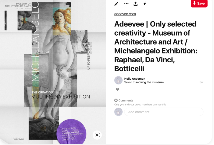
In order to get some starting inspiration, Jen and I decided to search on pinterest for exhibition designs along with posters and spacial set ups. When doing so we pinned images which inspired us and caught our eye the most in order to create a moodboard. By doing this we were able to find ideas for colouring, imagery, typefaces, set up and layouts.
This slideshow requires JavaScript.
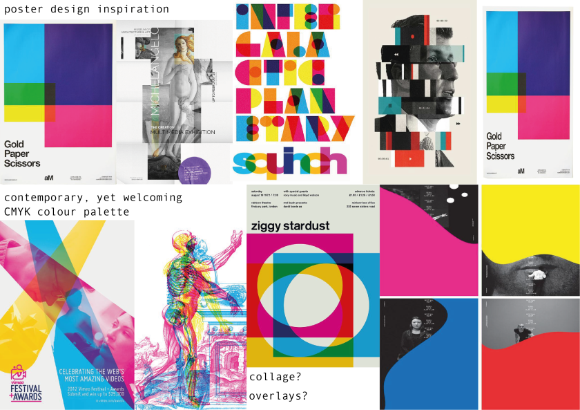
One of the posters that caught our eye straight away was this one shown below which was designed to advertise an art exhibition which included pieces created by Michel Angelo. The use of collage is what drew us in the most as the individual images come together to create the full image of Venus from ‘the birth of Venus’ painting. This creates an interesting and dynamic effect as it brings depth and texture to the image. We also admired how simple the imagery is but conveys the content of the exhibit accurately and effectively. As a pair we decided to keep this image on hand in order to inspire and influence us when designing our poster.
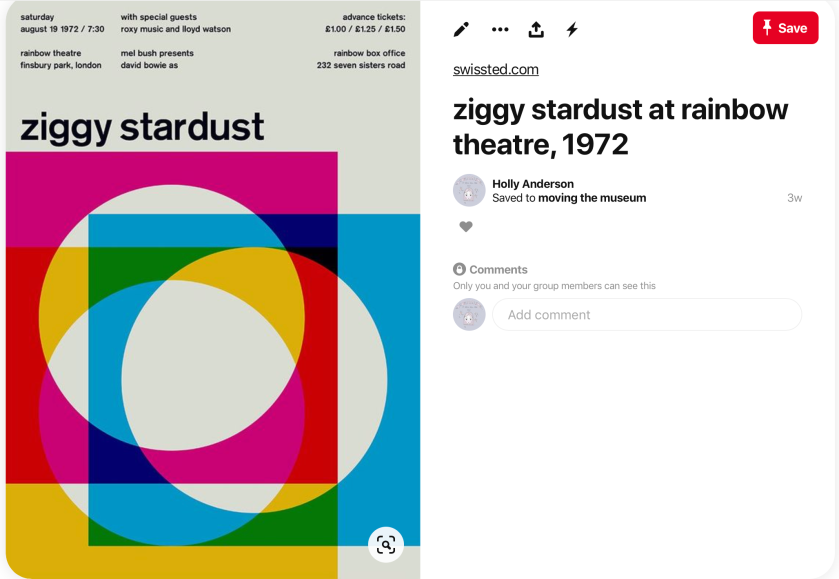
The poster below is another we admired as it has a simple but alluring design. We liked its choice of colour palette as it focused on the primary colours seen in cmyk colouring. I also thought that the layering of these coloured shapes was interesting as they mix to create new colours i.e. green, purple and orange. Jenna and I had decided that this would potentially be an interesting colour palette to explore and follow for our own designs.
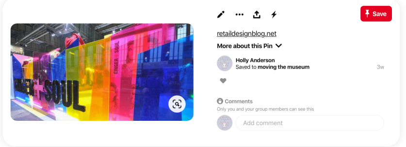
For the space itself, we saw many images on pinterest of decorations such as this displayed in the image below. We really liked the use of the see through coloured plastic and how it can manipulate and effect a space. I admired how it changes a room when viewed through the colours and also how the reflect their colour with light. They bring an interesting element to the room and add make it more eye catching to viewers. They also matched the cmyk colour palette well which would tie in nicely with the posters and booklet design.
In order to create a better vision of our visual ideas, we created a second moodboard on Illustrator. We took images of the posters which inspired us the most to narrow down our style/theme options. In general what we had selected looked very similar. From looking at it we could see that we liked the idea of layering and collage along with bright and bold palettes.
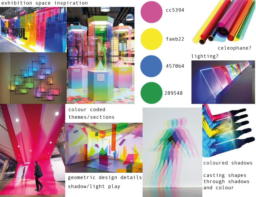
For the exhibition space we wanted to ensure that it matched the posters and booklet as we wanted a clear connection between the two. Jen and I created a second moodboard to better visualise our ideas and ambitions for this design. We decided to include a precise colour palette including the codes for each colour. Taking inspiration from the coloured plastic seen from pinterest images, we believed that cellophane or lighting gels would be an easier and cheaper substitute. Our idea was to incorporate the poster colours around the space and using the coloured plastic along with lighting would be the best way to do that. In our mind the reflection of these colours would represent how the students have reflected on the museums works and how they’ve used their creativity to effect a space.
We used illustrator to figure out the correct and exact colour codes for each of the colours we wished to include in our work. We also based it on the small image of the RGB and CMYK colour graph shown above the page in order to ensure we achieve the perfect colours.
Our idea was to use these colours in order to create section each creative category, i.e. animation, sketches, VR, paintings. We would determine these categories later in the process as that is when we were able to find out what everyone was intending on creating. In our opinion, colour coding each creative category would create a more organised and structured space while allowing a better flow around the room.
The categories we decided to make were:
Paintings, illustrations, sketches (pink)
Digital creations – animations, videos, VR, photography, digital art (green)
Commonly, exhibitions are organised presentations/displays of particular items. Usually, exhibitions are used in museums, art galleries, parks, libraries, exhibition halls and fairs for cultural or educational purposes.
Through research I discovered a few exhibits that I found eye-catching and visually interesting, which I believed could help inspire me when designing.
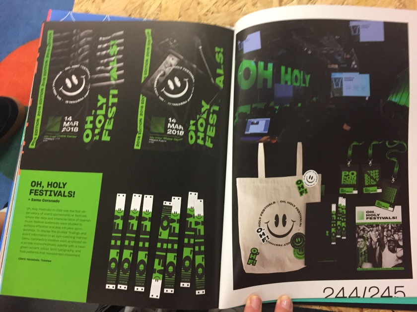
Oh, Holy Festivals!
Samu Coronado designed the ‘Oh, Holy Festivals!’ exhibition branding in 2018, which was designed to display the studies of audience data. In order to achieve effective and less intrusive sponsorships at festivals, this branding was designed. Coronado represented the modern take on current festivals by using a much darker colour palette with bold accents. The use of the neon green colours against the black backgrounds adds a refreshing aspect to the design as it is so eye-catching and complimentary of each other. The use of a visual logo to compliment the textual logo is something I admire. It brings an extra aspect to the design which is fun and memorable/recognisable which will draw and keep the attention of viewers.
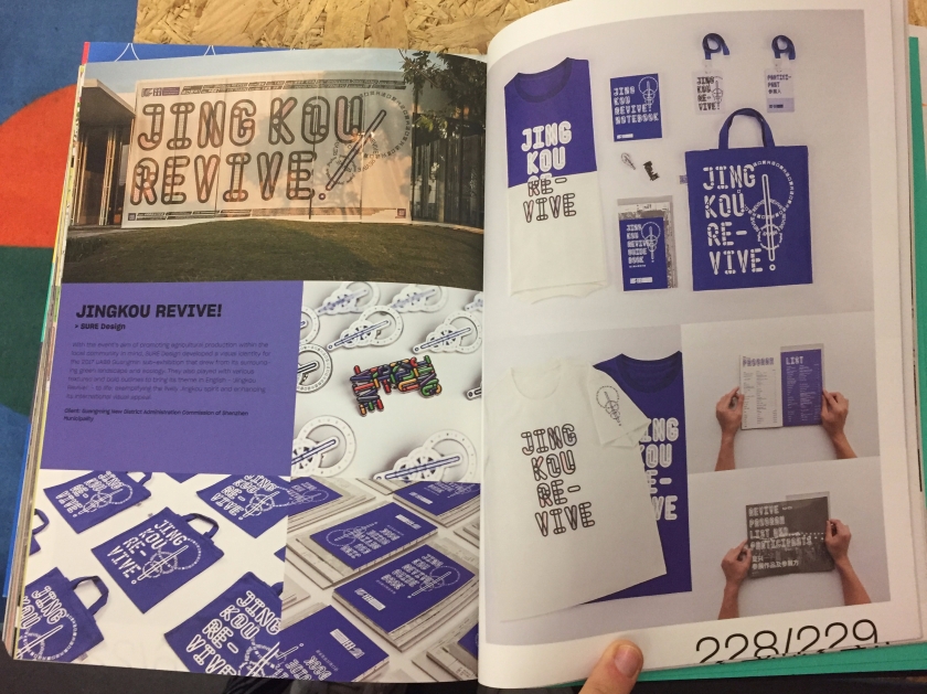
Jingkou Revive
SURE Design created a visual identity for the UABB Guangmin sub-exhibition during 2017, in hopes to promote agricultural production. This was achieved by using minimalistic colouring and their own designed curvy typeface, which ensured a bold visual and recognisable design. This is most effective as it doesn’t takes away from the exhibition itself and doesn’t crowd the space and advertisement. The message is displayed simply which works and still attracts viewers.
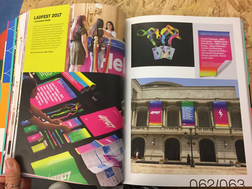
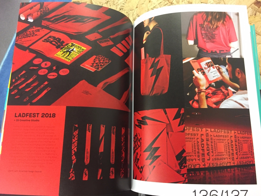
Ladfest 2017 and Ladfest 2018
Spearheaded by IS Creative Studios, Ladfest is short for Latin American Design Festival. IS Creative designed both the 2017 and 2018 exhibits and they were both visually compelling but vastly different to each other. Colourful rainbows of bright neon colours and an electronic looking typeface was used to represent the 2017 exhibit, which created an eye-catching and inclusive identity. The following year was quite the opposite as in 2018 their colour palette was changed to just red and black. This design had a dark but modern feel to it as they kept it minimalistic and bold. Although the two exhibits are starkly different, they both represent the brand effectively and are very stylish. I admire the darker design as it comes across trendier but I also like the bright colourful palette as it creates a positive and uplifting feel. The only similarities between the two year’s designs were the electronic typeface and logo remained the same.
Common aspects to exhibitions
After sifting through to various exhibition designs, there are similarities which appear throughout which I believe is important for me to consider incorporating in my own creation.
Minimal colour palettes are the norm it seems as most of the designs only include up to three colours in their designs. Although ‘Ladfest 2017’ displays a very colourful appearance, I would say it is one of my least favourite designs of the four.
Visual identities is also something that appears frequently as designers incorporate images to their branding.
Posters, booklets, signage and wayfinding
Past experience with exhibitions
At the beginning of the school year graphic communication students were set a project to create and design our own exhibition. For this brief we needed to choose a topic from a list of categories (mine was ‘glitch’) and then think of an interesting exhibition which would suit that category which doesn’t currently exist. I decided to choose the Mandela Effect as the topic of my exhibit. Along with coming up with the concept, we were asked to design posters, a booklet and merchandise along with signage and wayfinding for the hypothetical space. I found the project tricky due to the fact that the space was imaginary and we weren’t able to use an actual pace to design or set up an exhibit. I wanted to put everything I had learned from that project into this project as I wanted the opportunity to design and curate an actual museum space. I had also done enough research on exhibitions to understand them more and how they are designed.
These are some of the things I had made during that project:
For this project, we were asked to create a piece of creative work in response to the curation of the items displayed at the National museum of Wales. This field project’s aim is to help us understand how artists/designer/film makers and photographers work with public institutions. We were also shown the importance of curation as a means of communicating ideas and stories. Along with our creative work, we were asked to complete learning journals which discusses our process.
On the first day we were asked to come to the National museum of Wales in Cardiff in order to explore the building and its design. While doing so, our task was to search the exhibits for similar looking shapes and images to create our own typology animations. Typologies are a type of classification according to general type, especially in archaeology, psychology or the social sciences. As we walked around the museum we started to see similarities in the pieces displayed. I then selected a certain classification (which was faces) and searched for any artworks which included facial features and took images of them for my short animation. This method creates an interesting yet simple video as the perfect alignment of each face adds a form of movement to the animation.
The second day we simply had a tour of the natural history and environmental sections of the museum. We had a chance to explore and see the works displayed more in depth and ask whatever questions we had about the museum itself and the objects displayed. It was also a perfect opportunity to discuss the curation of each exhibit shown so we were able to get a better understanding of the motivations behind each set up.
This slideshow requires JavaScript.
On our final day at the museum, we were asked to explore once again to find a piece of 3D work and sketch it. We had to draw the object twelve times by using different methods and patterns for each one. This again was another form of typology but instead of different items of the same category it we used different styles of the same item. When searching the museum, I found a large sculpture of a bust hidden underneath a stairwell on the upper floor. This bronze sculpture was curvy and had an interesting shape, it also seemed to be easy enough to draw multiple times which is why I settled with it. After finishing the twelve different drawings, we all had to use the animation app ‘Animate it lite’ to create a typology video, perfectly aligning each image with the other. Although strange and time consuming, the outcome of this experiment was creative and interesting. My video came out much better than I expected and came out with an effective result.
Having these three days to explore the museum was beneficial in my opinion as we were able to see how different exhibitions are curated and how they connected to each other. This definitely effected my work throughout this project as I kept in mind all the things I had learned while at the museum.
This year our field project was optional, as we were able to choose three of our favourite subjects. I was placed into the “Space is the Animated Place” subject which ultimately consists of animation. Our brief is to create a short film and AR app proposal consisting of a narrative based on a good/bad character/creature of our choice.
For years I have been interested in the world of animation, when seeing it was an option for our level 5 field project I couldn’t refuse. Growing up I always enjoyed Disney and DreamWorks movies, Tim Burton’s collection of animated works and the ‘Wallace and Gromit’ films. At the moment I’ve been watching Wes Anderson’s recent attempts at stop-motion animation which I believe are amazing works of art. The movies I have watched over the years have definitely created my interest in animation and have inspired me a lot throughout this process of creating my very own animated short.
Research
Disney – This animation studio has had decades of designing captivating movies for the world’s families. The great thing about Disney’s animations is that they know no boundaries. They have tackled every type of story, character, theme and visual type (2D/3D) imaginable. Disney is a company which never forgets the details and enjoy a challenge. Each film, although they display animated characters and worlds, are able to connect with audiences emotionally as they are skilled enough to have viewers laugh and cry when intended. When watching their films, you can see their heart and souls have been put into the work as the outcomes are almost always perfect. The animation’s themselves are never flawed, so much so, they don’t age as the years go by. None of Disney’s old animated films appear dated (except the dialog), visually they are just as effective as the day they were released.
The works of Tim Burton – On the opposite spectrum to Disney, Tim Burton’s movies have very dark and creepy narratives. Although, this is what I believe makes his movies so great. Tim Burton and his team don’t conform to the classic idea of what animated films should look like. They embrace the oddness of their aesthetic and share it with the world. This aspect of their animations definitely allows them to stand out from the crowd, as their ideas, themes and visuals are so original. Stop-motion is a form of animation that I think is disappearing. Over the years, more and more studios have been switching to computer generated animations as technology has progressed so much. I admire how Burton has stayed true to his animating style by keeping the stop-motion movies. They have a completely different feel to computer generated films as their physical presence on the screen is captivating. Something else that Burton has done is create a world of his own. Essentially, he has his own cinematic universe as his animated movies all connect.
Wallace and Gromit – Similarly to Tim Burton, Aardman’s animations of Wallace and Gromit are entirely stop-motion. Although they are decades old, they remain timeless as their storylines and visuals were ground-breaking for the time. This fact allows them to be memorable and family favourites across the world. The reason why people love these movies so much is because of the narratives and simple British humour used throughout. Like many others, I admire the fact that Aardman decided to create an animated film which is set in Britain as it branches out to a wider variety of people. I also appreciate the time and effort that goes into a classic stop-motion film as there is so much skill and patience needed to animate clay figures.
Character inspiration
When discussing ideas for our character, I decided to screenshot some character designs which I have seen over the years that interest me the most. The images above are based on the creative works of Tim Burton. As I’ve mentioned before, I am an admirer of his work, especially his animated films. His character designs are very unique and are recognisable to the majority of the public due to their dark, strange appearance. This is the same reason I like the animated characters which were designed for the music band ‘Gorillaz’ (as shown in the image below). These characters are also very strange and have a creepy aspect to their style. Again this ensures they are memorable and recognisable to society which gives the band a great form of publicity. Unlike Tim Burton’s work, they include a variety of colour to their designs, although they may not be bold bright colours they still catch the eyes of the viewers.
Unlike the previous two character designs, the designers of Rick and Morty (a tv series) decided to use vibrant and bold colour palettes. This ensures that viewers are drawn to the show as their appearance is pleasing to the eye. What I like about this style of character, is their simplicity. They’re able to achieve interesting and recognisable characters even with a basic design. The animation team is also unafraid of exploring wild and whacky character, as seen on the show, many of the episodes include a variety of new quirky characters. I admire the fact that they are explorative with their designs.
Idea Generation
During a workshop at the beginning of the course, we explored character ideas through a creative exorcise. In this exorcise, we were asked to fold a large piece of paper multiple times, we then has to pass the paper around and draw our personal ideas. When unfolded, the character’s whole body is formed.
This was the result:
After, we were made to create a narrative for this character we had drawn as a group. We came up with an idea consisting of a character who is made up of soggy food, his/her name was ‘Moist’. This character was meant to be a collection of soggy food brought home after shopping on a rainy day. We continued to develop this idea to see if it had any potential for our final film. Sketches were made to explore if ‘moist’ could come in any other form.
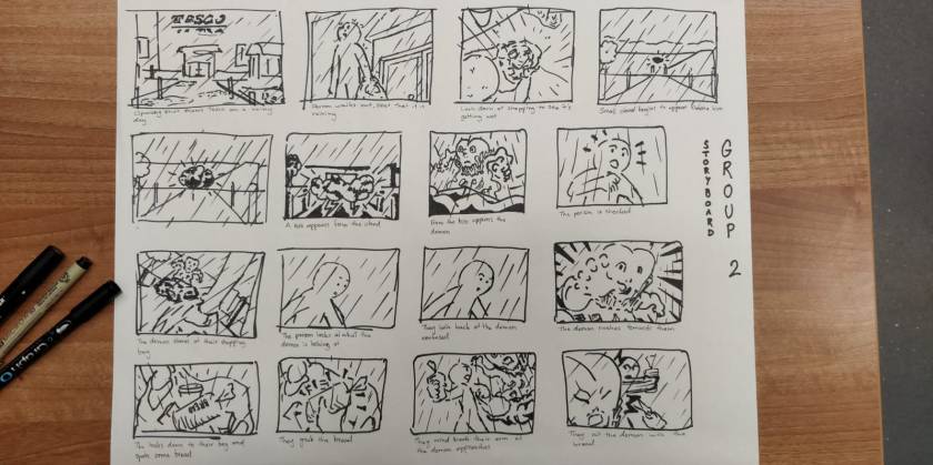
We then decided to create a storyboard to allow us to fully visualise this characters narrative and what could potentially be the storyline for our short film. The story was that an individual goes to Tesco for their weekly shop and as they leave it begins to rain heavily. When looking in his/her bag of food, they find a horrible mess, this then grows into ‘Moist’ the character.
Although this was an interesting idea, we didn’t wish to move forward with the design as we weren’t sure of the narrative or how it would fit into the AR design. It also didn’t connect enough with the brief of creating a character that represents the school of art and design here at Cardiff Met.
For the second time of creating a character, we decided to try generating our own ideas individually and then come together and share as a group. When we came to discuss, I suggested the idea of a character which absorbs its surroundings and starts to adapt to them also. To start, I thought of it absorbing colours from various items, but quickly we changed this. In the end, we established that our character would absorb various items around CSAD as it was trying to build itself a body so it could live.
Idea Development
The narrative for our new character was that he represents the ‘creative block’ of a person. It begins as a ball of paper and begins to come to life and adapt to its surroundings. It does this by absorbing items found in the different courses of CSAD to build itself some arms, legs, eyes and accessories. We decided that we wanted our video to be a combination of stop-motion and digital animation in order to explore the two medias more and to give our short film an interesting visual. We wanted our character to begin as a ball of paper, as we had the idea that he/she is a discarded idea/sketch of an individual. This ball of crumpled paper would then slowly become our fully formed character with limbs, eyes and accessories.
We experimented with a real ball of paper to test its movability and how it could look if given features such as a mouth (and if that mouth could move effectively). We soon came to realise that using paper would be extremely difficult to manipulate him/her the way we would want.
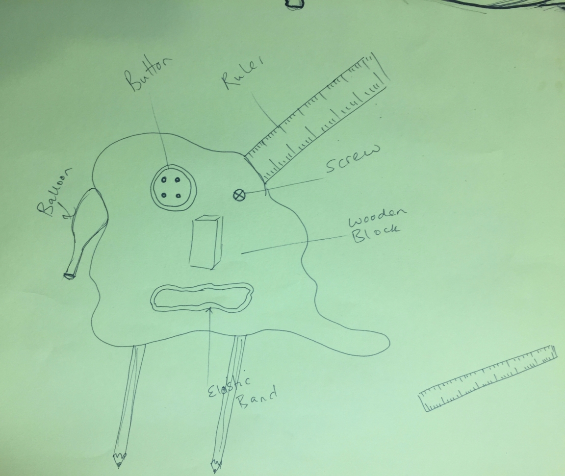
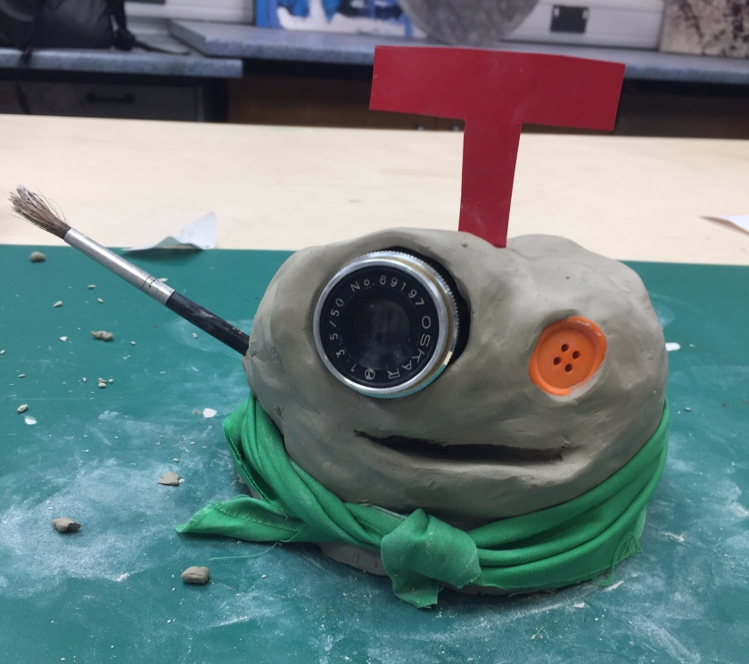
After sharing more ideas, we established what items we wanted out character to absorb and what body parts they would represent. The idea was to ensure we represent a variety of courses in CSAD through these items. They were: a paintbrush, letter ‘T’, button, camera lens, fabric cape, compass, pencils and pipe cleaner. The image below is how we visualised our character.
Storyboard
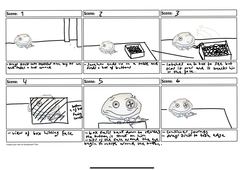
In order to begin creating our storyboard, each of us in the group picked a department of CSAD (textiles, art, illustration, photography) and developed a narrative which connects with that area. For example, the ball enters the photography department and falls on a camera lens which then becomes his eye. The scene I created was for the textiles department. My idea was that the character would walk into the textiles room (after exploring others) to find a box of buttons sitting on one of the desks. As he/she walks towards it, he/she steps on the edge of the box accidentally and it flips smacking him/her in the face. When the box drops, we’ll see that a button has stuck to his face, creating an eye. The character continues on its journey but it notices it has no way of getting down from the table. It looks around for a solution and finds a piece of fabric. It uses this to create a parachute and jumps from the table to land safely on the floor. The character then ties this fabric around him/her like a cape to keep for later use.
My scene’s storyboard:
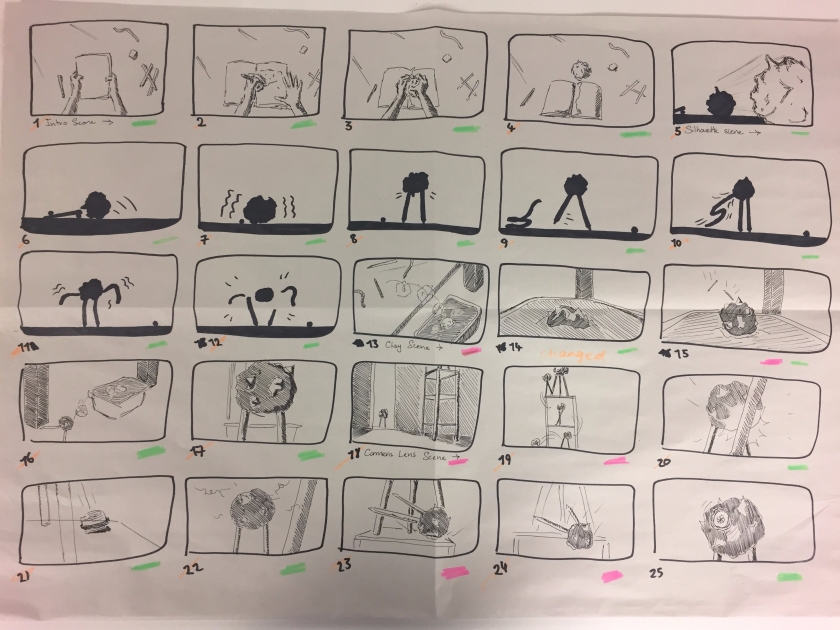
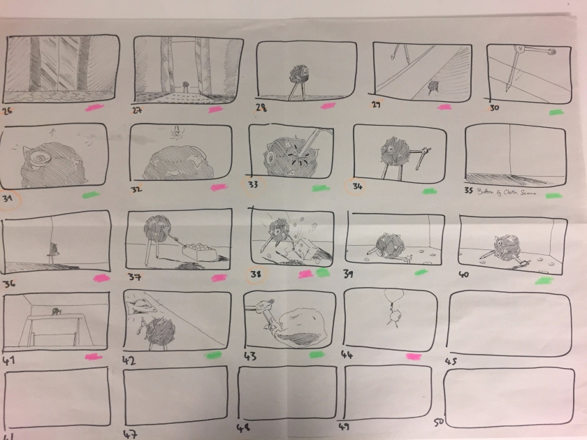
After creating our own stories we came together to connect them.
The narrative for our animation is that a student of CSAD is given a brief to design a unique character but they are suffering from a creative block. After sketching an idea, the individual crumples up their sketch in frustration and throws it to the side. The individual then leaves the building as it is closing for the night. When alone, the ball of paper begins to come to life. It shuffles around the table and finds a ball of clay and pencils which it then consumes. After this, it begins to explore the rest of the building. It first enters the photography studio where he falls and lands on a camera lens (this then becomes his eye). He then continues up to the next story in a lift to find the architecture studio where he bumps into a table and a compass lands on his side (which then becomes his arm). After this, he enters the textiles room and finds a box of buttons, he accidentally steps on the box and it flips into his face. A button from the box is seen to have stuck onto his face creating an eye. In order to jump off of the desk, he finds a piece of fabric and then uses it as parachute. Spud keeps this fabric as an accessory. Finally, he returns to the desk from the first scene where his creator (the student) walks in to find her creative block has come to life.
The storyboard:
Character design
To design our character, we used clay to form his main body as it is malleable and easy for stop-motion, we then added the different objects. After doing so, we quickly realised that some of the scenes we had made for the storyboard were going to be too difficult to recreate with stop-motion as they required a lot of movement and had complicated scenarios to achieve effectively. We decided to create a digital version of our character also by using the 3D model as reference. This meant that we had the option of designing digital animations to create the complicated scenes and add any extra scenes just in case on top.
We were able to achieve this digital design by taking individual images of each of the items used to create him. These images where then placed together to create the final look.
The Final Video
In the end I am proud of the final video as it is exactly what we intended on creating and more. The scenes worked well together and the mixture of stop-motion and digital animation gave the film an interesting and compelling visual. It also has a sense of humour and is an easy watch for anyone to enjoy. I believe our narrative was conveyed well also as it is easy to follow throughout the film.
During the film making, I participated through creating the stop-motion scenes such as the title sequence, beginning scene of the student (featuring my own hands), paper ball scenes, the clay consuming the paper shadow, the compass landing into his arms, Spud finding the parachute, Spud crating an arm out of a broken paint brush and the final scene of the student returning to her desk (also featuring me).
I enjoyed the experience as I have always wanted to take a stab at animating as it is a subject I have been interested in for years. I discovered how difficult it can be for animators to create their visions accurately and effectively as we came across a few issues of our own. I also learnt how to animate with stop-motion effectively and how to use the professional equipment.
The AR Design Proposal
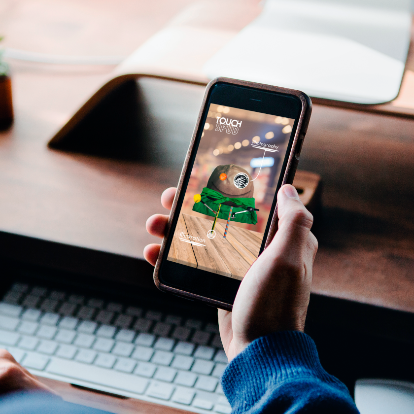
The idea for our AR app is that our Spud will appear on the users screen to supply help when the user is suffering from a creative block. The user is able to select one of the body parts (which represent each course) and the character will present an idea relating to that subject. The purpose of this is to help users with their idea generation.
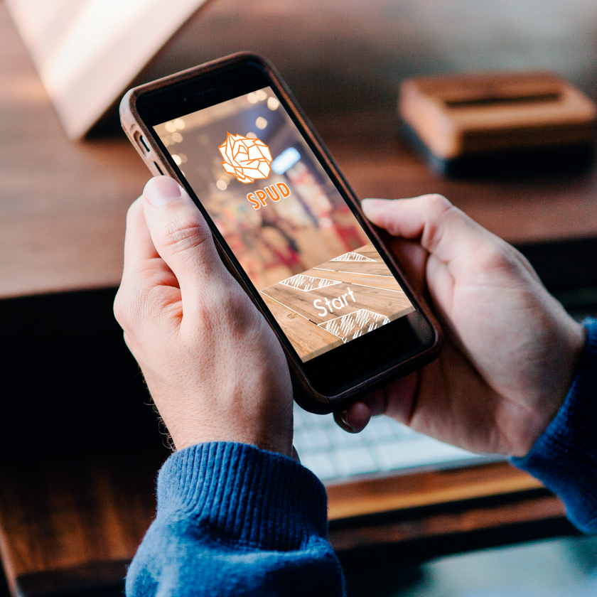
The app will be called “Spud” (which is the name of our character) as we wanted it to connect well with our animated short. The logo design represents his original form which is a crumpled piece of paper, as we want to convey the beginning of an idea and how it can kickstart any piece of creative work. The colouring of the logo is orange due to Spud’s button eye being the same colour. Orange is also a warm happy colour which inspires creativity. We decided to use a bold san serif typeface for our logo as it is clear and gives it a modern aspect. We also added hand drawn looking features to its design in order for it to connect with the creativity of the users.