Portfolio design – Year 1

Subject Yr1, Uncategorised

For our last submission of the year we were asked to create a portfolio, containing images and text displaying every final piece of work from across the year. Beginning to design the portfolio was difficult as there weren’t many specifications, which meant that we had free reign of how we displayed our work. Usually we have many specifications which narrows down our options and essentially makes decision making easier. But it took me a long time to really understand how to design a portfolio.


Research

To begin, I did some research by looking at images on Pinterest to analyse layouts and styles in order to help me create my own. I noticed that most of the portfolios I had seen, stuck with the same few colours, which were black, grey and white and then add a pop of colour here and there. They also played with rectangular shapes in their work to add dimension and decoration. The images used would be quite minimal in order to keep the portfolio focussed on the product and not any other features in the picture. Text would also be very simple to ensure that the portfolio is easily legible. These are aspects that I made note of to consider including in my own portfolio.

Screen Shot 2019-06-05 at 21.09.03Screen Shot 2019-06-05 at 21.10.23Screen Shot 2019-06-05 at 21.11.08Screen Shot 2019-06-05 at 21.11.39Screen Shot 2019-06-05 at 21.11.55Screen Shot 2019-06-05 at 21.19.32


Colouring

For my colour palette, I decided to use black, white and grey as they were the most common I saw when doing research. I also added a couple of other brighter colours, such as red, yellow and blue to add a pop of colour. I chose red, yellow and blue as they are the primary colours and will therefore match most of my images. They also represent creativity and adaptability as they mix to create other colours.


Order

I decided to order my work from most recent to oldest as I wanted my best work to be displayed first and not last in the portfolio. I believed that starting with the work I’m most proud of will demonstrate the level of designing I am at today.
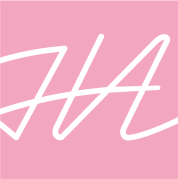
Logo

To represent my personal brand, I designed a logo which I intended on using for the front page of my portfolio. I wanted the logo to display my name somehow as I believed this would be the best way to represent myself. At first I tried using a signature as my logo as I believed this would add a personal touch to my work, but after placing it onto my portfolio, it didn’t look quite right and seemed too obvious of a choice. I then tried experimenting with my initials and attempted to connect them together to create one unique letter. This looked much better and had a more professional look, therefore I continued to experiment with this design.

Screen Shot 2019-06-05 at 22.18.46

The design I chose:

Screen Shot 2019-06-05 at 22.18.57

I chose this design as its simple but stands out as it is unique and modern. I also belt like it represented myself and my style of design.

Imagery

In order to create the imagery for my portfolio, I used photography and Photoshop to display my work. Photography was my favourite form of creating the imagery as it makes your work look real and adds perspective to the scale of your works sizing. I didn’t edit them much except add black and white filters and changed the brightness or contrast. This was to ensure that my images remained simple in order to portray a clear visual of my work. Another aspect included as imagery were rectangular shapes, as I saw many of them while doing research. I used them to add backgrounds and also as ways to include a pop of colour. They added some texture and dimension too, due to the fact that I added shadows and bevelled some of the rectangles.


Text

For the text in my portfolio, I used Aktiv Grotesk Ex in XBold and Bold, and Avenir Light and Heavy. I used Aktiv Grotesk for the titles as it was simple but had a modern edgy style, Avenir was used for the main body text as it was basic and easy to read. I took inspiration from the portfolios I had seen through research as the majority used the same methods of having interesting texts as the titles and simple ones for the main writing.

Screen Shot 2019-06-05 at 22.04.08

Final work

Considering this was my first time creating a portfolio, I believe my work turned out well as it displayed my work simply but effectively. My colour palette blended well with the imagery and text and added richness to the overall designs. Although Photoshop isn’t my strong point, I believe my edited images ended up looking better than expected as they look clean and simple. The added rectangles give the pages extra decoration and design as they bring colour and a geometric style to the work.

If I was to create another portfolio in future I would explore more with my photoshop editing and photography in order to achieve a more professional look. I would also experiment more with the layouts of each page in order to create more unique content.

This slideshow requires JavaScript.

Text and logo placement (practices)

Screen Shot 2019-05-27 at 15.11.42Screen Shot 2019-05-27 at 15.22.14Screen Shot 2019-05-27 at 15.36.13

App Project – Final 2

Subject Yr1, Uncategorised

Video of the app’s final result:

The app’s video demonstrates:

•The Log in page
•Home page
•User Profile page
•Settings page
•Timer page
•How to: ‘Walk’ section
•How to: ‘Run’ section
•How to: ‘Car’ section
•How to: ‘Plane’ section
•How to: Create a playlist

The app allows the user to:

•Enter the duration/distance their form of travel will take. The music will stop after that time/distance is complete
•Use location tracking so the app stops the music when the user stops moving
•Favorite locations and playlists
•Create their own playlists for a location/journey
•View how many steps they have ran and calories lost on the “Run’ section
•View how long is left of a car journey by time and distance

The Final Wireframe

Screen Shot 2019-06-01 at 16.59.17.png

I believe it is important to show the final wireframe in my learning journal as it is showing to see how many connections are needed to create a basic working app. This is something many people wouldn’t realise and I also didn’t know until having to create an app myself. Although it may look confusing, I found that creating the links was my favourite part of the process as it is nice to see your work come together and function properly.

Reasons for the Travel options

screen-shot-2019-05-24-at-17.10.01.png

I decided to include travel options in my app as they also have an effect on the playlists that appear. For example, ‘Run’ would have playlists which include songs of a higher BPM as this would be better suited for a person who is on a jog. Individuals that exorcize will much prefer to listen to a faster tempo when being active as it matches their movements and energy better. People could say “well wouldn’t the app know if your walking or in a car or plane, due to the fact that the speed of each would be different? Why do you still add these options”. But again, each of the travel options have different features, when on the ‘Run’ section, the app displays the amount of calories lost and steps taken while on your journey. On the ‘Car’ section, the app displays how long of your journey is left by time and distance. For the ‘Plane’ section, the user is able to download playlists as wifi won’t be available on the plane. 

Target audience

I have designed this app to be suited to a variety of individuals due to the fact that it doesn’t favour any age group, gender or race. The app is designed to appear neutral and simple, and because the app combines music and travel, both attract all types of audiences. The fact that the app has customisable options, it allows users to change the app and its features to how they want. I believe the app would probably attract an audience between 14 – 28 (as they are more active and music listeners) but it was not designed to do so, it was designed for anyone.

Creating revenue

In order for the app to create revenue, it will contain adverts which will play (like on radio stations) after every three songs that play. This is similar to the app ‘Spotify’, as users will also have the option to pay for a subscription, which will remove all of the ads.

Final thoughts 

Overall I enjoyed designing the app as it was different and rewarding when seeing the final product. I could’ve improved a bit on simple things like the visuals and how the app  works in general, but I was actually really happy with the end result anyway. Considering it was the first time I have ever made and app and using a complete different software, my app turned out well and did everything it was supposed to. If I created another app I think I would make a more playful design for a game or comedy app. I believe doing that would have been best for my first attempt as it makes the work more interesting and you’re able to experiment with visuals which allows you to be more creative.

App project – Final Work 1

Subject Yr1, Uncategorised

Design of the key pages

Screen Shot 2019-05-24 at 17.09.48Screen Shot 2019-05-24 at 17.10.01Screen Shot 2019-05-24 at 17.10.16Screen Shot 2019-05-24 at 17.10.38Screen Shot 2019-05-24 at 17.10.46

In my opinion, the key pages (to visualise the app) are the ‘log in’, ‘travel selection’, ‘search bar’, ‘playlist selection’ and ‘music’ pages. I kept each page’s overall design very simple in order to keep them looking modern and clear. I also ensured that the colour palette and typefaces remained the same, so that all of the pages seem visually connected. To most of the icons and text I added shadows in order to add some depth and character to each of the pages designs. As soon as I did this I noticed how it really made a difference in elevating its style by adding some personality. After seeing these pages come together, I was happy with the way they turned out. Each page looks modern, sleek and reminds me of the outdoors. I like the colouring and subtle background images of the sky and how they continuously appear within the app as they give it a more identifiable design. By ensuring that every icon and text had a purpose, I was able to keep the pages minimal and clear for the user to navigate the app easily.

Buttons and their functions

screen-shot-2019-05-23-at-17.03.47-1.png

This is the ‘Home page’ button and diverts the user back to the ‘Travel selection page’ where they are able to choose ‘walk’, ‘run’, ‘car’ or ‘plane’. I chose this as the home page as it is where the app itself begins. The user would easily be able to change their form of travel by using this button.

Screen Shot 2019-05-23 at 17.03.47

This is the ‘Play’ button, it remains on the ‘toolbar’ continuously for the user to be able to press play and listen to the most recent song played from their last use of the app. When they press this button the ‘music page’ will appear, displaying the song, artist, playlist and location.

Screen Shot 2019-05-23 at 17.03.47

This is the ‘Profile page’ button, it diverts the user to their personal profile which displays their own playlists, favourite playlists and favourite locations.

Screen Shot 2019-05-28 at 17.29.13

This is the ‘Settings’ button, which diverts the user to the settings page where they are able to make adjustments the the apps features and are also able to log out.

Screen Shot 2019-05-24 at 17.23.29

This is the ‘Timer’ button, which appears when the user selects a playlist. It will appear at the top of the page and when tapped on it diverts them to the ‘timer page’. The ‘Timer page’ allows the user to type in an amount time or distance they believe their journey will be in order for their music to stop when they stop/arrive at their final destination. It also displays an option for the app to track their location, therefore the app itself will know through tracking when the individual has stopped their moving (aka their journey). 

Screen Shot 2019-05-24 at 17.22.47

This is the ‘Favourite’ button, which appears by playlists and locations to allow the user to favourite them. By favouriting them, the playlist or location will be saved onto their personal profile so they can be accessed easily and quickly.

Screen Shot 2019-05-24 at 17.20.23

These are the ‘Shuffle’, ‘Repeat’, ‘Skip’ and ‘Back’ buttons which are seen often in music apps (each button does what one would expect).

Designing the Logo

When I began designing the logo I hadn’t made a final decision on the name. It took me a while to begin developing the logo as there aren’t many visuals to use that are in the app itself. Commonly, the logos of popular apps are simple and clear, but don’t necessarily need to have images that are included in the actual app (as shown in the image below).

fullsizeoutput_95f

To begin, I looked back at the imagery and name mind map I had created in the hopes that I would find some inspiration. I wanted to ensure that I incorporate at least one of the two themes of the app (Travel and Music) as I wanted the logo identifiable to users. One of the ideas I wrote on the imagery mind map was to include a ‘map pin’ as they are recognisable as something you would see when looking at a map/travelling. In the sketch (made on my ipad pro), having the map pin didn’t look quite as effective as I had expected. It looked too general and could apply to any travel app, which lost the identifiable effect I was looking for. Map pins are commonly red also, and this wouldn’t suit the style or colour palette of my app.

fullsizeoutput_97c

For the second design, I tried to incorporate letters from the title (at the time I hadn’t chosen a name so I experimented by using the names “Travel Tunes” and “GoTune”), therefore I was using two ‘T’s and ‘G, T’. For the ‘Travel Tunes’ design, I believed by placing them in a certain way, they might look like the lines on a map, which would connect with the ‘travel theme of the app. I could also potentially add a map pin or location icons on there too, to indicate that the logo was replicating the look of a map. But this would’ve made the design too busy and if I didn’t include the extra imagery it would’ve been too abstract for users to understand. For the ‘GoTune’ design, I tried combining both letters to make them form one image. Doing this looked effective but lacked interest as it was too basic. In my opinion the design didn’t fully represent the app visually either.

fullsizeoutput_97c-1.jpeg

fullsizeoutput_97b.jpeg

The third idea I had was to use footprints as the image, due to the fact that this is the icon for the ‘Walk’ section of the app. After sketching it, this design looked too simple and didn’t really stand out enough. It definitely needed another feature to add some interest, so I considered including a music themed image to the design. After taking a look at my imagery mind map once more, I noticed that ‘soundwave’ was written under the ‘music’ category. I decided to try and incorporate this into the footprint design as it was basic but added some pattern to the logo. This did improve the design but I still wasn’t quite happy with it. I then tried experimenting with colours to see if that would make any difference, and it did but I still didn’t believe it represented the app effectively.

fullsizeoutput_97e.jpegfullsizeoutput_978.jpegfullsizeoutput_979

The final design was by far my favourite, as I incorporated an aspect from each of the other designs I had made. I took the idea of using letters of the apps name from my second idea, and then combining it with the soundwave from the third idea. For this example, I decided experimenting with the name ‘BeatMap’, therefore I used a ‘B, M’ as the letters. I then went on to add a soundwave to the background of the logo. This sketch was far better than the rest already as I had taken the features I liked from the other designs and combined them all together. It also represented the app well as it showed clear connections to the app, and it also had a simple but interesting visual. I decided that I’d be moving forward with this design due to these factors.

fullsizeoutput_97a.jpeg

After creating the sketch, I began designing the logo on ‘illustrator’ and experimenting further with its appearance. To start, I tried playing around with the colouring, style and overall look of the letter ‘B’. Due to the fact that my colour palette was blue, grey and white I remained within those boundaries when creating the design. I decided to try and combine the letter ‘B’ and ‘M’ together by colouring the letter differently. As you can see, I coloured the back of the ‘B’ differently to the rest in order to create an ‘M’ on the ‘B’.

fullsizeoutput_97f

After, I played around with what imagery I could add to the logo. I experimented with both ‘footprints’ and ‘soundwaves’ as both of them represent the app. The footprints looked interesting but didn’t look classy or professional. Whereas the soundwave background looked sleek and sophisticated, which was what I was looking for. Although, I ended up editing the first soundwave I designed as it had pointy edges and I believed a rounder edge would give the logo a softer look. After adding the softer edge, it looked much better and represented the app’s name and purpose (as music app).

fullsizeoutput_97d.jpeg

Final logo:

Screen Shot 2019-06-01 at 14.46.33.png


App Project – Idea development 2

Subject Yr1

Designing the ‘Travel icons’

In order to add more visuals to my app, I decided to include small images that represent each form of travel which are ‘walk’, ‘run’, ‘car’ and ‘plane’. When creating their designs, I thought of what visual representations I think of when I hear those words. I quickly came to the decision that for ‘walk’ I would create foot prints for the image, ‘run’ I would create a trainer shoe and for ‘car’ and ’plane’ I would obviously create a car and plane. These images seemed like they fit these words the best and were easiest to identify.

Similarly, to the ‘toolbar icons’, I used the software adobe illustrator. Again, I made sure that all of the icons had simple designs and for the colouring, I used the colour’s identification number (of the blue sky background) which I had noted before. Now all of the apps features were matching.I created two versions of these icons (outlined and filled versions) to ensure that I have options when placing them in the app. After playing around with that particular page’s background with the icons I decided that the filled versions would best suit the design.

These are the two versions I created: 

Screen Shot 2019-05-24 at 17.15.58Screen Shot 2019-05-24 at 17.16.22


Deigning the ‘Music icons’

Due to the fact that my app is a ‘music’ app, I needed to create icons as buttons for the music pages. By looking at other music apps, I could see the common icons that appear in them. Commonly, music apps have ‘play’, ‘skip’, ‘back’, ‘shuffle’ and ‘repeat’ buttons, which I noticed while researching the designs of other apps. You can see the similarities in the ‘Spotify’ and ‘Apple Music’ apps:

In order for the users to quickly navigate their way around my app, I decided to incorporate the same icons as they would already be familiar with these types of buttons. I used illustrator to create these designs and followed the same steps that I used when creating the ‘toolbar’ and ‘travel’ icons, such as the colouring technique and their overall style.

Here is the final outcome of the ‘music’ icons: 


Screen Shot 2019-05-23 at 17.03.47Screen Shot 2019-05-24 at 17.20.23


Designing other icons

I used the same process from creating the ‘toolbar’, ‘music icons’ and ‘travel icons’ to design the extra icons needed. These were a map pin, search icon, timer icon, tick icon and star icon. The colouring was exactly the same for each and I kept a simple design for all in order to keep a cohesive look to the entire app.

Here is the final result for the remaining icons: 


Creating a wireframe

To ensure that I keep organised while creating the app, it was important that I make a wireframe. Due to the fact that I had already practiced making wireframes before (especially for a music app) I felt confident that its structure would be similar. I kept its design very simple in order to ensure that I avoid any confusion when in the ‘prototype’ process. I also wanted to design it on illustrator instead of my sketchbook so that I have a clearer view of it when designing on XD. I started off by creating the main sequence of pages as this would be a good guideline for me when adding extensions to them. I then added important sequences such as the ‘create playlist sequence’ and the ‘profile sequence’. Due to the fact that the ‘profile sequence’ is similar to the ‘settings’ and ‘timer’ sequences I decided not to add them to the wireframe as I can just copy the ‘profile sequence’. I also didn’t feel the need to create a wireframe for each of the other forms of travel (run, car and plane) as they were also similar to the ‘main sequence’ which was ‘walk’.

Here is the final wireframe: 

Screen Shot 2019-05-24 at 16.48.51

Typefaces used

Throughout the app, I wanted to keep a cohesive design which all connects smoothly. To achieve this, it was important that the typefaces remained the same throughout. I already had one typeface in the mix which was ‘ShreeDevanagari 714’, and now I needed some others to add different tones to the apps design. I decided to include ‘Helvetica Neue’ as it is a popular typeface used by Apple. It also matched ‘Shree Devanagari 714’ well and suited the rest of the apps design. I was able to experiment with both typefaces by changing their weight a lot throughout the app to add depth and tone.

App Project – Idea development 1

Subject Yr1, Uncategorised

After creating mind maps and mood boards I decided to continue my work with a simple blue colour palette as it seemed to connect more with possible visuals. The colour blue often reminds me of the sky. When travelling, whether you are walking, driving or flying, the one constant thing you will see is the sky.  This is why blue seemed like the right colour to use for my app as no matter where you are in the world you will see a blue sky. Blue also appeared a lot in my mood board as pictures of nature and the outdoors obviously includes this colour. In my opinion, this colour is clear, light and seems calming as it is cool and simple. To match the blue I believe white, grey and a hint of black would be best suited as it seems light and airy.


The Wireframe

In order to begin creating my app, I needed to create my own wireframe. I didn’t want to get confused when creating the pages of my app while on XD, therefore I wanted to have something by my side that I could refer to. I didn’t make my wireframe with the intention that those designs would be the definite layouts, I wanted them to be a guideline as I could then add extra pages or remove them if I felt it was appropriate. I decided to make my wireframe on ‘Illustrator’ as it would look clearer to me instead of sketches and I would also be able to print them out to have them beside me.

IMG_1961


Designing the backgrounds

To begin designing my app on XD, I wanted to create backgrounds in order to have a guideline for how I design the other features of my app. For example, my text and icons would have to be designed to match and not clash with the background and that’s why I decided to design the background first. As the app is based around travel and locations, I believed that photography would be the best method to capture these aspects. Photography adds a more personal and organic visual to the user, which also matches the app’s connection to the outdoors. For the ‘Log in’ page, I selected an image I had taken which was a view from the top of a mountain in order to incorporate nature and the idea of exploration into the app’s design. I then edited the image on Photoshop to give it a blurred affect. I did this to ensure that the image remains in the background and doesn’t interfere with the text and icons. The picture also conveniently included a lot of blue from the sky which connects with the colour palette I had selected. I then cropped this image in order to fit the measurements needed to for an iPhone X. For some variation, I added two other backgrounds for the actual app in order to have a separation between the ‘Log in’ page and the rest of the app. One of the backgrounds was similar to the image I used on the ‘Log in’ page but the picture was simpler and only included the sky. I wanted the main pages of the app to be simple as I didn’t want to distract the viewer from the app’s icons and text. The second background I included in the app was just basic white.


Textual Logo

In order to create the textual logo, I decided to experiment with a variation of typefaces. By using Illustrator, I typed the app’s name multiple times and selected a few typefaces that I thought might suit its design. The few I used were:

  • Euphemia UCAS
  • Futura
  • Lao Sangam MN
  • Shree Devanagari 714
  • Trebuchet MS
  • SignPainter
  • Courier New

If they were available, I experimented with different weights and styles of each typeface to view every version of them. Doing this ensured that I find the typeface that fits best with my app. The most elegant and sleek design to me was ‘Shree Davangari’ as it was thin and most importantly, modern. I ended up selecting this typeface for my app after seeing how well it connected with the other features on the app’s ‘Log in’ page.

Screen Shot 2019-05-06 at 18.48.46


Designing the ‘Toolbar’ icons

Almost every app has a toolbar of some kind in order to allow the user to quickly access the most important/popular pages. I noticed this factor while doing research into the most popular apps. The toolbar usually consists of a ‘home page’ icon, ‘profile’ icon, ‘notifications’ icon and ‘search’ icon.

Facebook toolbar: fullsizeoutput_96d

Twitter toolbar: fullsizeoutput_96e

Spotify toolbar: fullsizeoutput_96f

In my app, I believed it was important to add one, as users would expect this feature and are familiar to its functions. On my toolbar, I wanted to include, a ‘home page’ icon, ‘profile’ icon and a ‘play’ icon. The play icon is different to most apps as it remains on the screen continuously. I did this to ensure that the user can pause and play what they had previously listened to whenever they please. It also adds a unique feature to the app which will make it identifiable when compared to others. In order to design the icons, I used the software adobe illustrator. I ensured that all of the icons had simple designs therefore the users would be able to easily identify their functions and they would be easy to change (if needed later in the process). For the colouring of the icons, I took a swatch of the apps background (which was the blue sky) and noted the colour’s identification number. I then typed that number onto the swatch maker on illustrator to use it for the icons. I used this method to use the same colour for the other icons later and to also keep the colour palette cohesive throughout my app.

These icons were the final outcome:

Screen Shot 2019-05-23 at 17.03.47

App Project – Idea Generation

Subject Yr1, Uncategorised

In order to begin creating my app I needed to come up with an idea. It was important that I ensure the idea I chose was interesting to audiences but also useful, in the hopes that it would entice people to use it more.

My initial ideas:

  • “Rate my Date” – A dating app where you are able to give individuals reviews and ratings based on whether they were good in bed, one night stands, cuddles etc.
  • “Curse your enemy” – The user is able to (hypothetically) cure anyone they wish. They must name the individual and the general area they are from in order to curse the correct person. The user is also able to customise their curse.
  • Music for locations – An app where the user enters the area they are going for a walk i.e. Cardiff Castle, Bute park and a selection of music playlists are available to listen to while there. The music will match the areas atmosphere and should play the entire walk without ending. Users can also customise their own locations and music choices.
  • Singles – App where you display your name, picture of yourself, sexuality and whether you’re single or not. Other individuals are then able to see these details and know if they should approach you or not in a bar or club. (It avoids awkwardness of “chatting up” people with partners).
  • Book sound – The user types in the book they are currently reading and playlists that match the books tone and story will appear, which you can select and play throughout. This should make the user feel more immersed into the story they are reading.
  • You’re beautiful – App where every time you open your front camera it will play “You’re beautiful” by James Blunt.
  • Simple hard game – A game where you must answer questions that are really hard but seem simple I.e. “A is the father of B. But B is not the son of A. How’s that possible?” (B is the daughter).


The top three ideas I liked the most were “Curse your enemy”, “Book sound” and “Music for locations”. “Curse your enemy” has more of a comedic purpose than the other two ideas and is only meant to be hypothetical and give the user some closure. It would definitely be more of a visual app which will make it much more fun and interesting but lacks usefulness to the user. The “Book sound” app was one of my more serious ideas as it is something I know many readers would appreciate. Adding music to the background while reading your favourite novel can bring the events to life and strengthen your imagination. I like how it is simple and handy as the playlists are already made to suit each book. Lastly, the “Music for locations” app is useful for any individual as it will cater for any journey or location. The app having multiple locations and journey options also ensures that there are less restrictions of when and where a person can use the app. There are customisable qualities which lets the user feel more in control of what they are able to listen to or feeling at a certain occasion.

After considering the potential of each app, I decided to move forward with the “Music for locations” app as it had more useful qualities that I believe users would appreciate and enjoy. It promotes exorcize, travel and education.  It is also something I would personally want available in the app store.  

Name generation

In order to create the name of my app, I decided to choose words that I believed associated with my app such as listen, sound, music, location, travel. I then entered them into the online thesaurus to retrieve even more words that could potentially associate with my app. I made sure to keep them categorised within the word I originally typed in so I would be able to look back and connect each word easily.

IMG_0099


After doing so, I created a mind map connecting the words I wrote down from the thesaurus search and wrote down all of the name ideas I had. I made sure to include both sides of the app (music and location) in the name in order to ensure that audiences are aware of the apps contents. My favorites were “MoveTune”, “GoPlay”, “MusicMap” and “BeatMap”. All of which sounded catchy and were simple to remember. They also described the apps purpose and function clearly. Sadly, after searching the names on the app store “GoPlay” and “MusicMap” were already taken by other companies. Which narrowed my options and made it easier for me to make a decision.

IMG_0115

Imagery mind map and mood board

Due to the fact that apps have minimal imagery, it was a challenge coming up with visual ideas. I began by creating a mind map and incorporating the two elements of my app which are music and travel.  The first things that came to mind when I thought of music was music notes, soundwaves, music appliances such as headphones and speakers. Practically, there is no need for those types of visuals to be included in the actual app itself but they could be included in the logo. For travel, I thought that including images of locations in the app could be helpful to the user as they’d be able to easily identify a location they are searching for. Other details I decided to include on the mind map were colour scheme options and the different forms of travel.

IMG_0089


To help me with the imagery, I also created a small mood board of images in order to visualise what could be included in my app’s design. After brining all the photos together, I realised that a colour palette was forming of blues, greens and white. A lot of the images I used were of nature and the outdoors and therefore the palette developed to become much more organic looking.

Screen Shot 2019-05-17 at 18.51.10

*(All images in the mood board were taken from Google search and are not my own)*


App Project – Research

Subject Yr1, Uncategorised

Our phones are constantly around or with us in 2019 due to their convenient accessibility. Almost every smart phone has an app, many of them are designed to minimise the number of items people carry i.e. watch, notebook, compass, maps, books etc. This then makes everything more compact and convenient to us. The rest are mainly created to distract us from everyday life through games and social media platforms. As handy as it all seems to have so much accessibility in one device, my friends and I spend the majority of our time on the more “pointless” apps such as Facebook, Instagram, Twitter etc. I accessed the settings on my iPhone and looked into how much of my battery time is used in a day/week, in order for me to see my most popular apps and how much time I spend on them.

1 week:

fullsizeoutput_960

1 Day:

fullsizeoutput_961


In order for me to truly understand the popularity of apps, I looked into some online statistics:

Number of mobile app downloads worldwide in 2017, 2018 and 2022 (in billions)

Screen Shot 2019-04-20 at 15.16.49

(Image from: https://www.statista.com/statistics/271644/worldwide-free-and-paid-mobile-app-store-downloads/)

As the years go on, mobile apps become increasingly popular and high demand. People are donoading more and more onto their phones as everything in our lives are being transferred to a digital format. It is shocking to see that perhaps when we reach 2022, 258.2 billion app downloads will be made just onto mobile devices.


Mobile audience reach of leading smartphone apps in the United States as of December 2018

Screen Shot 2019-04-20 at 15.24.10.png

(Image from: https://www.statista.com/statistics/281605/reach-of-leading-us-smartphone-apps/)

Taking the top spots are Youtube, Facebook and Google. I am very familiar with these apps, using them pretty much every day, I have them downloaded onto my own phone. It comes as no surprise to me that these are the most popular.

Most popular Apple App Store categories in September 2018, by share of available apps

Screen Shot 2019-04-20 at 15.38.35

(Image from: https://www.statista.com/statistics/270291/popular-categories-in-the-app-store/)

As seen on the graph, “Gaming” has a large lead on popularity among app seekers compared to the other categories listed. I believe this could be due to the fact that the amount of games created is much higher than other apps. Surprisingly, social networking is rather low on the graph considering that the most popular apps (as seen earlier in my research) are Facebook, Instagram, Snapchat etc. Perhaps there is too much competition for social networking companies and so it is difficult to make them more popular compared to games.

Distribution of time spent on mobile apps in the United States in June 2017, by category

Screen Shot 2019-04-24 at 13.32.11

(Image from: https://www.statista.com/statistics/319652/us-mobile-app-time-distribution-category/)

Even though social networking and music apps are not considered the most popular in downloads, they are two of the most frequently used. As I have mentioned before, the reason for this difference in statistics could be that there are fewer (decent) apps available in those categories. When making my app I’ll take this factor into consideration in order to please user needs.


To further my research, I decided to look further into the most popular mobile apps. It’s important for me to see what attracts the users and what makes them continue to use their favourite apps every day.

According to “Mashable.com”, Apple has released their list of the most popular mobile apps on their app store in 2018. Those apps are:

  1. YouTube
  2. Instagram
  3. Snapchat
  4. Messenger
  5. Facebook
  6. Bitmoji
  7. Netflix
  8. Google Maps
  9. Gmail
  10. Spotify Music
  11. Amazon
  12. Uber
  13. WhatsApp Messenger
  14. Pandora 
  15. Wish 
  16. TikTok 
  17. Cash App
  18. Google Photos
  19. Google Chrome
  20. Twitter

I am familiar with all of these apps and it comes as no surprise to me that they are considered the most popular in 2018. At the moment, I personally own 11 out of the 20 listed above which includes the top 7. YouTube is understandably the most downloaded and used due to its non-existent target audience which caters to all ages. It also has a multitude of uses by allowing people to watch, create, discover, educate, entertain etc. The platform has developed such a following that it even creates thousands of paid opportunities for video makers. For the apps that follow, such as Instagram, Snapchat, Messenger, Facebook and Bitmoji are all owned by the creators of Facebook. It is clear that they have dominated the social media demographic by figuring out exactly what users want which makes them very hard to beat. They also welcome all ages and have few restrictions on what the user can do.

By looking at the designs of these apps, I notice their simplicity of images, colour, typeface etc. They are kept bright and have clear symbols to indicate actions available in order to ensure users find what they’re looking for easily. The logos are also kept simple but eye-catching and are quickly recognisable to individuals.

fullsizeoutput_95f

Analysing the wireframe of another app

In order to get a sense of how an app works, I decided to pick another music app called ‘Spotify’ and breakdown how each page connects with each other. I did this to ensure that when creating my own app, I would understand how it should function and how to make clear icons that tell the user “press me”. After going through each page and clicking on random buttons, I realised how there were so many pages and buttons to explore. When using my own apps, it is easy for me to block out certain aspects of their function and how they make sure to cater to your every need.

IMG_1961.jpg

Changing faces project – Final result

Subject Yr1, Uncategorised


Screen Shot 2019-03-17 at 20.17.34

How I achieved this design: On the first double page spread, all of the text is sized 9/12 and in the typeface ‘Avenir’. The colour of the text is a dark grey and I used the Pantone colour swatches in order to find it. I achieved the perfect colour by then creating a new colour swatch and selecting Pantone – colour bridge coated – Pantone cool grey 10C. ‘McKinnon’ is the title of the spread and has a weight of ‘heavy’ in ‘Avenir’. Its colour was taken from the main image by using the ‘eyedropper’ tool. The main image covers the entire first page just like layouts I saw through my research. On the right page, the background colour is a greyish lavender and was taken from the main image. I added the ‘torn paper’ image to the left side of the page in order to simulate a page being missing.

Analysation of the spread: The portrait image represents how McKinnon’s view of the world is distorted and how it is different to everyone else. Even though it is difficult to see, you are able to make out that it is a person, similarly to McKinnon when she meets people. I also included the image of the ‘torn paper’ on the right page in order to simulate a page being ripped from a book. This again is to represent McKinnon’s life as you can see that a page has been torn but you do not know what was on the page.  

Layout: The title stretches across three and a half columns because it is large but also so it can merge onto the other page, this will accommodate the ‘missing page’ effect. The ‘torn page’ image fits within one column on the second page in order to leave enough room for the text and sub-title. “In a Perpetual Present” is the sub-title and fits within the middle and right column and the words are placed on the left to match the main text. All of the text flows from one box to another and fits within the same two columns as the sub-title to keep structure.

Screen Shot 2019-03-17 at 20.18.18.png

Hierarchy: The reader should see the image, due to its size, and then the title, sub-title and lastly main text.


Screen Shot 2019-03-17 at 20.19.28.png

How I achieved the design: For my second double page spread, all of the text is 9/12 and in the typeface ‘Avenir’ with the colour of the text all Pantone cool grey 10C. The text box was coloured a lavender purple which I took from the eye image by using the ‘eyedropper’ tool. It is at 92% opacity in order to keep the full effect of the dots in the background. As advised by my lecturer David, I enlarged the eye image significantly and covered both pages entirely.

Analysation of the spread: There is an image of an eye as McKinnon relies on them to experience moments in her life. She values this as she likes the fact that she is able to live in the moment unlike many people. The eye is difficult to make out at first which is similar to how McKinnon lives her life. She knows what things are but cannot make any memories of them or any connections. The dotted effect also backs this as McKinnon is unable to “connect the dots” and it takes time for her to piece things together.

Layout: The image takes up the entire two pages and the text box is placed in the middle of the far-right side of the right page. It is placed within the middle and right column in order to give it an off centred effect.

Screen Shot 2019-03-17 at 20.18.52.png

Hierarchy: First the reader should see the image, as it consumes both pages, and then the text box.


Screen Shot 2019-03-17 at 20.20.47.png

How I achieved the design: Like the others, my last double page spread has 9/12 size text and is in the typeface ‘Avenir’, the colour is Pantone cool grey 10C. The large quote at the top of the left page is also ‘Avenir’ but has a ‘black oblique’ weight. Its colour is a greyish pink and was taken from the image on the right by using the ‘eyedropper’ tool. Underneath the quote I placed the ‘torn paper’ image to add a 3D effect and also gives the page a less structured aspect. As advised by my lecturer, the ‘torn hole’ image has been enlarged and consumes the entire right page.

Analysation of the spread: I included the rips in order to represent McKinnon’s life is like a book with pages missing. You recognise that there was something there before but you don’t know exactly what it was. Also, the large ‘torn hole’ image is meant to replicate a page with a hole and seeing the image through it on the following page. It represents McKinnon looking at life in a different perspective. Even though something in her life is lost it doesn’t mean she cannot see or benefit from it. 

Layout: The quote is placed within two and a half columns as it is very large and requires more space.  The text is separated into three columns as there is a lot of it and it keeps some structure and makes it easier for the viewer to read. Separating the quote and main text is the ‘torn paper’ image which stretches across all three columns. The main image on the right takes up the entire page, similarly to layouts I’ve seen during my research.

Screen Shot 2019-03-17 at 20.20.05.png

Hierarchy: The reader should see the large quote, then the main text and finally the image.


This project was a challenge to me as it was a larger workload than expected but I believe the outcome was to the best of my abilities. Overall, I like how everything turned out. I am most confident about my images as they are the strongest aspect of my design. They link with the article well and have thought and meaning. Each page is simple due to its three-column system and so it is easy for the reader to look at and read. The colours are calming just like the article and match the imagery well.


Changing faces project – Editing after feedback and New feedback

Subject Yr1, Uncategorised

After receiving feedback from Ian, I had to begin creating real layouts and include my fully developed images. I realised that my imagery was falling behind slightly and that I needed to make larger changes. I began by pursuing another idea I had at the beginning of my imagery generation, which was the “tearing of paper”. I hadn’t yet included it in my online images as it has only been explored in my sketchbook. Honestly, I wasn’t quite sure how to transfer the look of real paper onto my computer for a while, but I then realised that I could use the scanner in my university.  My idea was to tear actual paper and then scan them onto the computer. I tried this with just a blank piece of paper and this was the outcome:

Screen Shot 2019-03-17 at 17.52.46

It turned out better than I had expected and I was glad that I now had a new direction to take my imagery. I knew that it would be versatile as it’s simple which meant that I could possibly use it more than one on different pages of my spread.

Taking the idea further, I decided to combine both my edited photography and the “ripped” effect to create one image. I wanted it to look as if a hole had been cut from the page above and therefore you’d be able to see the page behind. I achieved this by printing an image I had already edited:

Screen Shot 2019-03-17 at 15.43.46

I edited this image on photoshop by using the “pixelate” filter, which gave it a distorted square effect. The image represents the misplacement of events and moment in McKinnon’s life and how it is difficult for her to piece together information. After printing the image, I took a plain piece of paper and tore a whole right in the centre to perfectly fit the pixelated face underneath. I then placed the two in the scanner and ended up with this result:

Screen Shot 2019-03-17 at 17.53.59Screen Shot 2019-03-17 at 17.54.58

Screen Shot 2019-03-17 at 17.57.56.png

This image came out exactly how I had hoped and in my opinion represented its meaning effectively. It also matched the tone of the other images I had made, which is important to keep the spread looking professional.

Another image I decided to develop was the eye. I continued with the image of the eye as I believed more could be done to achieve a better visual. I used an image of an eye that I had cropped before in order to save time. I then used a filter called ‘pixelate’ and then selecting the ‘pointillize’ option. This created a dotted effect, making the eye harder to see at first. I liked the look of this as the dots represent the moments of McKinnon’s life and how she knows they exist but none of them are pieced together. It also makes an interesting visual for the viewers as they themselves have to piece it together to create an image.

Screen Shot 2019-03-17 at 15.45.09

For the colouring of some highlighted text on my article spread, instead of using random pink and purples (from the ‘colour picker’ on InDesign), I began taking colours from my images by using the ‘eyedropper’ tool. This was effective as it began making connections between the text and images.


New Feedback

What was shown to David:

Screen Shot 2019-03-17 at 17.06.04

Screen Shot 2019-03-17 at 18.18.57

Screen Shot 2019-03-17 at 18.19.39

After creating layouts with fully developed images and text, it was time to receive feedback from my lecturer David. The first thing that was mentioned was that my text size needed to be smaller. He suggested that I change it from 10/12 to 9/12 and I believe this was the right call as my text was so large it took up a lot of space on each page of my spreads. He also mentioned that I should change the text colour to grey instead of black as it didn’t match the pinks and purples of my imagery. Another bit of advice given was about my title and how its position didn’t seem right. As it followed the flow of my main image by going down messed up the hierarchy. It wasn’t eye-catching enough and looked too simple. David also mentioned that the sub-title “In a Perpetual Present” needed to be larger and more present on the page. I agreed with this as it did seem lost and less important as it merged with the main text too much. He also wasn’t keen on the text being in the middle column of three as it looked as if it was floating.   

For my second double page spread David suggested that I make the eye much larger to encompass the whole two pages. This definitely will give a better overall effect and consumes the page just as McKinnon’s memory loss is a big part of her life.

My last spread had even less notes, as he advised that I make my torn picture much larger to cover the entire right page. I agreed with this as this was a technique I saw many times in my layout research.

Thankfully, David really liked my imagery and no major changes were needed with them. He also liked the colour palette and typeface.