Portfolio, CV and Website Design

Subject Yr2, Uncategorised

Portfolio

Designing my portfolio was the most daunting task for me as I have not yet discovered my own personal style or brand. In my head I believed I would struggle to come up with my colour palettes and house style but when starting to design the front cover, I came to the final product quickly.

For a while I have been experimenting with different logo designs. Last year I designed a simple linear “HMA” logo with the three letters combined to make an abstract shape. I used this logo for my first year portfolio and instagram account for a long time and while I still like  this design, I believed it wasn’t the best quality. From what I’ve gathered over the past couple of years, my style is more towards the minimalistic side as I like line drawings, shapes and simple features.

Screen Shot 2019-06-05 at 22.18.57

At the start of my second year at university, we were asked to design 100 personal logos in order to get our creative minds working again. Looking back at those designs, I tried redesigning them on illustrator and sketchbook pro just to experiment with new logo designs. One which many of my peers said they liked at the time was a circular logo with my initials in a rounded shape. When trying to design these through the correct software’s, I quickly realised I wasn’t fond of the overall look of the logo as I didn’t feel accurately represented.

This slideshow requires JavaScript.

After this I went back to my original logo and began experimenting with its colouring as I thought adding some defining colour to it would improve the logo slightly. This worked as I did prefer them with colour but I still wasn’t set on using it for my portfolio.


Once again I returned to my 100 logo designs and found another which I wanted to experiment with. This design had two rectangles on each side to represent the shape of the “H”, and then a square in between with an “A” inside to incorporate my last initial and the bridge of the “H”. This design was interesting and quirky but didn’t display my initials very clearly and looked odd. Therefore, in the end I abandoned this design also.

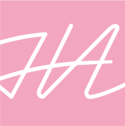
Finally, I took a look at the different handwritten typefaces on illustrator to see if any of them would spark some ideas. I found a typeface called “Neonoir” which was a smooth linear but edged design which I really liked. I decided to try combining my initials together into a square shape in order to keep the design professional and simple. But the letters were too spaced out, and when they were brought closer together they would overlap and interfere with each other. To fix this I placed the letters into photoshop and edited them to combine and appear cleaner. This worked and appeared so much better as they now looked purposely combined and as if I had drawn it myself. Due to the fact that it was linear and hand drawn, I definitely felt that it represents me and my personal style, which is why I selected it as my final logo. Before adding it to my portfolio, I created a few versions in different colours in order to have some variety.

For my portfolio, I wanted a gender neutral colour palette as I feel my designs are usually directed towards all genders, but I didn’t want to select colours that I didn’t like. Therefore, I chose pink and navy as my main colours as they represent both masculine and feminine qualities while still being complimentary to each other. Using white as an extra colour worked well also as it stands out clearly with both navy and pink. To start, I used my logo as a guide of what features would be applied around it. It took me a while to figure out the layout I wanted but I got there eventually. I used examples given by the university and pinterest to help inspire my layout choices as I wanted my work to appear as professional as possible.

Screenshot 2020-06-12 at 16.07.22Screenshot 2020-06-12 at 16.06.30Screenshot 2020-06-12 at 16.07.36Screenshot 2020-06-12 at 16.07.45

For the layout, I selected 3 columns as I wanted to dedicate a third of the page to text and the rest would be dedicated to images. On my first page/cover, I decided to create a blocky design with outlined details as it appears simple and modern.  Due to the fact that I wanted my information, logo and name to be clear and legible, I wanted the background to be plain colour. For my typeface I used ‘Arial Black’ as I wanted a bold and thick type to match the rest of the blocky design.

Screenshot 2020-06-12 at 16.10.08

I designed my second page to be an index page in order to make it quick and easy for viewers to reach/find the work they wish to see (without having to scroll through the entire portfolio). The layout for this page was all set centrally as I believed this would make the structure appear more even. To start the index page I decided to add a message where I introduce myself and welcome them to my portfolio. On the bottom of every page I included my logo along with left and right arrows. I did this as the portfolio is interactive and  it will allow the reader to go back and forth from each page as the arrows work as buttons. Along with this, I hyperlinked my logo to take the reader to the index page when selected.

Screenshot 2020-06-12 at 16.10.21

For my main pages, I aligned all of the text to the left as the left column would be dedicated to the information. I used ‘Avenir Next Medium’ as my main text typeface and ‘Neonoir’ as my titles. I chose ‘Avenir Next’ as the main text as it is a simple and clear typeface, which will allow easy reading for the viewers. Underneath each title, I described the type of project and the year as these are important factors for employers to consider when reviewing my work. Also under the titles, I included an extended pink line to incorporate a feature of my linear style and to tie in the colour palette. This line also leads the eye into the direction of the imagery as it continues outside of the borders. The right half of my pages are dedicated to the images of my work as I wanted extra room for images to be larger and spaced out. Each project includes two pages of work, except for ‘Penguin’ and ‘Space is the Animated Place’ which have one page each as I did not have as many outcomes to display.

Screenshot 2020-06-12 at 16.10.35

Finally, my last page is an exact copy of my first page except for the text as I wanted them to mirror each other like a book cover would. The text directs the reader to my social medias, contact information and wordpress.

Screenshot 2020-06-12 at 16.10.46

CV

Due to the fact that I wanted my portfolio and CV to appear similar and in my own style, I ensured that both included similar imagery and colour palette. It also displays similar features, such as my outlined border. To inspire my layout, I used examples supplied by the university and pinterest, where I found many interesting and professional designs to help me.

Screenshot 2020-06-12 at 16.22.56

(*I have blocked out my phone number in this image using a purple box for privacy purposes*)

Website

Just as I did in my portfolio and CV, I kept to the same colour palette and imagery style in order to have a cohesive personal brand. I decided to create my website on ‘Adobe Portfolio’ as I have never attempted to start a website before and I wanted to use a software that was easy to navigate. I began by selecting a template which I found the most suited to my style, which I was then able to edit and incorporate my own imagery and colour palette. I chose a similar typeface as the one ‘Avenir’ was unavailable, but the typeface I used still matched my style as it was bold and blocky.

For my cover photo, I was unsure what to use to start as having just a block colour seemed a bit too simple for a website. Instead I wanted to include something personal, in order to allow viewers to feel welcome and as if they can get to know me better. To achieve this, I illustrated a linear image of myself by using ‘Sketchbook pro’ on my ipad. This style of drawing has appeared in my work a lot this year and I felt as though it represented my personal style perfectly. Due to the fact that there was so much extra space around the illustration of me, I decided to incorporate some botanical imagery in the background to add some depth and pattern. I have always been drawn towards floral and botanical imagery, which is why I felt it was necessary to add. This made the image much more interesting and suited to my personal brand. When testing it out on the website, it didn’t work well with my title as the typeface was in a hand-drawn style also, which meant it didn’t stand out enough or appear legible. To overcome this, I went back to my illustration and filled in some of the imagery with colour, as I believed a block colour would be a better background in order to see the text. This worked well in the end as my title was much more legible than before and even made the imagery of me stand out better than before.

IMG_1067

Screenshot 2020-06-11 at 18.08.36Screenshot 2020-06-11 at 18.08.47

Along with my website, this year I created an instagram account ‘@hma_designss’ in order to give my work a social media presence. So far I have posted images of my ‘Branding’ and ‘Penguin’ designs and I intend on continue posting more of my university projects and personal work. Recently I’ve also included a link to my website on my bio in order to promote viewers to take a look.

IMG_9221


Exhibition Project – Improvements and Development

Subject Yr2, Uncategorised

POSTER 1

After receiving feedback and having time to rethink some of my designs, I decided to make a few changes to my work. Starting with the posters, I began to question my main imagery, especially the long distorted image of Mandela. Due to the fact that this image was displayed on every cover of the posters, booklet, billboard etc, I didn’t feel like it had a lot of impact. The time I spend on other projects allowed me to come back to this project with a fresh insight and ideas on how to improve this. In my feedback, my lecturer mentioned that he much preferred the Mandela head image with the green stripe. This image was only displayed once in the booklet and on the tote bags. I definitely agreed with his comments as I too found this image much more striking than the image I already had.

I began with editing my first poster, I started off with the imagery as the text and other features could be built around this. I swapped in the image of the Mandela head with the green stripe and removed the one I had before. Due to the fact that I wanted to simplify the design even more, I removed the grey boxy background and left it plain black instead. This allowed the Mandela head image to be larger and the focus of the design. After doing so, I realized the “What do you believe?” slogan almost perfectly fit into the green stripe of the image. I proceeded to manipulate the slogan into the strip in order to achieve a more appealing visual. This was perfect as it gave the green stripe more purpose and looked completely intentional.

To keep the minimal linear design, I included a thin white outline around the inner border of the poster. This allowed the design to connect better with the remainder of the exhibit’s branding and gave depth to the visual. Finally I manipulated the rest of the text, such as the logo, dates and ‘Tate’ logo to fit the new layout and appear cleaner. I wanted everything to appear balanced and that their placements were purposeful, therefore I followed the columns I already had in place and ensured all of the text had similar sizing.

This second and final draft of my first poster now looked much more professional and minimalist which I preferred. The overall appearance of the poster looked far better and I was happy with the changes I had made. The image I used was much better for the poster as you could see that it is Mandela and therefore the audience would get a better idea of the exhibition.

Screenshot 2020-06-04 at 16.35.19Screenshot 2020-06-04 at 16.03.26

POSTER 2

After returning to this project, I quickly realized how much I had fallen out of love with with my second poster. The image wasn’t interesting or exciting to me anymore and I didn’t feel that it represented the modern minimalist look I was trying to achieve. Instead of removing this imagery (of the long distorted Mandela) entirely from all of the designs, I decided to return to Photoshop and explore different ways of editing the image. I thought about enlarging the image more in order to have more focus on Mandela and the interesting liquid distortion. I felt that along with this I should try other colour methods than the green as I believed hints of green appeared better that a lot. I experimented with whites and greys in order to keep with the colour palette. After trying them out on the poster, I picked the grey as it reminded me of the different tones on a static TV screen. Although this improved the design, I didn’t feel that it matched my new image on the first poster. Due to the fact that the first poster’s imagery had a static effect, I believed it was important that this effect was also included in the second poster. Through Photoshop, I added a ‘Noise’ filter to the new grey version of the image. This added some slight speckling and created a nice subtle but not exact glitch appearance seen in the first poster’s imagery. Finally I was happy with its appearance and began adding it to the poster.

In order to fit the imagery into the layout, I decided to condense it into an outlined box. This feature also allowed the overall design to match the minimalist linear branding of the exhibition. With this outline, I incorporated the green shown through the rest of the designs which allowed its appearance to seem more cohesive. After doing so, I felt that the poster needed to match the first design by including the slogan and green stripe. Therefore, I included these two features to the poster which gave depth and a better connection to the other poster. Finally, I added the same text and information and ensured they were placed in the exact same locations and were the same size.

Overall both posters matched but weren’t identical and this is something I wanted to achieve from the start. Its design was much better and I was happier to see the brand new versions of both posters. They both now represent the branding more effectively and work well when placed next to each other. They would be much easier to identify and link together now that I have made these changes.

Screenshot 2020-06-04 at 17.03.25Screenshot 2020-06-04 at 16.03.06

BOOKLET

Due to the fact that I had changed the imagery for both posters, it was important that I changed the booklet too. To achieve a similar appearance to the posters (in order to easily link them), I decided to have an almost exact copy of the first poster design as the front cover of the booklet. All I had to do was follow the layout and sizing of the first poster and apply them to the booklet’s cover. The information was cut down even more and simplified in order to ensure the cover doesn’t appear busy and crowded.

Inside of the booklet, I decided to remove the Mandela head image on page 4 and replace it with the Mandela imagery used on the second poster. This too created a link between the two and made sense as the other image was now being used for the cover (and I didn’t want to repeat them in the booklet). I also changed the imagery on page 6, as I wasn’t happy with the overall look of the eye imagery due to the fact that it didn’t match the rest of the new designs. To improve it, I downloaded n image of an old TV and edited it in Photoshop to appear black/white with a static effect. My idea was to include the TV as they would be included throughout the exhibit itself and the eyes represents the different perspectives of each viewer. I much preferred this visual as it made more sense and matched the branding much more.

These minor changes made the booklet appear more professional as it was cohesive with the other designs and the imagery now looked far more appealing than before. Overall, I am happy with the changes I decided to make and how I managed to develop the designs further.

Screenshot 2020-06-04 at 17.41.15Screenshot 2020-06-04 at 17.41.22Screenshot 2020-05-30 at 18.13.00Screenshot 2020-05-30 at 18.11.29

Screenshot 2020-05-30 at 17.59.23Screenshot 2020-06-04 at 17.53.41

Screenshot 2020-05-30 at 18.13.19Screenshot 2020-05-30 at 18.13.12

BILLBOARD

Once again, as I had changed the imagery for the posters and booklet, it was important that the billboard design had some changes. The main thing I wanted to do was switch the imagery for the new Mandela head as this would allow the billboard to perfectly mirror the first poster design. I decided to include the slogan as it has been reiterated throughout the branding and it was important that this was displayed on the billboard too. I had the green stripe flowing outside of the image to lead the eye to the logo and information. These changes to the billboard allowed the overall design to connect better with the rest of the posters, booklet and branding. It appeared much more visually interesting than the first draft and has clear and simple amount/layout of information and text.

Screenshot 2020-05-30 at 18.57.40

Screenshot 2020-06-04 at 18.41.50


WEBSITE

For the website the same things applied, I needed to incorporate the designs and imagery used in the new designs to the site. Looking back at my old website, I believed I struggled with designing it the first time around as I have never attempted a web design before. I added a selection of pages such as “About”, “The Mandela Effect”, “What to Expect” etc. I did this to make it easier for viewers to reach certain sections of information and is a feature displayed on many websites.

This time I believe the changes I made appear more professional and the overall design looks more modern and minimalist (which is what I was hoping to achieve the first time around). I experimented with the layout and ended up with a similar but cleaner design at the end. I added the new imagery, changed the layout and colouring of the original design to achieve the finished design. These changes were definitely needed and I’m much happier now that I decided to develop its design further.

Screenshot 2020-06-04 at 18.14.16Screenshot 2020-06-04 at 18.42.02

(mock up image from: https://www.freepik.com/free-photos-vectors/mockup”>Mockup psd created by rawpixel.com – http://www.freepik.com

(and: https://www.freepik.com/free-photos-vectors/mockup”>Mockup psd created by customscene – http://www.freepik.com)


TICKET

Finally, for the ticket redesign, all I really needed to do was replace the imagery on the left hand side. I was pretty happy with its original design, therefore I didn’t feel that there was really a need to change anything else. The imagery was changed simply to match the rest of the new designs in the posters, booklet etc.

Screenshot 2020-06-04 at 18.20.59


Persuasion – Final outcomes

Subject Yr2

Posters

Screenshot 2020-04-01 at 18.06.57Screenshot 2020-04-01 at 18.37.55

On my last attempt at the poster, I kept most of the elements included on my sixth try, including the typeface, placement, imagery and colour combinations. I simply reintroduced the circle shape as it definitely added dimension and broke up the dead space, it also allowed me to introduce more colour to the design. With the “V is for volunteer” slogan I changed it to “V for volunteer” as it flowed much better as it follows the rule of three (it includes three words only). I also added an underline to the word “volunteer” in order to make the word stand out more and show its importance. Along with the slogan, I created another which is “Become a #Cityhospicehero” as it bring more attention to the social media side of the campaign, which is something I wanted to focus on due to the target audience being mainly students. When I was finally happy with my design, I applied all of the same elements to the male version of the poster as I wanted viewers to be able to connect the two easily. 

In my opinion, students would gravitate towards this poster as it has bold bright colours which catch the eye and a young vibe with its inclusivity of race and gender along with the hand-drawn elements of the typeface and imagery. Also, the superhero franchises are larger than ever and very popular with young adults, therefore this imagery will spark some inspiration and motivation. Overall I’m happy with the final designs as they display the message in a clear but inspirational way. They’re both simple yet bold which is something I wanted to achieve, and match the clients branding with some added features.

Social media posts

This slideshow requires JavaScript.

After designing the posters, the social media posts were simple to design. I wanted to match everything together in order to allow the campaign to be recognisable and cohesive. To achieve this, I simply had to scale the posters to fit a 1080px by 1080px size (which is the average size of a square social media post). I added the message “Apply now! Link in the description” in order to give the viewers some direction on where to find more information. When posting these designs, the client can insert a link into the description of the post which is why I decided to mention that on the design. The third design I included lists the many volunteering opportunities the client provides which will allow viewers so get a better idea of their volunteering potential.

They can use the three versions of the designs as they wish, separately or together. On Instagram, accounts can post multiple images on one post where the viewer is able to scroll through the variety of pictures, which is what I intended with this triple design. Although Facebook does not have this feature therefore, I designed the three with the idea that they could work individually also.

Social media stories 

To go with the social media posts, I designed two social media ‘stories’ to add to the campaign. Again this was easy to achieve now that I had designed the posters and posts, as I only needed to rescale everything to an iphone screen size.  I believe it is best to keep these social media stories as simple as possible as they are limited to a short amount of time on screen until they disappear. Therefore, I removed most of the text and only included the imagery, slogan and “Apply now”. Instagram stories can include links, they appear as a small upward arrow on the bottom centre of the screen. To highlight this, I designed a “swipe up” message which would be located right above the link arrow. I gave the text a slight curve in order to compliment the arrow and it would fit around it easily and effectively. I ensured to leave plenty of room at the top and bottom of the designs as Instagram adds the profile’s name and profile picture at the top, along with further information and comment section at the bottom. I made sure to leave room for those as I didn’t want them to obstruct the text on the design

Public Promotion

Screenshot 2020-04-01 at 22.36.36

Screenshot 2020-04-17 at 14.37.20

Lastly for the campaign, I created a design for a stand up life-size cardboard cut-out for promotion in public areas. During the aftermath of the coronavirus, young people will be out in public more than ever and wanting to share their experiences after being released from lockdown. With this in mind, the cardboard cut-outs will allow passers-by to have some fun and take pictures of themselves as superheroes, thus posting them on social media. This will spread the clients message further as people would be using the hashtag and posting them on their own profiles which would then be a form of free advertisement for City Hospice. To achieve the design, I used the poster’s layout but changed the colouring of the background. I also added the male hero in order to promote people to get their friends involved when using the cardboard cut-out for pictures. To push the hashtag and have it on full display, I placed the “become a #Cityhospicehero” at the top of the cut-out as the main text. Along with this, I included the instruction of “take a picture and use our hashtag!” to direct users to promote the message and Hospice. Again, all of the social media information and website is included at the bottom of the cut-out in order for viewers to find out more about the hospice and what they do.


Persuasion – Drafts of posters

Subject Yr2

Screenshot 2020-04-01 at 13.43.45

After creating some visuals, it was time to move onto creating the first poster. I began by adding my imagery, shapes, logo and text to the A3 poster to start playing around with their scales and placement. It was also a point where I could experiment with colour combinations from the palette given to us by City Hospice. The circle shape is a feature which I noticed appears in their past posters and other promotional designs. I wanted to incorporate in order to connect better with those previous designs and the shape also helps break up the space and add some dimension. Due to my superhero image not having a full body, I felt that a banner was needed to conceal the bottom of the illustration to appear cleaner. The banner was also needed to highlight the logo better. As the City Hospice logo is in a thin typeface and is coloured in a light green, it was hard to see without the coloured banner in the background, again this is why it was included. In order to keep the “Hospice Hero” theme clear, I added a hashtag “#CityHospiceHeros”. This would also be beneficial for the client to use to promote volunteering on their social media platforms. Along with this I included their social media handles in order for viewers to know where to look for further information. On the imagery itself, the superhero wears a ‘V’ to represent ‘volunteer’, which I believed needed to be clarified to viewers. Therefore, I created the slogan “’V’ is for volunteer” as it explains the purpose of the supersuit, the message that City hospice wish to give and it is a phrase which is easy to remember. 

Screenshot 2020-04-01 at 14.01.54

Although I was happy with elements of the design, I wasn’t convinced that all the features combined well together or made a statement. I decided to try another version of this by swapping the colours and imagery. The second design looked clean and simple but again didn’t really inspire or interest me, so more changes were needed to be made.

Screenshot 2020-04-01 at 14.27.21

As I preferred the first design compared to the second, I revisited it to try and manipulate some of its features. Again I changed some of the colouring by adding the bright orange which gave it a much more uplifting tone. I also changed the typeface to ‘Rooney Sans’ as I thought the rounded edges would come across softer and more ‘cartooney’. This made my third design better but still not at its full potential, so I continued to experiment. 

Screenshot 2020-04-01 at 16.38.42

For my fourth try I decided to relocate the imagery to the centre of the poster as I was struggling to find the perfect place to put the text. I thought that trying the image in the centre could mean that the text could be placed centrally too. This allowed me to add the word ‘Volunteer’ to the bottom of the poster, where it could have more room. As the text and banner were of the same colour, I experimented with merging the two together. Once again I didn’t feel drawn to the overall look. Although, the imagery being central seemed to work much better, so I decided to continue with that placement when moving forward.

Screenshot 2020-04-01 at 16.51.48

For my fifth attempt, I swapped the image of the hero as I didn’t feel that the visual appeared bold enough. I removed the circle shape to see if it was making the imagery too busy and attempted a simpler look to the overall design. As for the information located at the bottom left corner I tried adjusting their size and added the city hospice website as it is key information for viewers to know. Again, I really wasn’t feeling inspired and attempted to experiment with other possibilities. 

Screenshot 2020-04-01 at 17.21.37

On my sixth try, I decided to completely change the typeface as it didn’t seem to work with the rest of the design elements. It was changed to ‘Amatic SC’ as it had a hand drawn effect similar to my imagery. This added to making the design appear more personal and authentic, and it tied in nicely with the branding as it is simple and gives a sense of positivity. Instead of the white background I inverted the colours, therefore the background was now orange and the text was white. This allowed the text to stand out more against the blue of the image and made the message appear bolder. I could feel that I was beginning to get on track as elements of the design began coming together, but there were still changes to be made to heighten its potential.


Persuasion – Idea Development

Subject Yr2, Uncategorised

For my first concept I was trying to achieve an inclusive design by creating designs of a variety of different young people. The image below is an illustration I made for this idea, I used imagery of tattoos on the individuals hands in order to convey the inclusive message. After creating the design, although I liked it, it didn’t seem right. I felt that something was missing and that the image was too cliché and predictable, it’s something people have seen many times before. I really wanted my imagery to stand out and to be something different for this hospice to include to their repertoire. I decided to abandon this concept and imagery pretty quickly after designing it as I knew the message wasn’t clear or inspiring enough for the audience I was trying to reach.


28F2FADB-0F45-4396-AF7B-838E84EC5043 1

After abandoning my last idea I decided to plow on and revert back to my other concepts and ideas for inspiration. One of them was for “Hospice heroes” which was a wild idea regarding international students joining the volunteers at city hospice which is a concept the group and I created. “Hospice Heroes” is a phrase displayed on previous posters shown in the Whitchurch City Hospice facility. I saw these while visiting one day and loved the idea that they called their volunteers this name. It really brings a positive message and sense of community to the thought of volunteering which is why it resonated with me. I decided to take this further and went with the idea of creating illustrations of everyday people becoming heroes for these people in need. Due to the fact that the Marvel franchise of heroes is booming and more popular than ever, I believe this idea has the most potential with attracting students.

To begin, I created illustrations of a young male and female becoming superheroes by tearing their clothes off to reveal their suits (similar to superman). I made sure to create both genders and races to continue the idea of inclusivity and that anyone can become a hero. I also added the letter “V” (similar to superman and many others supersuits) to represent the word ‘volunteer’. To create these illustrations, I used an app called sketchbook pro on my iPad to achieve the very hand drawn effect. I believe using a hand drawn element creates a more personal and thoughtful design.

Untitled 1-15B8DCA20-9CD9-4A7D-B70D-BD6DBA50DE41

Untitled 2

I continued by trying to incorporate colour to the illustration and add the comic book style elements. To do this I created a simple ‘bang’ onion shape on illustrator and then adding it to the illustration.

Screenshot 2020-03-31 at 19.24.36

This definitely felt more on the comic book style and made the imagery bright and bold but I wasn’t sure that it worked. I think I felt this way due to the comic book style being a bit cliche and it didn’t match the illustrations or branding of the hospice. Keeping pithing the branding is something I really wanted to achieve as it would make my designs more cohesive with what they currently have. I decided to remove the bold colouring and features to try a more simpler approach instead, which would hopefully be better suited to the client.

Screenshot 2020-03-31 at 19.22.26

After experimenting with the comic book style, I reverted back to the original linear design. I decided to try including the clients own colour palette into my illustrations in an attempt to connect my work and their branding better. By duplicating the illustration, I coloured the one entirely and left the other plain with just the line work. I really liked how the colour flows outside of the lines and how it wasn’t perfectly aligned. This made the imagery appear like it was screen printed and has more of an authentic feel. It also allowed the imagery to pop out better by having a bold block of colour in the background. I ensured that I made a version including each colour, therefore I’d have a well-rounded idea of it’s potential and the options I had. Overall, this design already felt more cohesive with the client’s current brand as it matched the illustration style and colour palette.

Screenshot 2020-04-17 at 14.09.22

Screenshot 2020-04-17 at 14.09.37Screenshot 2020-04-17 at 14.09.57Screenshot 2020-04-17 at 14.10.14


Although the last designs were effective, I wanted to continue experimenting to see if any other potential versions of the imagery could work too. Again, I reverted back to the illustrations original state and duplicated the image. I then coloured the outline of one of the illustrations by using the same colours. I also made sure to fill the hair and superhero symbol in order to allow them to stand out and break up the imagery more. These features also gave a screen printed effect and allowed the design to appear more hand-made and authentic. Again, I ensured that I made a version including each colour, therefore I’d have a well-rounded idea of it’s potential and the options I had. This version of the imagery was simple but effective as it only required a hint of colour to really tie in the client’s current branding.

Screenshot 2020-04-17 at 14.15.09Screenshot 2020-04-17 at 14.15.25


Screenshot 2020-04-17 at 14.16.28Screenshot 2020-04-17 at 14.16.44

Persuasion – Idea generation

Subject Yr2, Uncategorised

Mood board:

Through Pinterest I created a mood board of images which inspired me. Many of the images I chose had a youthful feel along with a similar design to the City Hospice brand, which is what I aim to have in my final product.

Screenshot 2020-03-31 at 17.32.23

Screenshot 2020-03-31 at 17.32.47

I liked the design above as it had a simple but bold design. The use of illustrations link well with the city hospice branding and coveys the massage easily and effectively. The colour palette used is minimal which allows the design to pop and be easily legible. I also admire the modern style of the overall design as it would appeal more to younger audiences.

Screenshot 2020-03-31 at 17.33.29

I admired the design above as it has a bright and vibrant colour palette and illustrations which matched the branding of city hospice. This factor also appeals to younger audiences and conveys a more fun and interesting message. The minimal text allows the design to be easily legible and uses positive language to attract and reach more people.

Screenshot 2020-03-31 at 17.34.02

I also liked the design above as its focus is on the imagery. The images display illustrations which is similar to the branding of city hospice with the variety of cartoon individuals displayed. The colour palette is also calming and positive as it uses light blues and pinks. This displays a more positive and uplifting message and would attract a wide audience. The text is simple and modern which makes them clear and visible, which is useful for posters in order for passers by to read quickly.

Mind map

IMG_0742.JPG

Initial concept ideas

As a group we developed four concept ideas in order to explore further and examine their potential.

Screenshot 2020-03-31 at 17.04.17

1. Targeting students

Who? Any Cardiff Based Students

What? To get students within Cardiff to engage in Volunteering, and becoming a part of the community.

How? Through posters, social media ads(gifs). Get them to consider how much time they spend on social media. What they could be doing with this time.

Where? Shopping centres, student halls and on university sites.

Why? Offers them experience to build up their CV’s and becoming a part of the community.

Positives? Having younger aging workforce is important to make sure that there will always be people available to volunteer.

Negatives? Might not have time, and need money to help pay for rent/student loans.

Slogan: ‘Connect the Community’

Screenshot 2020-03-31 at 17.07.13

2. After the coronavirus 

Who? The community of Cardiff

What? Continue the renewed sentiment of community spirit that Covid 19 is responsible for and inject that spirit into the City Hospice retail shops.

How? Recognising our audience for their selfless acts of kindness and urging them not to stop now. The use of typographic animations. The use of graphs that explain the spread of the virus as well as the spread in community spirit.

Where? Through social media, Printed media around busy areas, Other Talks and events that the City Hospice host. 

Why? (why are we targeting them, motives) The social impact of the current pandemic has increased the want to help within the public.

Positives? Using current global events as a means of relating to the audience. Targeting a broad audience effectively.

Negatives? Campaign would have to target a much broader audience all at once?

Slogan: “Don’t flatten our curve”

Screenshot 2020-03-31 at 17.09.55

3. Targeting mature audiences

Who? A mature audience of adults living in Cardiff

What? To attract mature audiences to engage with the campaign and charity.

How? They would be presenting statistics and opportunities for supporting other members of the community through infographics

Where? Advertisement would be through posters, window displays in shops, facebook posts, pamphlets

Why? This audience isn’t the most common for volunteering and charities are in need of a variety in skills and age.

Positives? The charity would employ more people of this age range which is much needed for variety and difference in skills. Infographics can display a lot of information on one piece of advertisement

Negatives? This age range are usually made up of people with full time jobs and children therefore they won’t have as much time to commit to the charity 

Slogan: “Connect, Comfort, Care”

Screenshot 2020-03-31 at 17.11.38

4. Targeting internationals

Who? International young people

What? Persuade internationals to travel and volunteer 

How? Present as an experience, with social and work benefits 

Where? Social media sites, video advertising, Uni’s, Expat sites

Why? Something different, experience of different place whilst doing good 

Positives? Encourage and support Welsh tourism, gain help from outside of wales

Negatives? Hard to achieve, not many forms of advertising, help not guaranteed

Slogan: “Breaking horizons. Making change”

Individual concept ideas

After creating our concepts as a group we had to move onto developing one of those ideas into another. My idea was to target students of Cardiff by using inclusivity and community as an attraction.

The target audience for the design will be directed towards any cardiff based students in order to get students within the city to engage in volunteering, and becoming part of the community. Having a younger raging workforce is important to make sure that there will always be people available to volunteer. The message will be demonstrated through posters, social media ads/posts and populated areas such as buses, bus stops, student housing and window displays.The ultimate aim is to get them to consider volunteering at the retail stores. It is important to demonstrate what they could be  doing with their time. The message conveyed will be that there are plenty of opportunities at City Hospice for them to gain experience and build up their CV’s by becoming a part of the community.

It is a large misconception that certain individuals aren’t as caring, compassionate or dedicated, for example people with tattoos. Through the designs, the aim will be to demonstrate to students that any individual can volunteer and that there are no restrictions. Black, white, gay, straight, tattooed, coloured hair, not one of those people will be denied or judged as volunteers are desperately needed. due to the fact that many young individuals of this generation are very open-minded about society and the different types of people in it, this form of advertisement will be effective.

In order to achieve a youthful feel and reach a younger audience, hands which have tattoos could be an effective detail. According to online surveys and statistics, the highest rates of tattooing were found among men and women in their 20s (29.4%). Men and women ages 20-39 were most likely to have been tattooed at least once. Overall the simpler designs with pops of colour appear most modern, therefore the designs will have room to breathe and the focus will be on the message.

Screenshot 2020-03-31 at 17.14.14Screenshot 2020-03-31 at 17.14.21

Forms of promotion:

To reach the most amount of people, I believe a variety of social media and public advertisement would be the best approach. As displayed in the rough sketches below, I’ve made what I believe the potential for this promotion can be and what could possibly be achieved with my designs along with standard posters.

Untitled.pngUntitled 1.png


Persuasion – Research

Subject Yr2, Uncategorised

Introduction

For the ‘Persuasion’ project we were asked to select a client from ten options and complete a brief designed by them. The purpose of this project is to get a better understanding of how to work with clients and achieve a final outcome which suit the briefs given to us. The final outcomes are then great assets to include in our portfolios and are also sent to the clients for them to decide whether or not to go ahead with any of our designs.

After reading about each individual client I decided to select the ‘Volunteering’ brief given by City Hospice. This attracted me as the client is a non-profit organisation and therefore the project will be for a good cause. I also took a look at their website for further information and to take a look at their current branding. I could see their brand was very cohesive and interesting due to their use of bold colour and fun illustrations which I really liked.

About the client

City Hospice is a hospice which cares for terminally ill patients across Cardiff by managing their symptoms and offering support. Their goal is to allow each patient to live their lives to the fullest for as long as possible. Every month, more people are referred to them and are made by the care team at Velindre Cancer centre, the University Hospital of Wales or patient’s own GP. They help people with diagnoses such as Cancer, Dementia, Motor Neurone Disease (MND), Chronic Obstructive Pulmonary Disease (COPD) or other life limiting illnesses.

The hospice is not a bedded unit as they offer care and support to their patients in their own homes and some attend their centre in Whitchurch, Cardiff. They make the effort to understand the preferences of those they care for and take into consideration where they wish to stay. They also take measures to support the relatives of patients by counselling them on how to cope with the difficult circumstances they are in, along with coffee mornings and opportunities to discuss their troubles with others in the same situations. This not only happens while someone they know is in the hospice’s care, but continues after when they need it most. The hospice allows volunteers to take part in many areas of the charity. Opportunities include: gardening, office work, retail stores, receptionists and many more.

As shown through their website, logo colour palette and features, the branding of this hospice is bright and colourful with a positive energy. The Logo displays an image of hope and community with its collection of people. It also shows the love and care given by the hospice through the use of the heart shape on the image. When scrolling through their website, images of positive smiling individuals are represented including carers, volunteers and patients. This really appeals to viewers as it instantly shows the care and attention they put into their work along with a positive, cheerful feel to reassure. Their illustrations are appealing and modern, they show a diverse variety of people which spreads the message of community further. These factors are what drew me in and inspired me to select them for my project.

Screenshot 2020-03-31 at 15.15.33

CityHospice-Logo-Master-Stacked-RGB-Lrg


Campaign research

For our first task we were asked to further investigate campaigns of a certain topic. The topic given to my group was ‘Homelessness’. We were also asked to research a notable event which has occurred in the last five years. As a group we searched the internet for designs which were made to tackle the issue of homelessness, and analyse them for further information.

image.pngimage

(images from: https://www.standard.co.uk/news/uk/hardhitting-posters-highlight-how-homeless-people-are-treated-as-invisible-a4086701.html)

The one I selected was GoodOrganisation in York, they are a Community Interest Company that supports disadvantaged people in York to share in the economic benefits of tourism. They offer training opportunities, manage small projects and provide personal development support to marginalised individuals across the city.  Their aim is to persuade members of the public to take action as homeless people are often ignored on the streets when they should be given more support. They wish to raise awareness and promote action. So far as a result, according to the ‘Evening Standard’, “The posters have gained attention across the globe, with messages sent to the group from countries in mainland Europe, the USA and Australia.”


Screenshot 2020-03-31 at 15.50.11

(image above is not my own work and was designed for a company for the ‘End youth homelessness’ campaign)

Client : End Youth Homelessness

Persuade : the public / youth 

Key message : Want to alert about young homeless people / raise awareness / aim to end youth homelessness / working to end youth homelessness on a national scale to give vulnerable young people a future / to tackle youth homelessness together / provides a national platform to raise awareness / share experience and generate voluntary income 

Success : 

Screenshot 2020-03-31 at 15.50.18

Screenshot 2020-03-31 at 15.50.28

Client : Glow Berlin and Berlin Red Cross

Persuade: the public 

Key message : to raise awareness / want to help homeless people directly 

What’s interesting with this poster is that the designers found another use for the simple billboard. By raising awareness about the conditions of the homeless during the winter, they help them directly by offering them survival blankets. 

How successful is the campaign?: As a result of this campaign, up to 400 homeless citizens in Berlin were able to take and use these blankets to keep warm whilst living on the streets.
Screenshot 2020-03-31 at 15.50.38

(image above designed by the clemengerbdo agency)

Client: Father Bob Maguire Foundation (made by clemengerbdo agency)

Persuade: the public

Key message: to change the homeless epidemic, by showing what they eat

How effective?: many news articles talk about the effects that father bob Maguire’s work had on the Melbourne community, even promoting further community values as the foundation is completely crowdfunded or from his own pocket.
Screenshot 2020-03-31 at 15.50.47

(image above is not my own and was designed by a company for ‘The connection’ campaign)

Client: Beki Winters, head of outreach, The Connection at St Martin-in-the-Fields.

Persuade: Passers by, particularly people in London

What is the key message?: This campaign is pleading Londoners not to give money to the homeless as it’s often spent on alcohol and drugs – implying that to help, guy them a warm meal, or a cup of coffee.

How successful is the campaign? The charity helps over 200 homeless people in London everyday. They have their own app, which is a way for people to donate to the cause.

Notable events of the era (recent five years)

In my opinion some of the stories which define my era are Brexit, the impeachment of Trump, #metoo movement and recently the hysteria of the Coronavirus.

image.pngimage.png

image.png

#Metoo

As shown through the name and images provided, the movement’s form of persuasion is through the use of short and bold statements such as “Me too” and “Me too, with you”. Theses are printed/painted onto placards for use during protests and marches linked to the movement. The message of equality and rights of women are displayed effectively through these short statements as they are clear and straight to the point. They show support and unity as they allow viewers to feel included through connecting with them by using these words. The aim is to let other people know that they are not alone in their experiences with sexual harassment and inequality and that these issues can be and should be addressed. The message is not only carried out through protests and marches but also through social media as many influential celebrities have taken part and shared their stories online along with members of the public.

Tutorials with Wendy:

During lectures with Wendy we were asked to answer a series of questions in order for us to get a better understanding of the client and their needs, along with our personal strengths and how we might work towards completing the brief given.

It was important that we figure out and answer the question of what we wish to ask the public. We decided that this would be “How might we persuade the general public to volunteer“. Some varieties of this include:

  • How might we persuade young people to volunteer more?
  • How might we persuade workers to dedicate their time to volunteer
  • How might we persuade people to use their skills for social events/charitable activities
  • How might we persuade the people of Cardiff to use their free time for change
  • How might we persuade students to volunteer (CV/ portfolio/experience)

10 things your team needs:

  • time management
  • personal experience (go there)
  • patience
  • utilising individual skills
  • team building
  • emotional connection
  • adaptability
  • forms of communication
  • persuade people who may not be expected to volunteerer
  • explore all ideas

10 things we don’t know about target audience:

  • who they are
  • schedules
  • lifestyle/priorities
  • charitable experience
  • financial status
  • gender/age
  • interests/hobbies
  • skill set
  • personal connection

IMG_6583

10 things we know about the target audience:

  • they live in Cardiff
  • have free time
  • easily accessible
  • are compassionate
  • they are passionate
  • they are outgoing
  • they are friendly
  • have good ethics
  • they are motivated
  • they are supportive

10 things we know about the client:

  • based in Cardiff
  • have many volunteering roles
  • Caring, counselling, therapy and advice
  • easily accessible and adaptable
  • they work in and out centres
  • “Caring for Cardiff” is their slogan
  • need more volunteers for retail
  • 7 charity shops
  • they do charity events
  • they need to reach a wider target audience

IMG_6581

10 things you know about the subject/message:

  • don’t require skills to volunteer
  • variety of jobs
  • sensitive, factual
  • open target audience
  • selfless
  • minimal funding from government
  • the importance of funding
  • requirement of support
  • open to everybody with a variety of events
  • retail specific

10 persuasive words:

  • encourage
  • understand
  • try
  • do
  • help
  • support
  • give
  • provide
  • please
  • join

10 things you know you can bring to this project:

  • passion
  • compassion
  • variety
  • positivity
  • emotion
  • creativity
  • different perspective
  • sensitivity
  • open mindedness
  • sensibility


IMG_6582

10 things we don’t know about the client:

  • outcomes
  • forms of media
  • who they are
  • specific target audience
  • budget
  • previous methods
  • fails/successes
  • language/approach
  • market tactics
  • preferences

10 things we don’t know about the message/subject:

  • impact on staff
  • impact on families
  • where the budget goes
  • where the budget needs to go
  • the sensitivity
  • previous work
  • previous connections
  • message language preferences
  • formal/informal
  • how many volunteers/aims

IMG_6584

We were also asked to come up with examples of potential good, bad and wild ideas. These are the few we came up with:

Good:

  • Using platforms we know people will look at, for example, public spaces, pop up ads online
  • persuade people in groups/friend groups – more likely to participate
  • get schools involved – creates opportunities

Bad:

  • Making the patients do the volunteering
  • target audiences with less time

Wild

  • expand volunteer list to across the globe – set up online activities, funding, shares/likes
  • interrupt online servers to spread messages
  • making a volunteering camp with international people

IMG_6585

6 Frames For Thinking About Information

As another helpful tutorial, we were asked by our lecturer Wendy to complete a series of questions relating to the hospice in order to achieve further knowledge.

Purpose – What are you looking for from the Information you have?/What is the purpose if of the Information?

• To increase the number of volunteers in the retail shops

• Demonstrate the positive impact volunteering has on City Hospice

• Raising awareness of

• Delivering a friendly experience within the hospice retail shops

Accuracy – Review a range of sources of information and score them from 1 – 5 in terms of accuracy, 1 being low and 5 being high. Is the source authoritative and credible?

Volunteering in Cancer Research

• Is a “.org” site so is trustworthy and reliable!

• Information is clearly laid out and legible

• Easy to navigate with clear headings and signposts for relevant information

• Downloadable volunteering policies

• Accuracy: 5

Volunteering at Macmillan Cancer Support

• Is a “.org” site again! Very trustworthy and reliable!

• Clearly laid out information in coloured boxes with legible headings

• Safe and reliable donation buttons using payment services from VISA and Mastercard

• Accuracy: 5

Volunteering with Oxfam

• Important FAQ and questions asked by the public listed on the site

• Is a “.org” site again!

• No advertisements to deter your attention

• Well established and well known!

• Accuracy: 5

Volunteering with Charity Retail Association

• Is a “.org” site again – very reliable and trustworthy!

• Clearly signposted headings using different colours as accents

• Safeguarding information available

• Social media links

• Not as established or as well known as the previous but still legitimate

• Accuracy: 4

Point of View – This frame examines point of view, bias and agenda. Is the information balanced or biased? A lot of information is designed to be biased and persuasive. Branding is biased and persuasive. A story has a point of view…newspapers have bias…any information will have come from a specific point of view. Is there an author (authority) or is the information from an unidentifiable source? Is it personal and emotive, a collective, viral or response? Does it claim to be factual? Can you trace the origins? Whose point of view matters?

• City Hospice is a non-profit organisation that is partially funded by the government (around 35%), but the majority of funding comes from volunteers in the charity shops and from the selling of donated goods

• City Hospice focuses on caring for patients in their last months/years and also for their family members during this difficult time and also in their grieving stage

• Their content is factual but also emotive as it’s solely based around the health and care of the patients

Interest – This frame directs attention to matters of interest. Understanding what is of interest may point to information that has more of an emotive affect. This may be an element of surprise or adding something new/unexpected to information we already know, introducing sensitivity to things that affect you/other people. People will often search larger volumes of information for specific things that they think they need. What can you extract from information that addresses things that affect you/other people personally?

• The aim of City Hospice is to care for patients that are terminally ill so their interest falls on the actual patients, their treatment and their family

• Photographs and short promotional films are used to evoke an emotional response in viewers to encourage them to donate and/or volunteer

• Personal and emotional stories from the patients and their family are told to encourage people to get involved

Value – Now that you have so many sources of information, you can introduce some judgement. Revisit the information and note information that confirms your view and gives you confidence. Also note the information you disagree with. Note information that you may disagree with but that adds value to your understanding by showing a different point of view. This allows you to reflect on the strengths and weaknesses of a point of view. Deliberately acknowledging information that you may not agree with or that reflects a conflicting point of view may suggest an opportunity you may not otherwise have considered.

What is of value to you?

• Personal stories are to be emotive and aim to encourage viewers to volunteer in the retail charity shops

• Perhaps listing facts and figures shows the viewers the enormity of the hospice and what they deal with on a day-to-day basis

  • Volunteer statistics are ever changing, with average participation age between 35 and 70 so perhaps by targeting a younger demographic, those statistics can become more inclusive

● The clients previous promotional work would need modifying to reach the younger audience

● A younger audience target market allows content to become more new and exciting

● Spreading a positive message and impact is vital in getting the attention of new volunteers

● The point of view of the volunteer needs to heard

Outcome – The 6th Frame, this is where you summarise and point to next steps…

Do you need more information, is the information accurate, can it be verified? What matters of interest have been noted? What is the overall value of information, are there new levels of enquiry to be opened up? What is the impact of the information, how will it influence our ideas?

Using studies can make our campaign for the charity more credible and emotive

● Creating questionnaires or interviewing volunteers and workers would be a credible source

● Retail work in the shops is currently lacking so this would need to be one of our main focuses (particularly the Barry shop)

● Include the examples of volunteer led activities to illustrate how volunteering is such a big part of the Hospice

● Show how volunteering becomes a community – turns into a form of social gathering

● Show how rewarding volunteering and what it can offer in terms of life skills and experience

● The impact of information would come from statistics – the Hospice aims to have 100 new volunteers through our help

● We need to enquire on the impact of younger audiences, we could so by looking at existing case studies

Persuasion -Task 1 and 2 research

Subject Yr2, Uncategorised

Research of into homelessness campaigns

image.pngimage

(images from: https://www.standard.co.uk/news/uk/hardhitting-posters-highlight-how-homeless-people-are-treated-as-invisible-a4086701.html)

The client is GoodOrganisation in York who are a Community Interest Company that supports disadvantaged people in York to share in the economic benefits of tourism. They offer training opportunities, manage small projects and provide personal development support to marginalised individuals across the city.  Their aim is to persuade members of the public to take action as homeless people are often ignored on the streets when they should be given more support. They wish to raise awareness and promote action. So far as a result, according to the ‘Evening Standard’, “The posters have gained attention across the globe, with messages sent to the group from countries in mainland Europe, the USA and Australia.”

Notable events of the era (recent five years)

In my opinion some of the stories which define my era are Brexit, the impeachment of Trump, #metoo movement and recently the hysteria of the Coronavirus.

image.pngimage.png

image.png

#Metoo

As shown through the name and images provided, the movement’s form of persuasion is through the use of short and bold statements such as “Me too” and “Me too, with you”. Theses are printed/painted onto placards for use during protests and marches linked to the movement. The message of equality and rights of women are displayed effectively through these short statements as they are clear and straight to the point. They show support and unity as they allow viewers to feel included through connecting with them by using these words. The aim is to let other people know that they are not alone in their experiences with sexual harassment and inequality and that these issues can be and should be addressed. The message is not only carried out through protests and marches but also through social media as many influential celebrities have taken part and shared their stories online along with members of the public.


Exhibition Project – Merchandise and Video

Subject Yr2, Uncategorised

Exhibition Ticket

To design the ticket I used the posters and booklet as references for the layout and appearance. All of the imagery, text, colouring and information is the same which allows it to have a better connection to the rest of the brand. This also ensures that users are aware of the tickets purpose. The white section (to the right) of the ticket is meant to be ripped off at entry and kept by visitors. The white differentiates the two parts of the ticket which makes it more visible to the viewer as a separate ticket. On the white side I have included the visual logo instead of duplicating the textual logo, therefore it’s not repetitive but still displays the brand.

Screenshot 2019-12-04 at 15.59.31.png

Merchandise

The merchandise design includes the logos and imagery seen throughout the exhibition’s branding. This of course is to make the items recognisable which advertises ‘Error404’ externally. All of the images below were edited on photoshop to show how the designs would look (hypothetically). The tote bag has two sides, the front displays the Mandela image and textual logo, and the back just displays the visual logo. I chose to use this version of the Mandela image as it represents the viewers perspectives through the covered eye visual, and the viewers are the ones purchasing this item therefore it seemed an interesting nod to this subject. The badge and lanyard just display the logos as they are very small items that should be kept simple and straight to the point.

screenshot-2019-12-04-at-15.59.54.png


Screenshot 2019-12-04 at 16.00.13.png


Screenshot 2019-12-04 at 15.57.12.png


screenshot-2019-12-04-at-15.58.45.png

Video

To create the video I used the visual logo as the main image. Due to the fact that this logo includes two overlapping circles (which represent the different realities crossing), I knew I wanted to have them spinning as the video continues. This effect gives the video a very sci-fi appearance as it looks like a broadcast interruption. To incorporate the glitch aspect of the branding, I downloaded a copyright free video of a screen glitch and edited it to appear black and white (as it was originally a rainbow colour). I changed the colours to match the colour palette of the ‘Error404’ branding which is black, white, grey and green. The video was created on ‘After effects’ which is a software I’m very unfamiliar with and find extremely complicated, so in the end I was very proud with the outcome I was able to achieve.

Screenshot 2019-11-02 at 20.03.54.pngScreenshot 2019-11-02 at 20.04.13.png

Exhibition Project – Signage and Wayfinding

Subject Yr2, Uncategorised

When doing research, I discovered that the Tate museum includes this sign (shown below) which directs visitors to the different locations. Considering I have been to the Tate before, this is a sign I saw multiple times while visiting, therefore I wanted to recreate it to represent my exhibition.

wayfinding-2-1-1050x600.jpg

(image above from: https://advisor.museumsandheritage.com/features/ccd-creating-crystal-clear-wayfinding-system-tate-st-ives/)

To begin, I redesigned the symbols used for the different floors by using illustrator. I wanted to keep these simple in order to match the look of the ‘Error404’ exhibition. In the logos and other elements of the branding, it includes outlined shapes, symbols and images. I believed it was important to keep this design choice within the signage as it is a recognisable feature of the brand. The green was also included as the other colours (grey, black and white) of the brand aren’t as eye-catching or definable. This green represents the brand the most which is why it is used in this case.

Screenshot 2019-12-04 at 16.48.29.png

For the floor numbers, I typed them out onto illustrator using the same typeface I’ve used before (Countach in bold) and then transferred them to Photoshop to be edited. On photoshop I used the ‘liquify’ effect to achieve this glitched look which appears throughout the rest of the branding. Again the green colour was used to tie in with the colour palette of the posters and other advertisements.

Screenshot 2019-12-04 at 16.49.16.png

The images below show the final design and an example of how it would look within the space. This design completely matches the original Tate design but has aspects and feature of the ‘Error404’ brand. When looking at it as a whole, I believe it definitely represents the exhibition well as it mirrors the same design elements which makes it recognisable to viewers.

Screenshot 2019-12-04 at 16.48.11.png

Screenshot 2019-12-04 at 16.48.49.png

For the wayfinding I designed two different green lines on illustrator, one filled and one outlined. This was done to match the text and numbers of the ‘Error404 logo’ where there are some numbers/letters filled and others outlined. I then photoshopped these lines into the space (Tate) and used the ‘liquify’ effect to achieve the glitched look which appears throughout the branding. I made this in order to lead visitors to and through the exhibition easily and effectively. Along with the lines, the visual logo would be stamped throughout the museum to let visitors know that they are near/in the exhibition’s location.

Screenshot 2019-12-04 at 16.49.31


Screenshot 2019-12-04 at 16.49.48.png

Screenshot 2019-12-04 at 16.51.59.png

Screenshot 2019-12-04 at 16.50.17.png