Layout
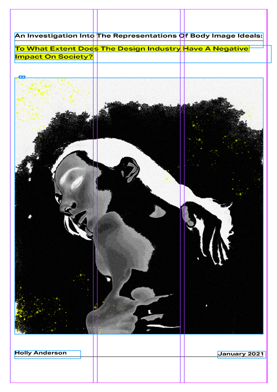
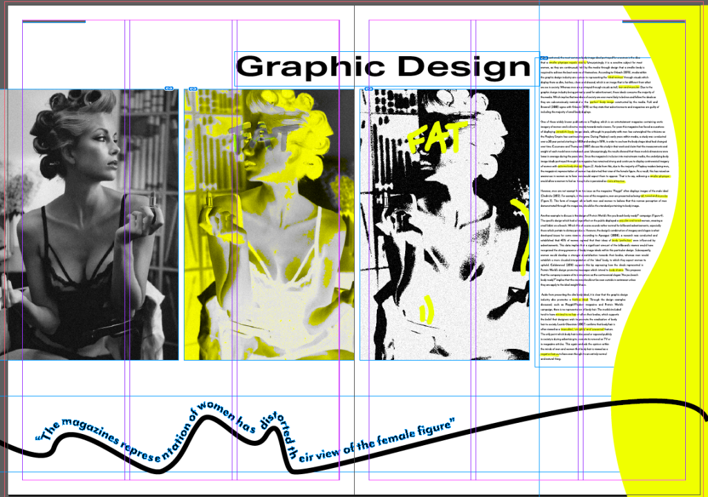
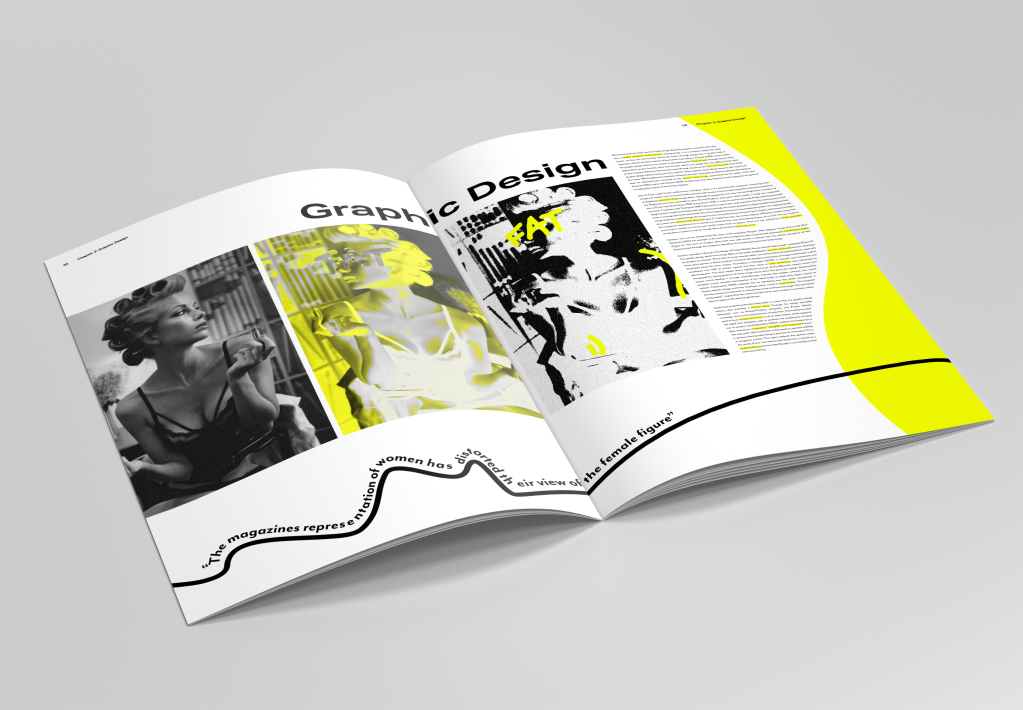
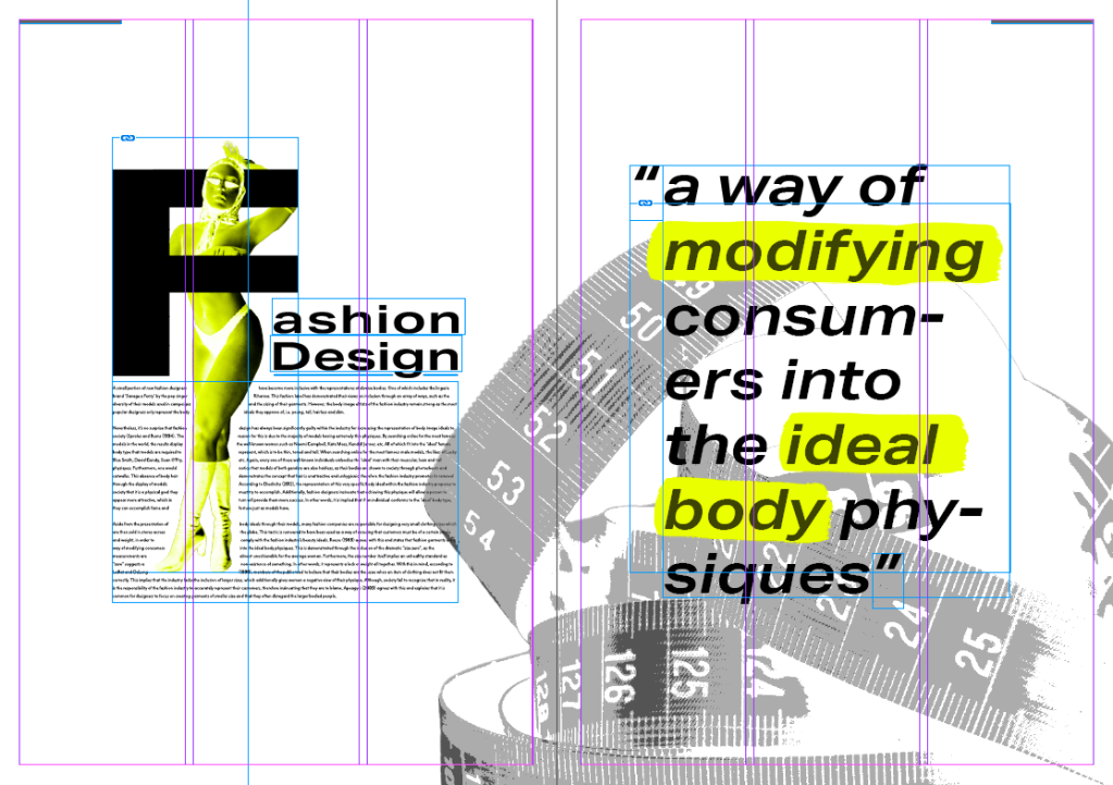
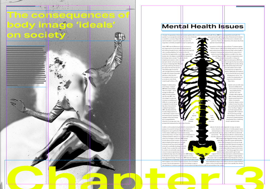
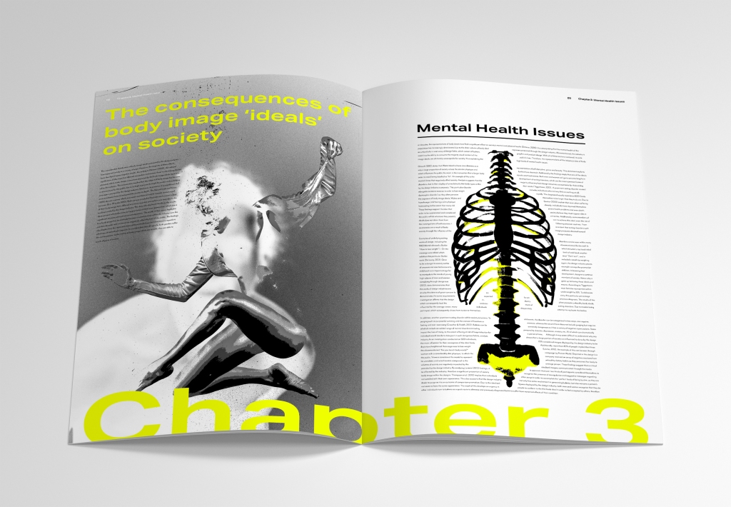
As you can see, for may editorial’s layout, I have tried to create a dynamic variety in the text’s structure and placement of imagery. Each spread follows the 3 column guidelines, however I have tried to ensure that each page is vastly different from each other. I did not wasn’t to repeat any particular style of layout in order to create a more interesting outcome. I believe I have achieved this as my designs are very experimental and demonstrate creative freedom.
Although I followed the 3 column guidelines, I still wanted to take risks within the design’s layout. I did this in order to demonstrate the key themes within my dissertation such as chaos, stress and manipulation.
The Visual Identity
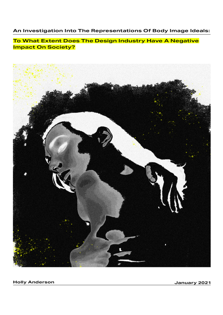
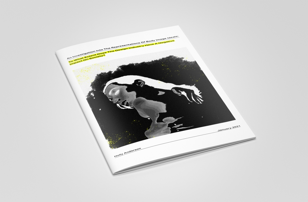
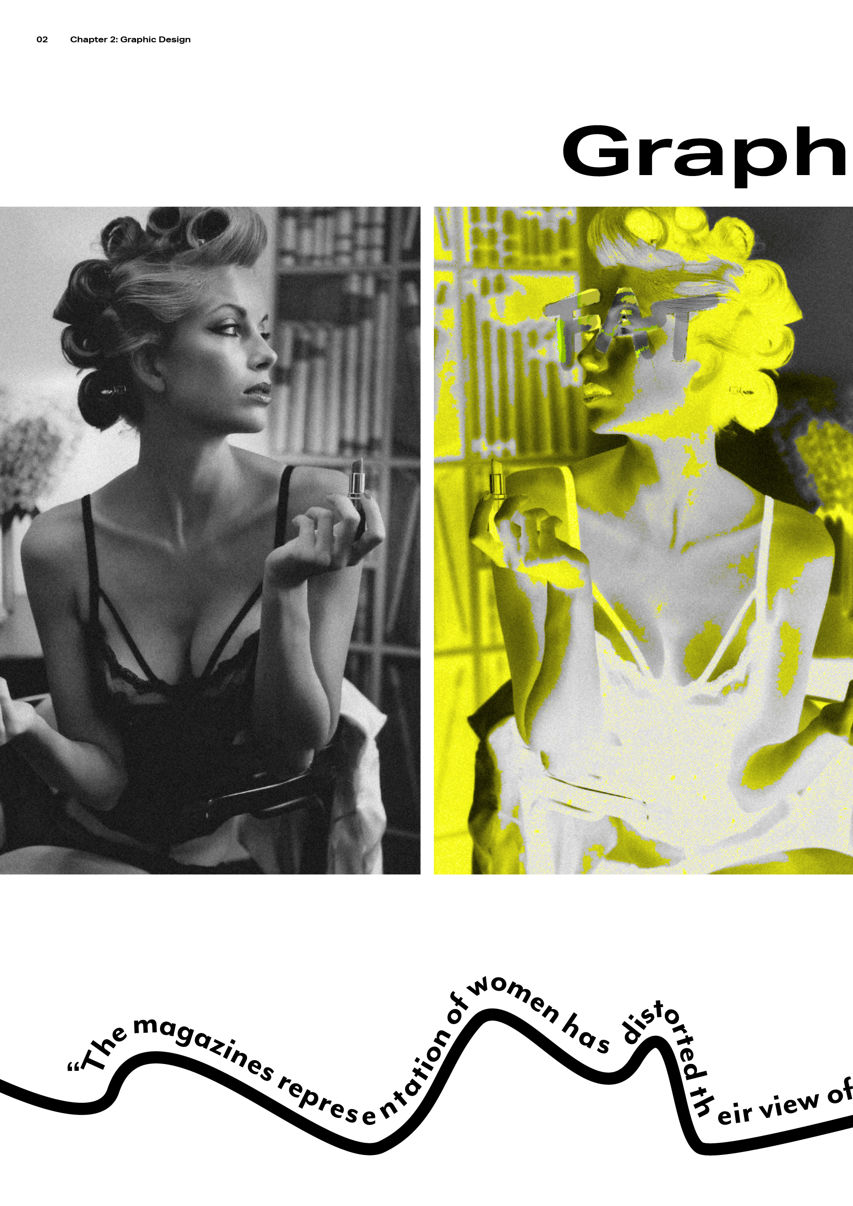
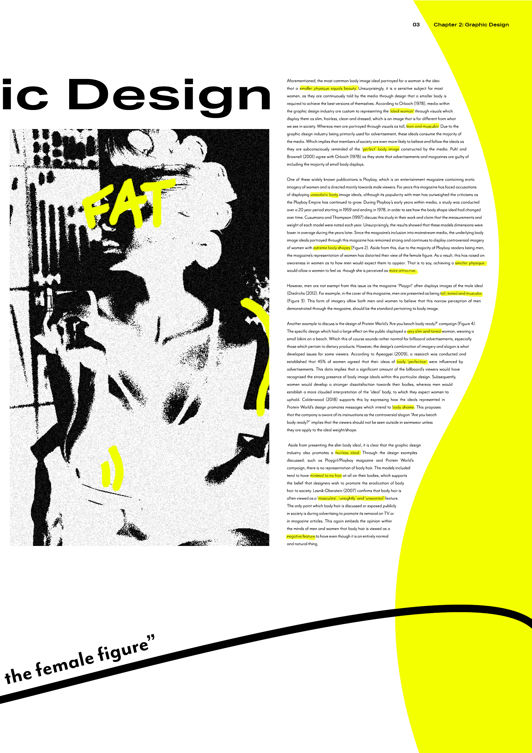
The visual identity of my editorial consisted of a variety of elements. For instance, in order to represent how the design industry draws attention to body image ideals, I incorporated ‘highlight’ effects to appear as though someone reading has highlighted words/images themselves. In addition, this allows the design to achieve a more personal feel, which I wanted to convey due to the fac that body image ideals has affected almost every individual in a personal way. To further push this idea, I also included hand-drawn text/visuals within many of the spreads. This effect also adds to the stress and pressure this issue causes on society, as many of the hand-drawn elements are messy and unstructured.
Other elements I included was curved imagery and shapes. The reader should notice that the body text is often manipulated to fit around curved imagery/shapes. Which is used as a nod to the design industry’s manipulation of society and how they view their bodies.
Finally, the primary imagery included are of slim bodied, hairless, barely clothed models. This design choice was made in order to replicate how the industry exploits the issue visually and often exacerbate it’s repercussions on society. Overall, my aim was not to covey a traditional, structured editorial, but it was to display the disorder and chaos the issue can cause.
Front Cover:
Spread 1:
For this spread, I wanted the visuals to convey how graphic design can manipulate a person’s perception of their body. As you can see, the imagery of the woman represents this as she is looking back at the distorted versions of herself. This spread also plays with shapes and the female form through the curves within the text and flowing line. This line also includes a pull out quote which discusses distortion. I placed this visual and quoted together as they both link through the subject of distortion (as the line distorts the shape of the text).
Spread 2:
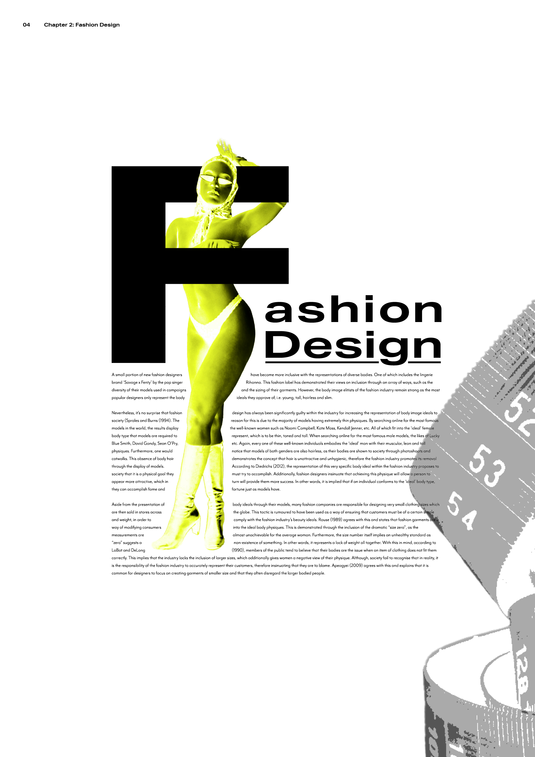
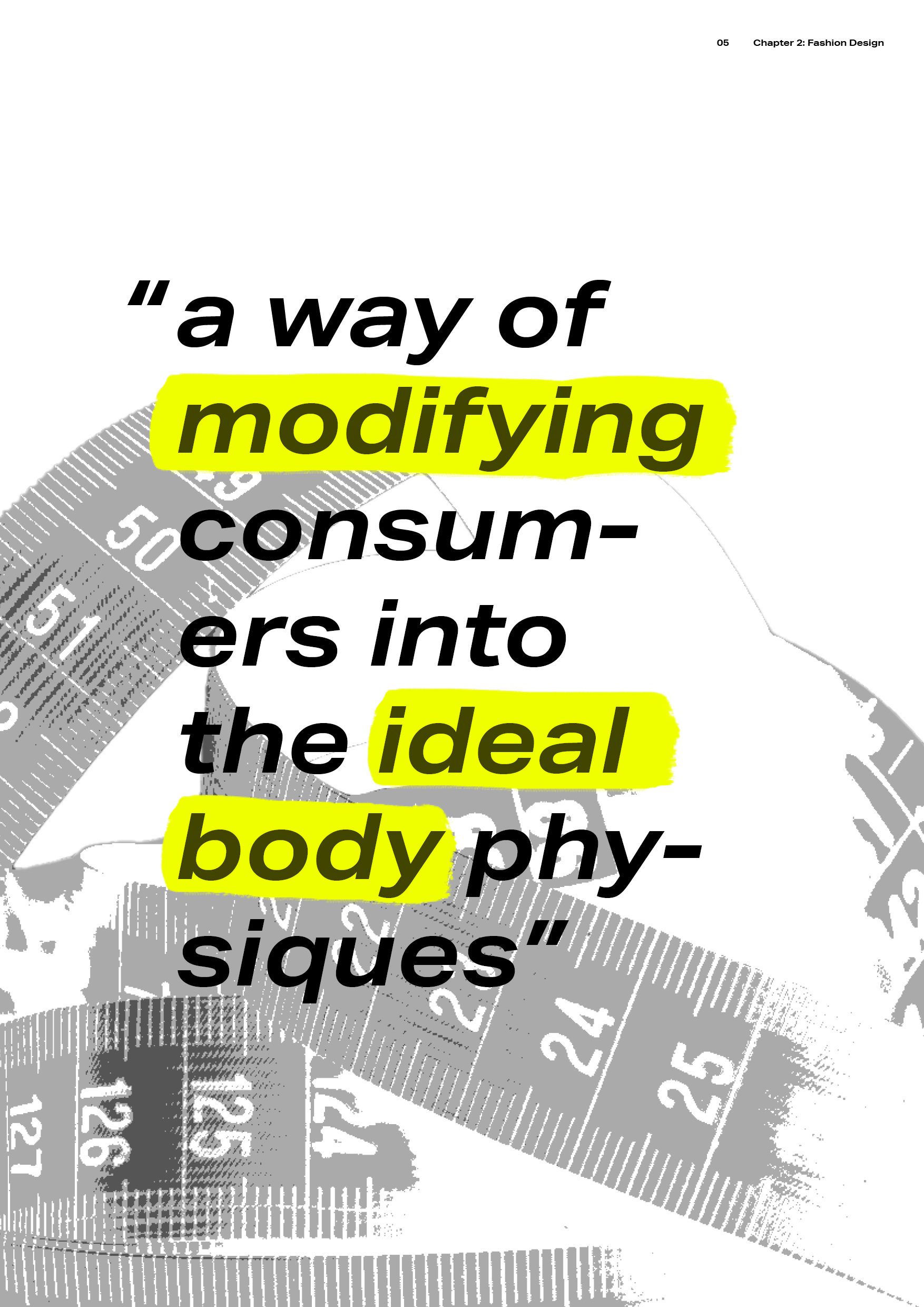
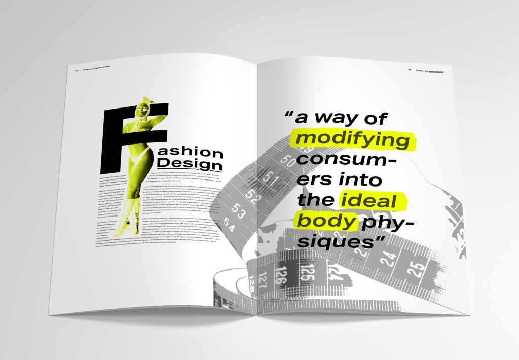
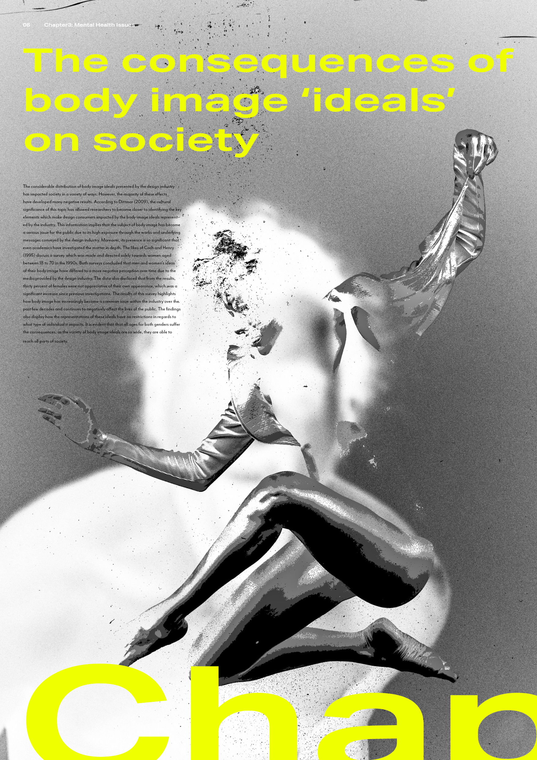
This spread demonstrates the relevance of body image ideals within fashion design as the unclothed model conveys how the industry exploits the insecurities of society. Additionally, the text follows the form of this models body, which insinuates that the fashion industry often manipulate the thoughts of others through their representations of the female body. Once again you will notice the inclusion of ‘highlight’ effects.
Spread 3:
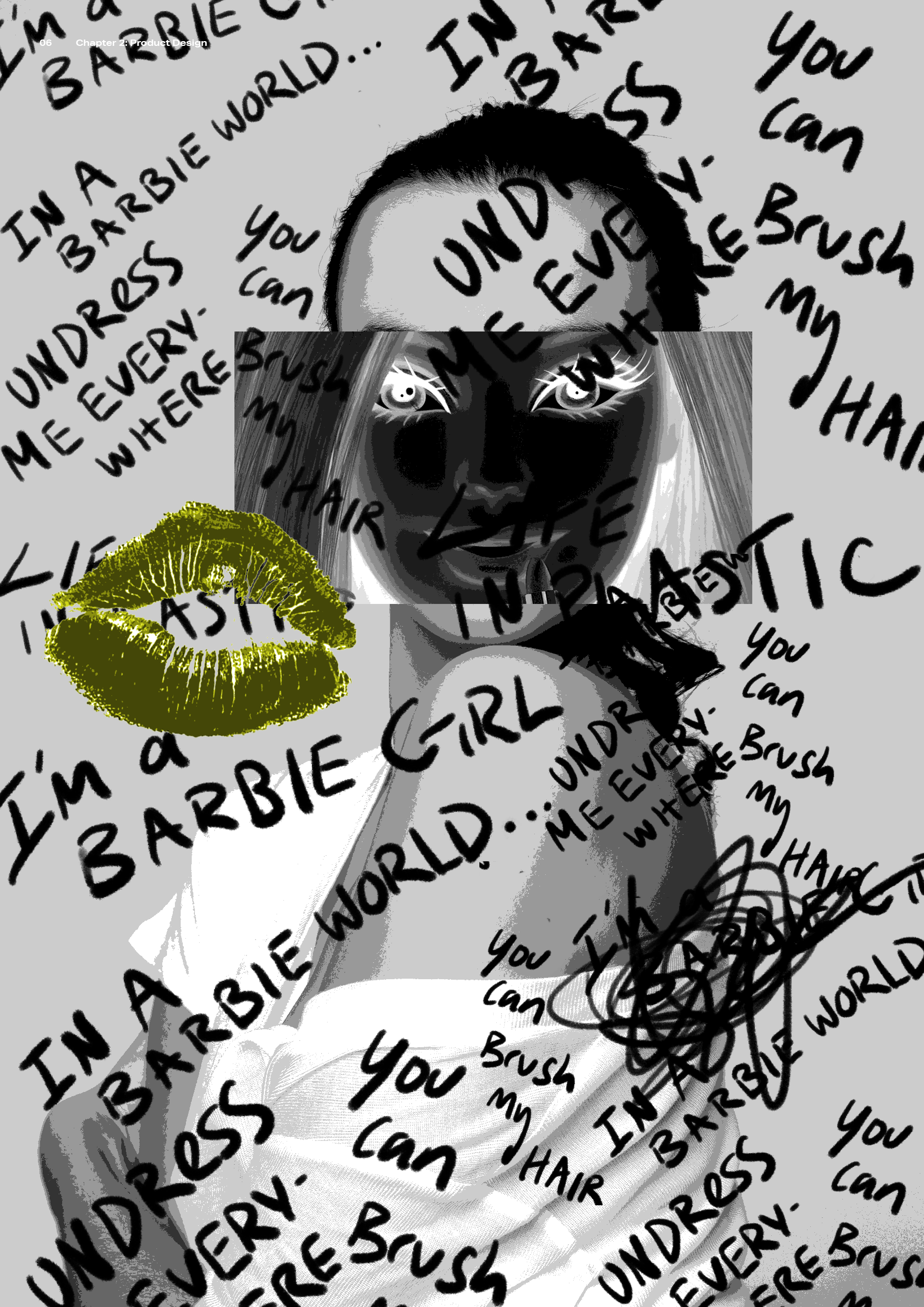
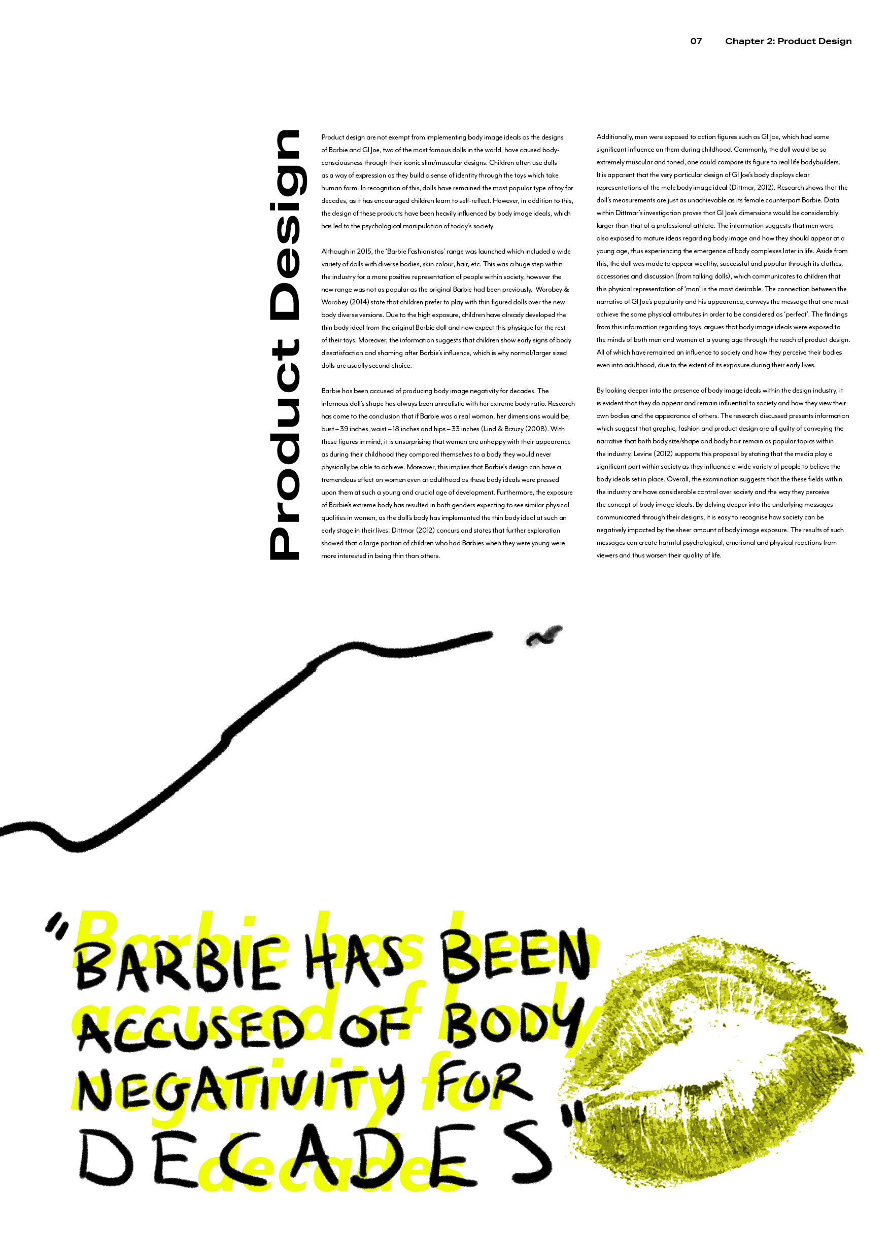
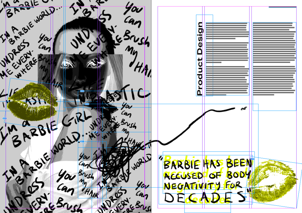
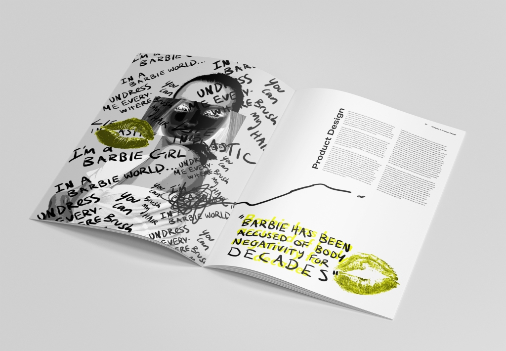
For this spread I focussed on how the product design industry convey body ideals through Barbie dolls. This page particularly displays stress as it demonstrates the pressure that Barbie’s appearance brings to young children. The text is placed in a box like shape as I wanted to not only represent Barbie’s product box, but also how society are forced to a hypothetical box of body image ideals.
Spread 4:
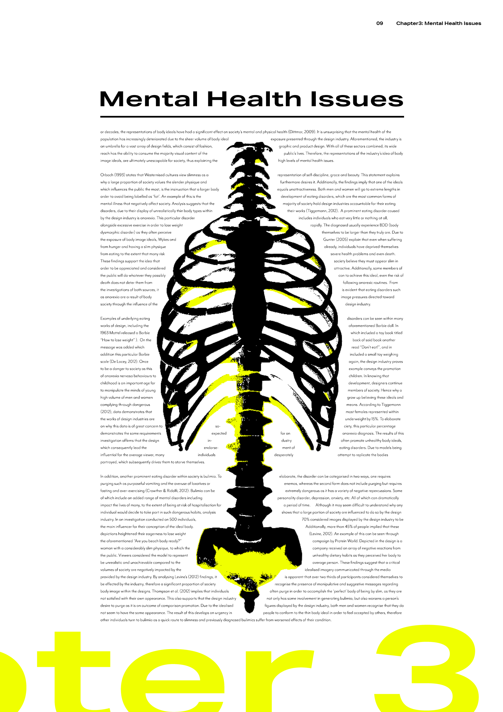
As previously mentioned within my blog, this spread was designed to demonstrate the subject of mental health. Sometimes a person’s thoughts about their body can consume them (just like drowning) – which is conveyed within this spread in an avant-garde way. In addition, I have included a skeletal visual as I wanted to represent the subject of anorexia within this piece. The text forms around this visual as I wanted to communicate how society often feel that they must conform to drastic/unrealistic body standards.
Spread 5:
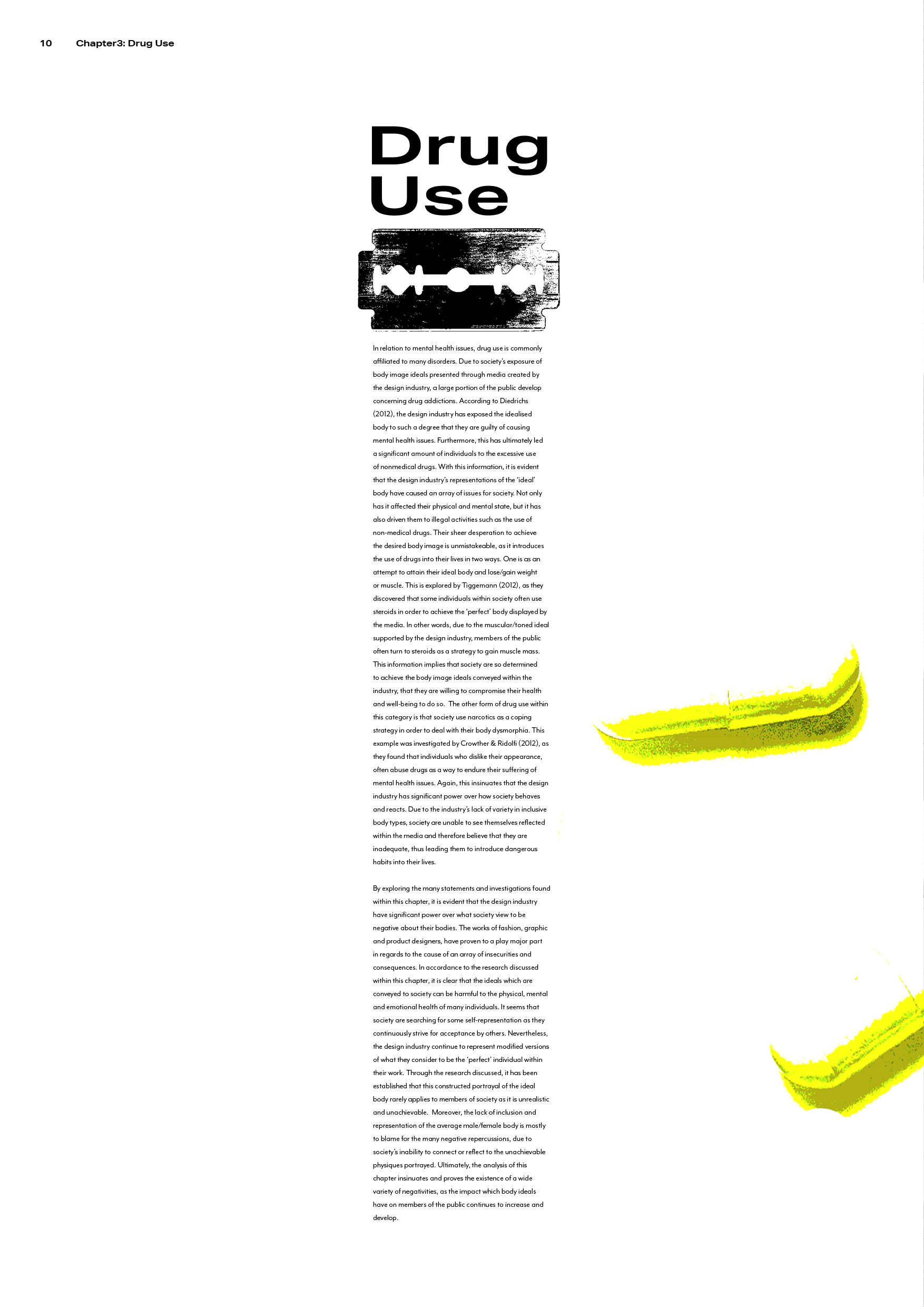
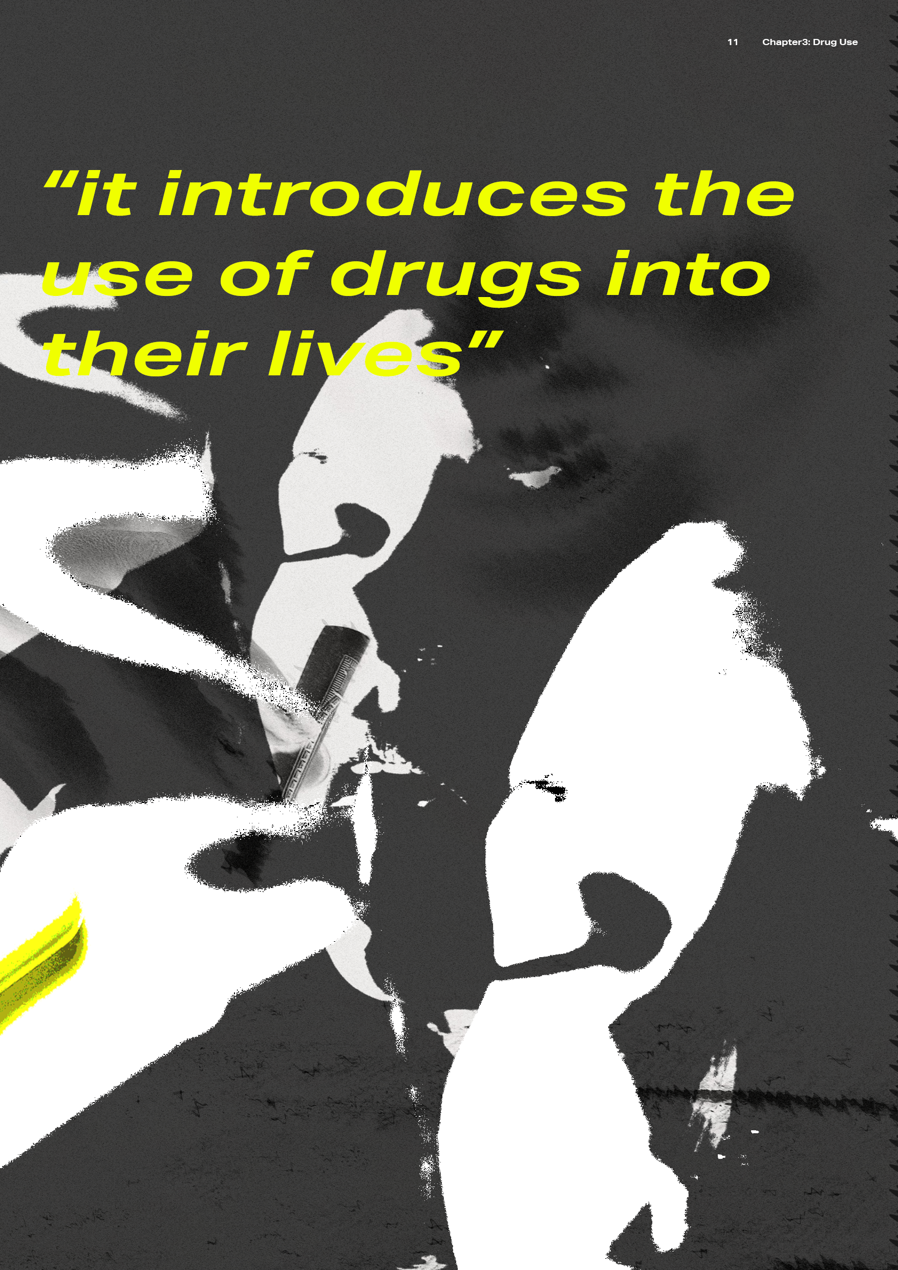
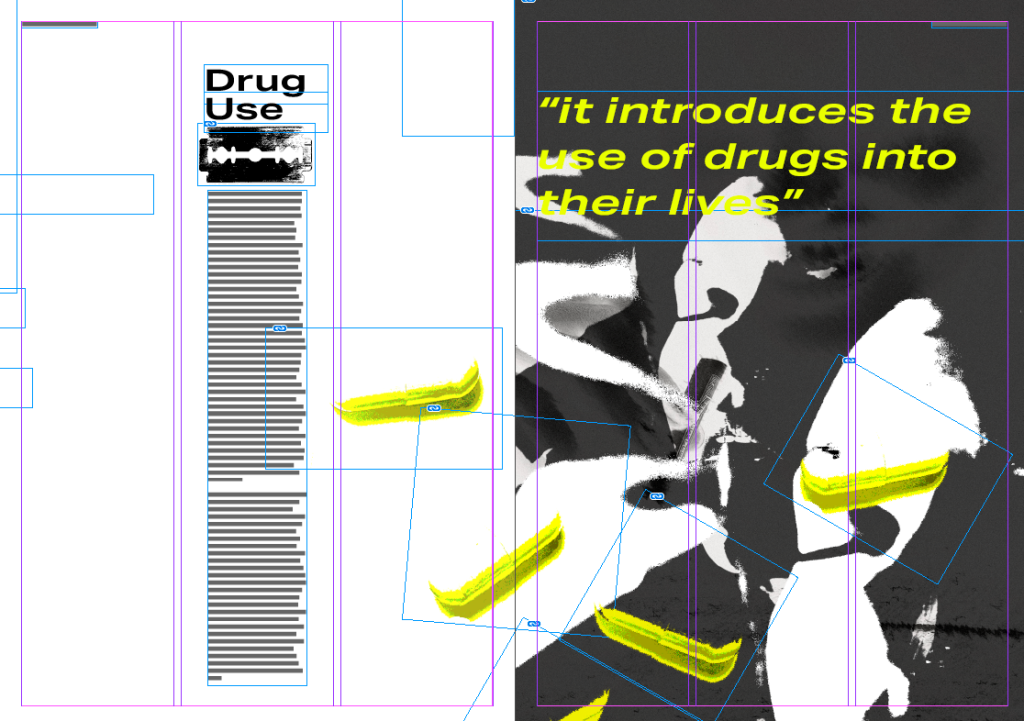
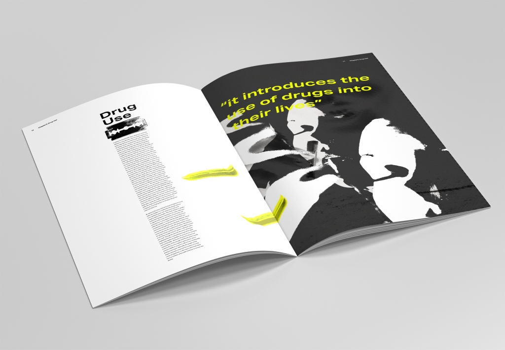
This spread discusses the topic of drug use, which meant that this subject became the inspiration for the visuals. Within this spread, you’ll notice that the text has been placed in a thin/long form followed by an image of a razor blaze. I did this in order to replicate a line of cocaine as I wanted to incorporate visual metaphor through the structure of the text.
Final thoughts
I have always been passionate about editorial design as I have felt more comfortable with the creative freedom – which in turn has allowed me to be more experimental during this project. I really enjoyed creating the imagery as I was able to test my design abilities in photo editing. Although I was excited for this project, I also found it quite daunting. I have always struggled with typography, so I found this brief quite intimidating. However, I was able to overcome this with my open-mindedness to experimenting with layout and form. Throughout the process, I ensured that I apply the feedback given by my peers/lecturers, along with the inspiration I had found within my research.
Since designing an editorial during first year, I believe I have come a long way in my design abilities. My personal style has been able to shine through in this project and it is one of my favourite outcomes of the year. In future I hope to continue to work on my typography for editorial designs and achieve an even better understanding of new and unique editorial styles.
