Spread 1
Although David was happy with my first spread’s imagery (which I had presented to him in a tutorial), I didn’t feel like it quite matched the distorted appearance I was looking for. It was important that I achieve this effect within all of my imagery in order to achieve a cohesive result within the entire editorial. Using similar techniques and effects I had applied within the design of my front cover, I experimented with how I could manipulate the original image to match. I did however keep some visual elements within this image, such as the hand drawn words/lines scrawled on top. Overall, I believe I was able to achieve an array of effective visuals which connected well with each other and the spread’s textual content. The spread’s heading was ‘graphic design’, therefore I wanted to use an image which best represented what type of visual would be used in a magazine i.e. Vouge, Cover, etc.

Spread 2:
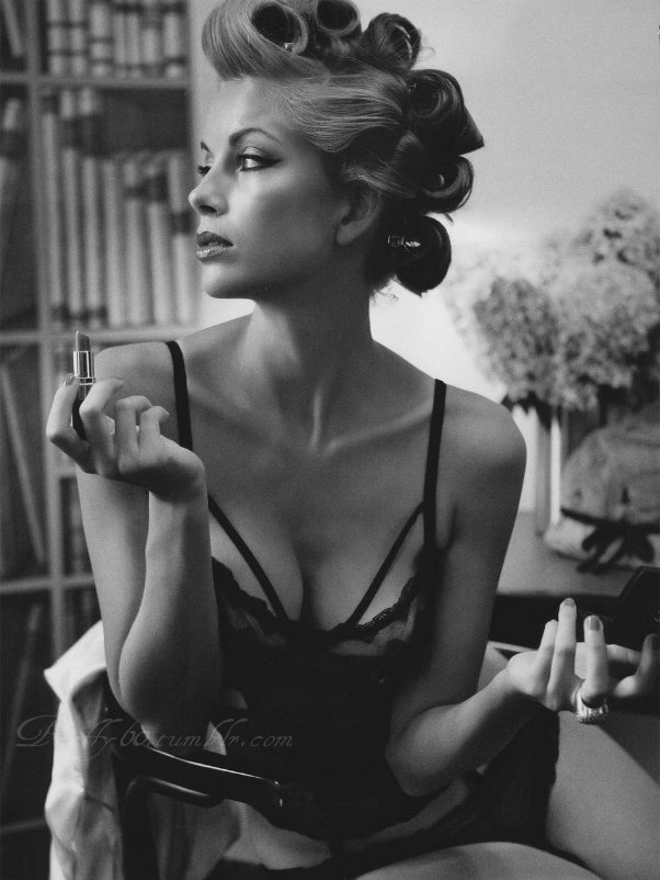
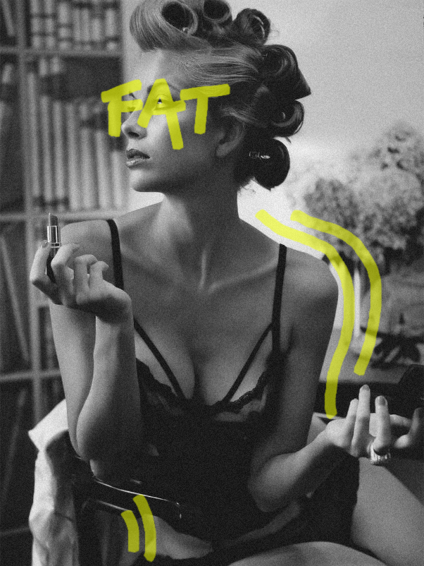
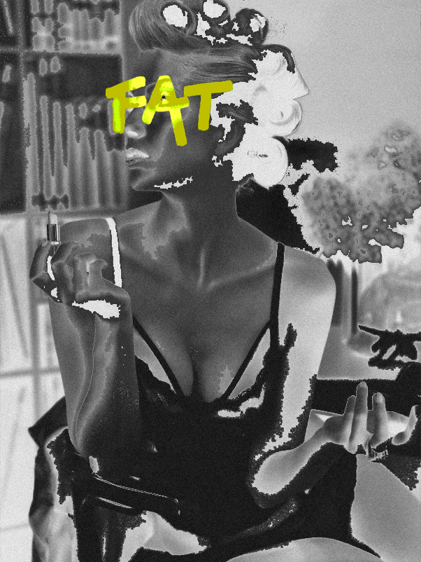
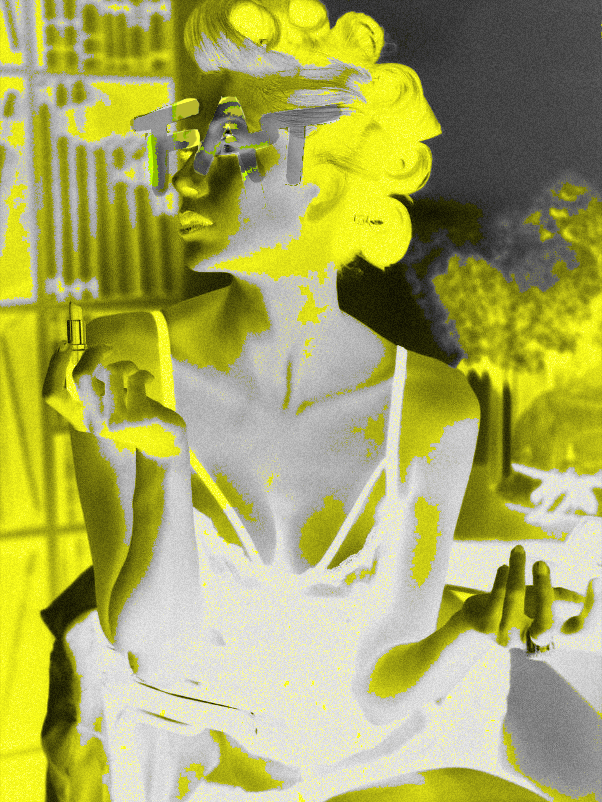
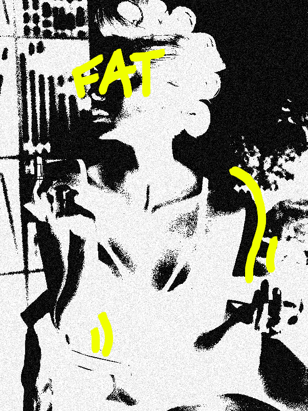
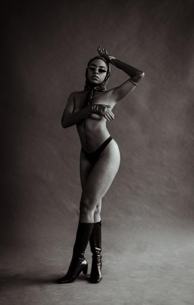
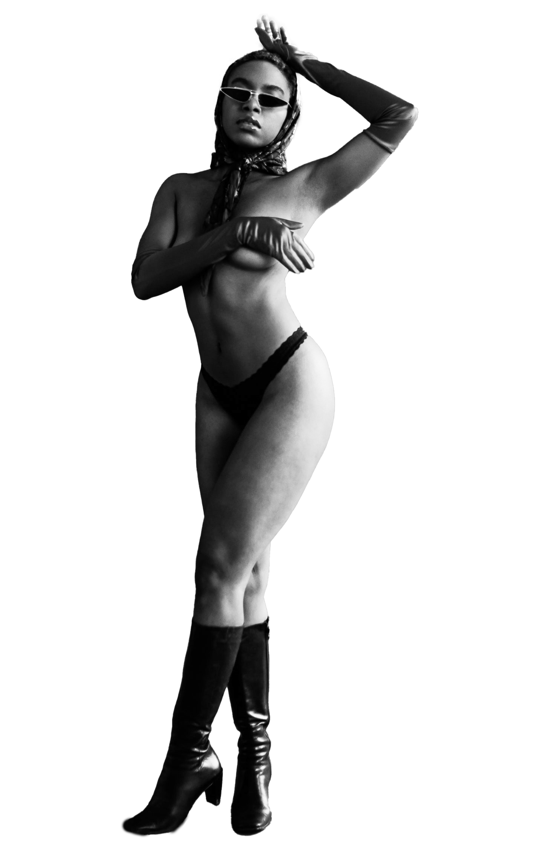
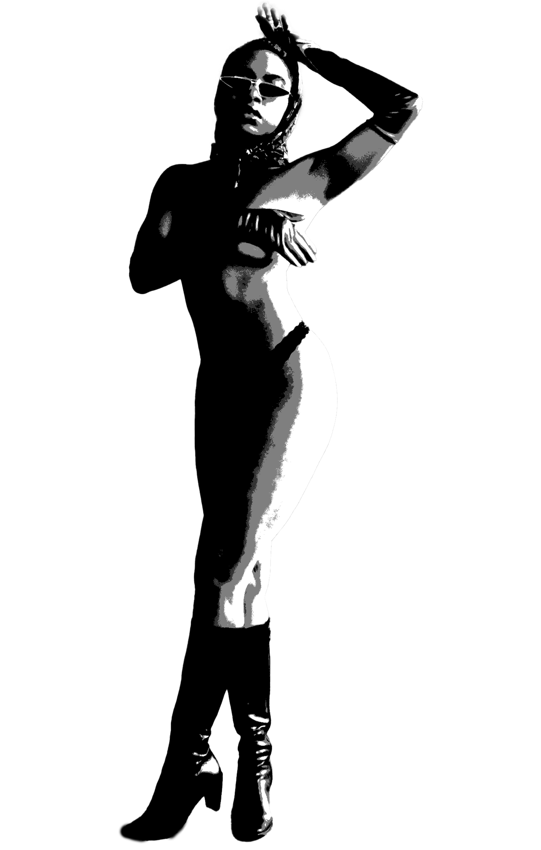
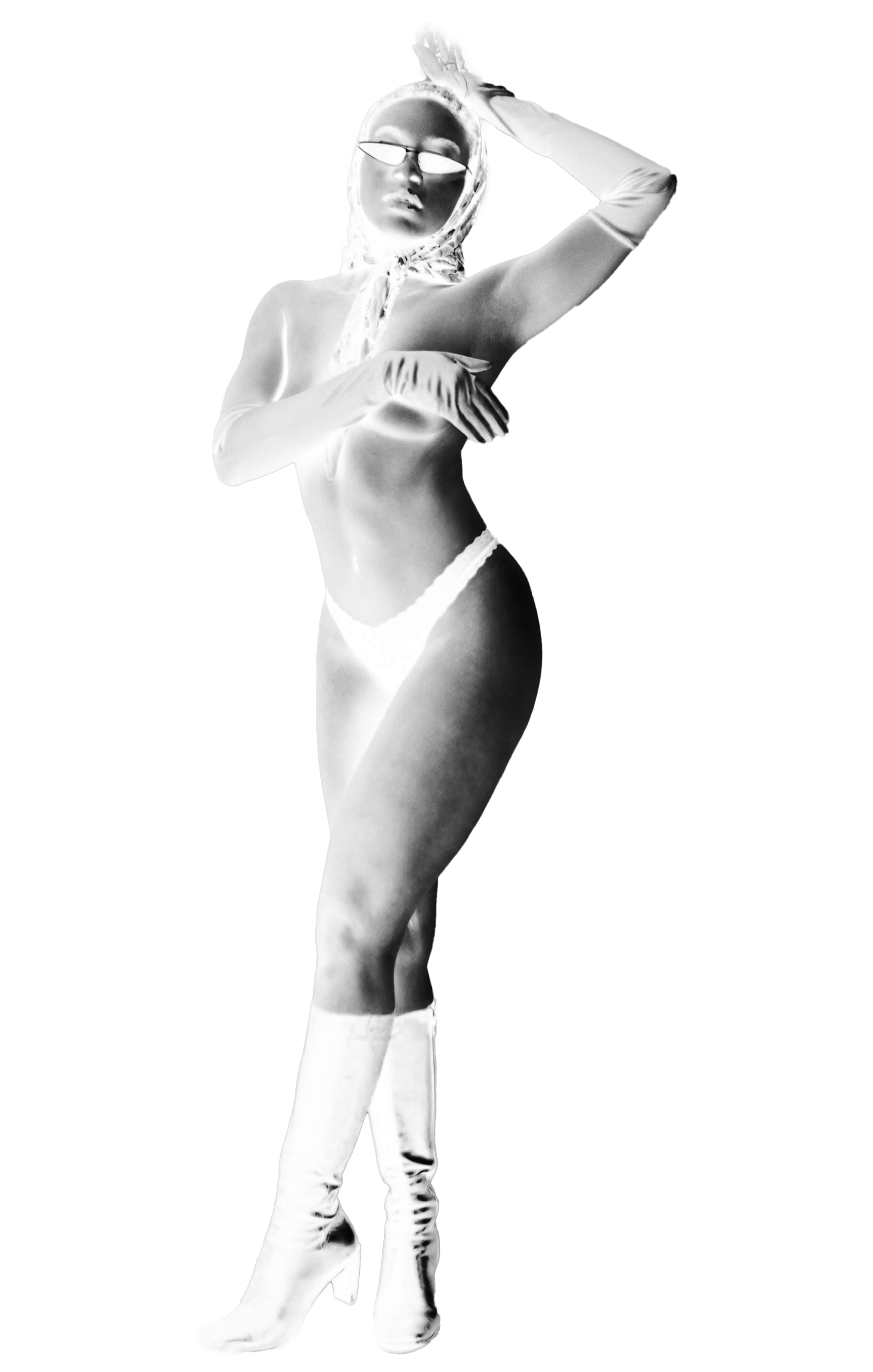
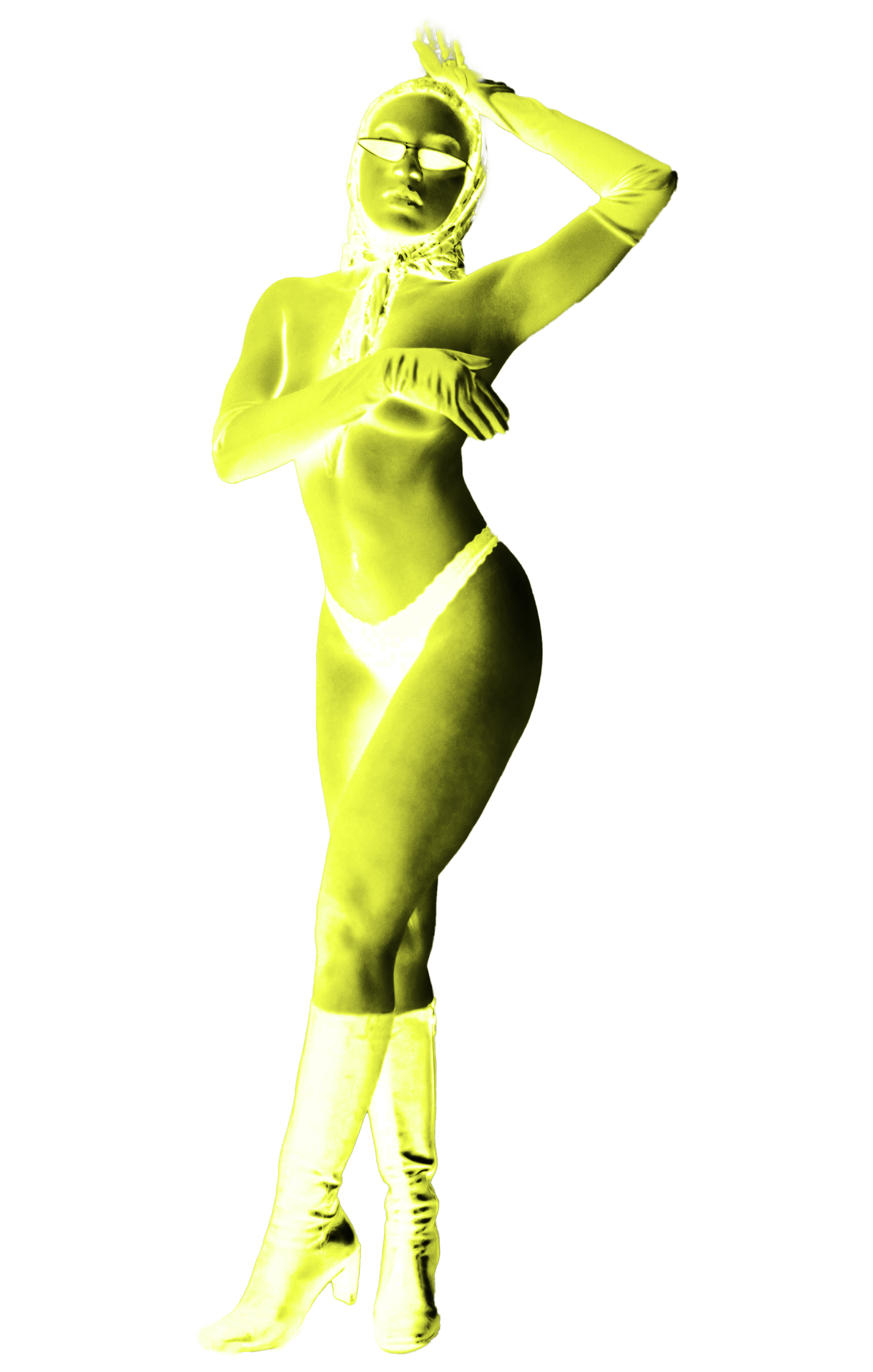
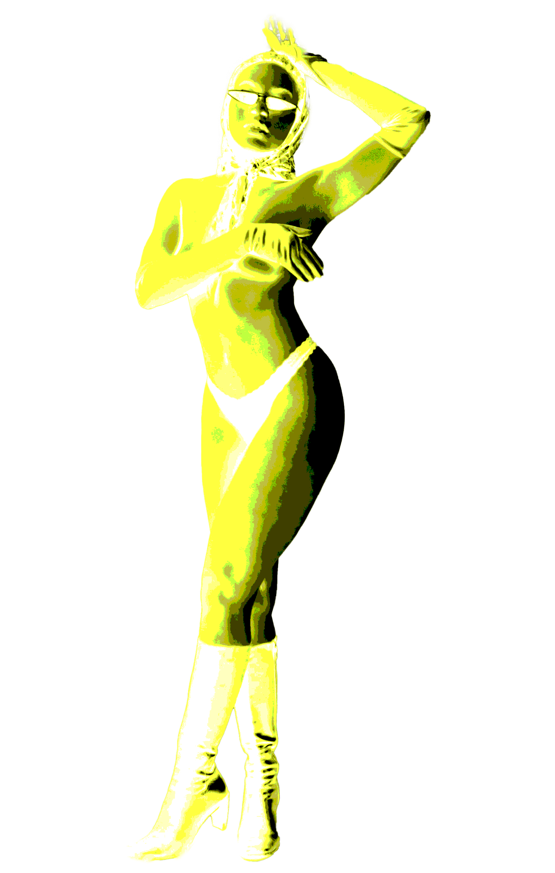
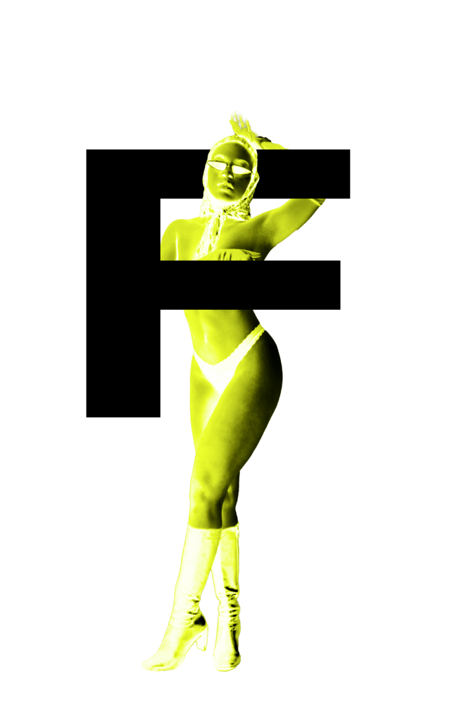
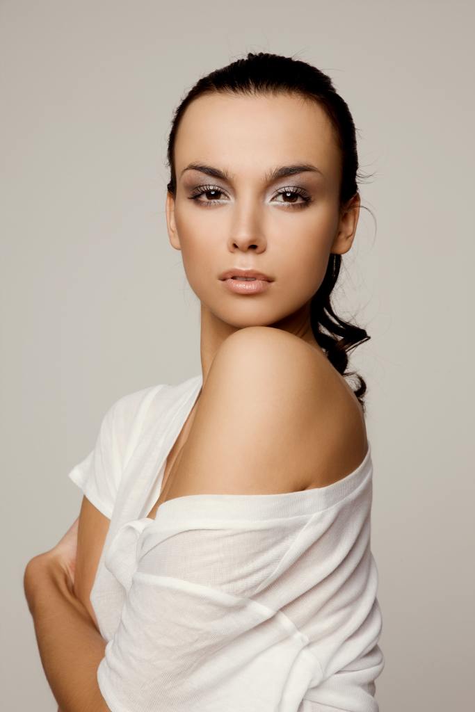
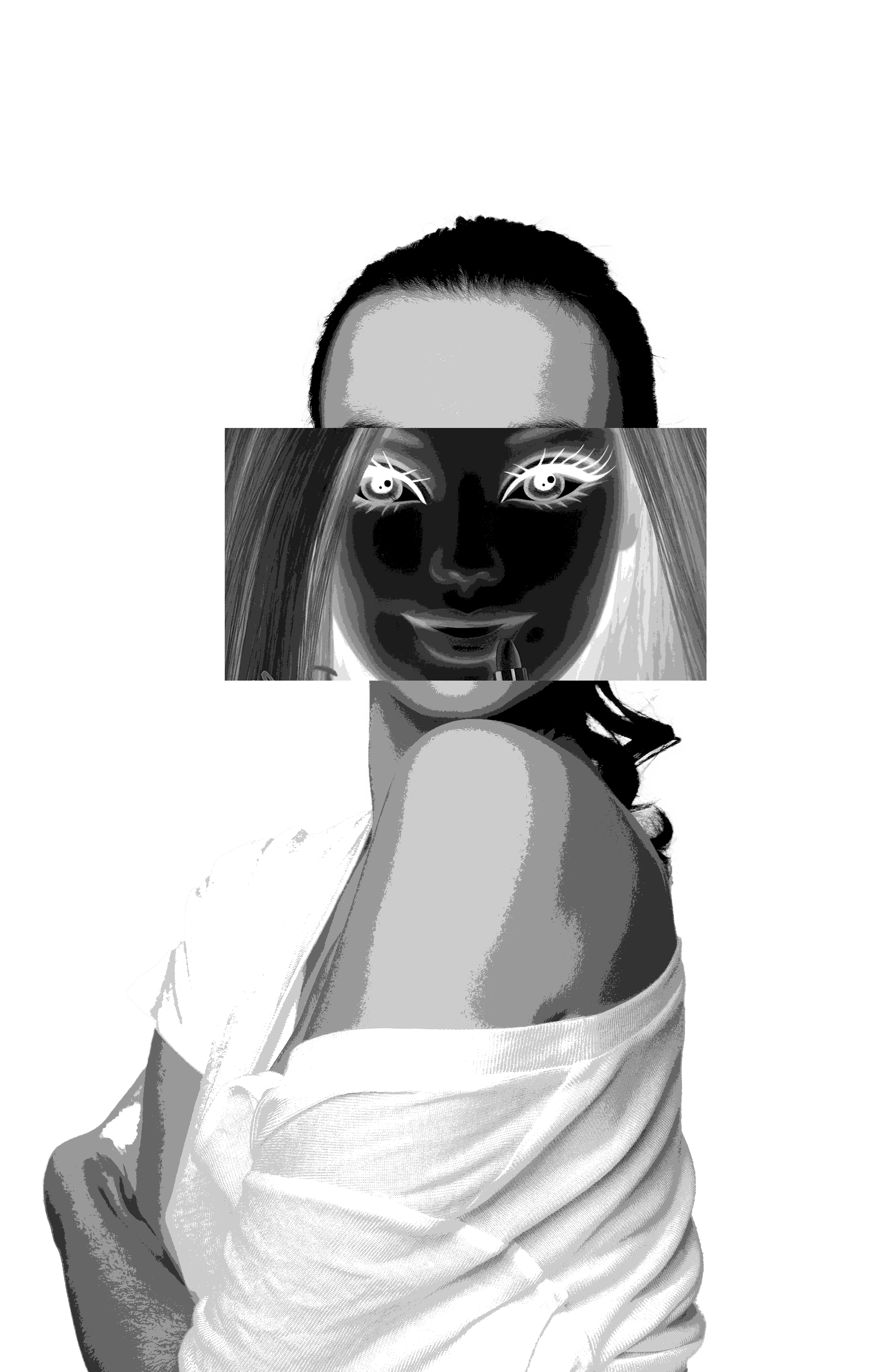
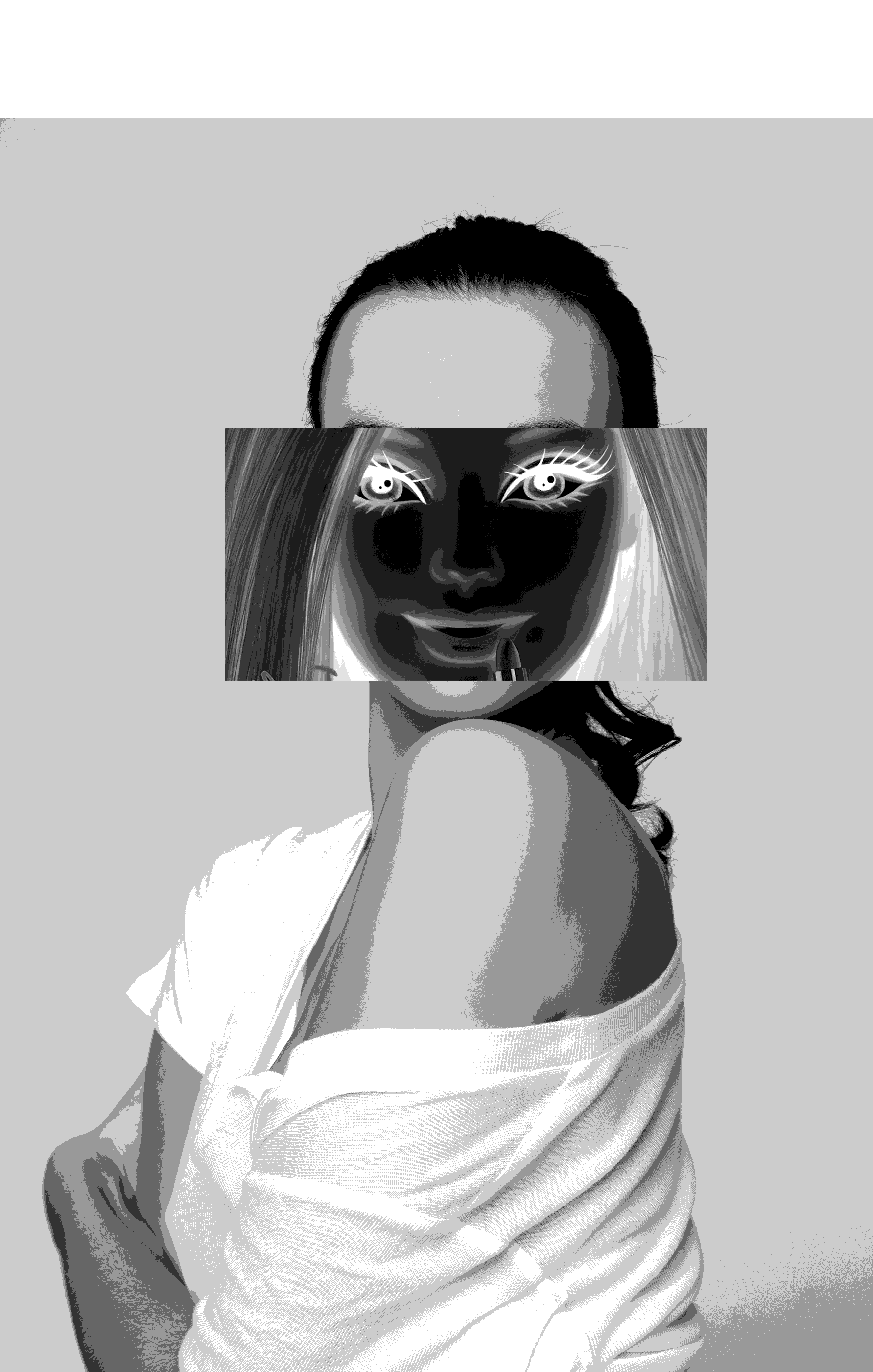
The heading of my second spread was ‘Fashion design’, therefore I wanted to include an image which best represented that category. I ended up selecting an image of a woman barely clothed and posing as if she was in a fashion shoot. I felt that this image really demonstrated how the fashion design industry often exploit body image ideals within their models – which connected well with the spread’s textual content. Once again, I used Photoshop to heavily edit the image to create a distorted appearance. By looking at the image, I noticed how the model was posing to show off her body’s curves. I wanted this to be a highlighted feature within this spread, therefore I used her body’s form to wrap around the starting letter of the spread’s text. The outcome was extremely effective and demonstrates how people’s bodies are often manipulated to follow certain standards of ‘attractive’ shapes.
Extra Images used:
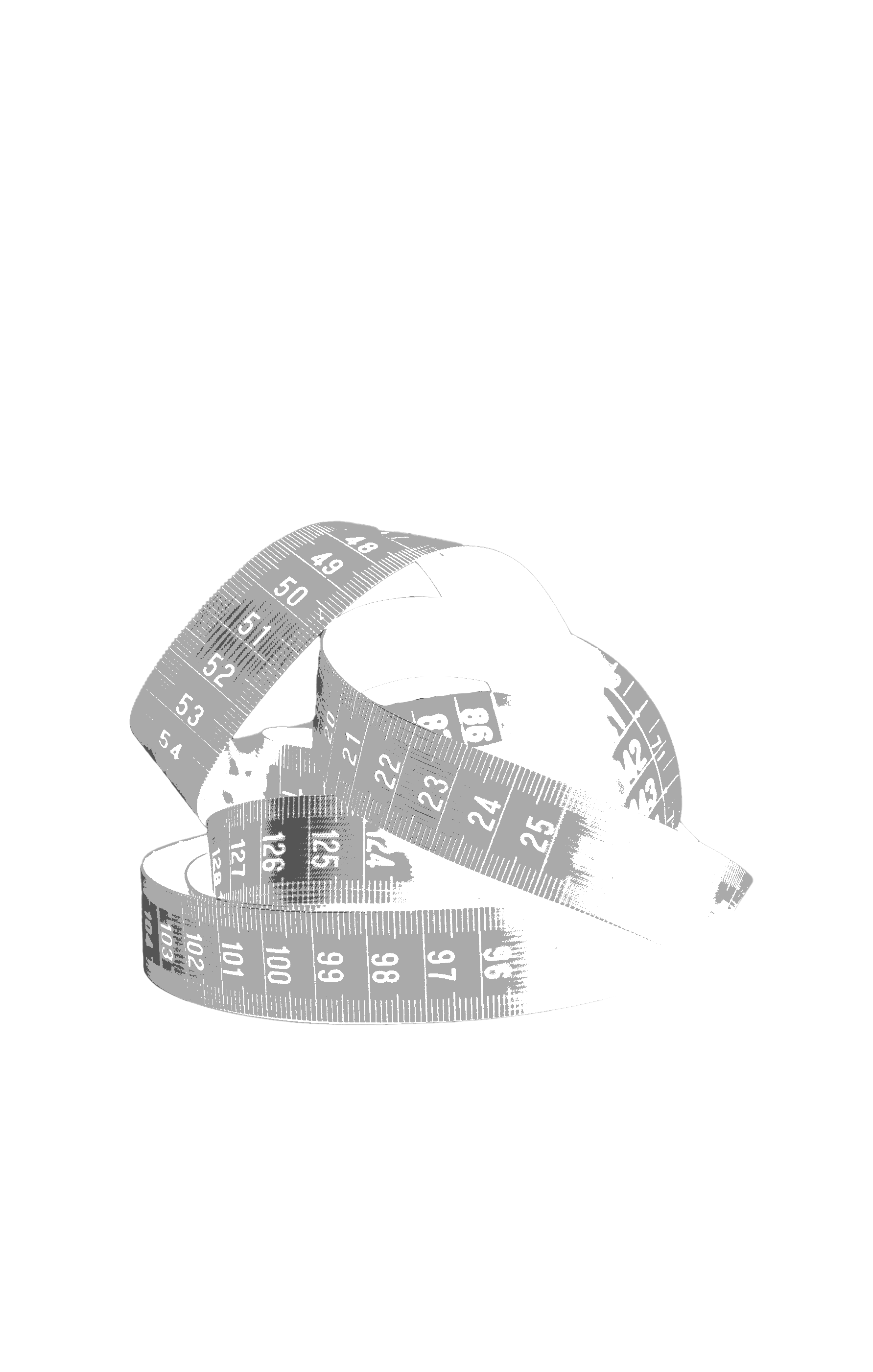
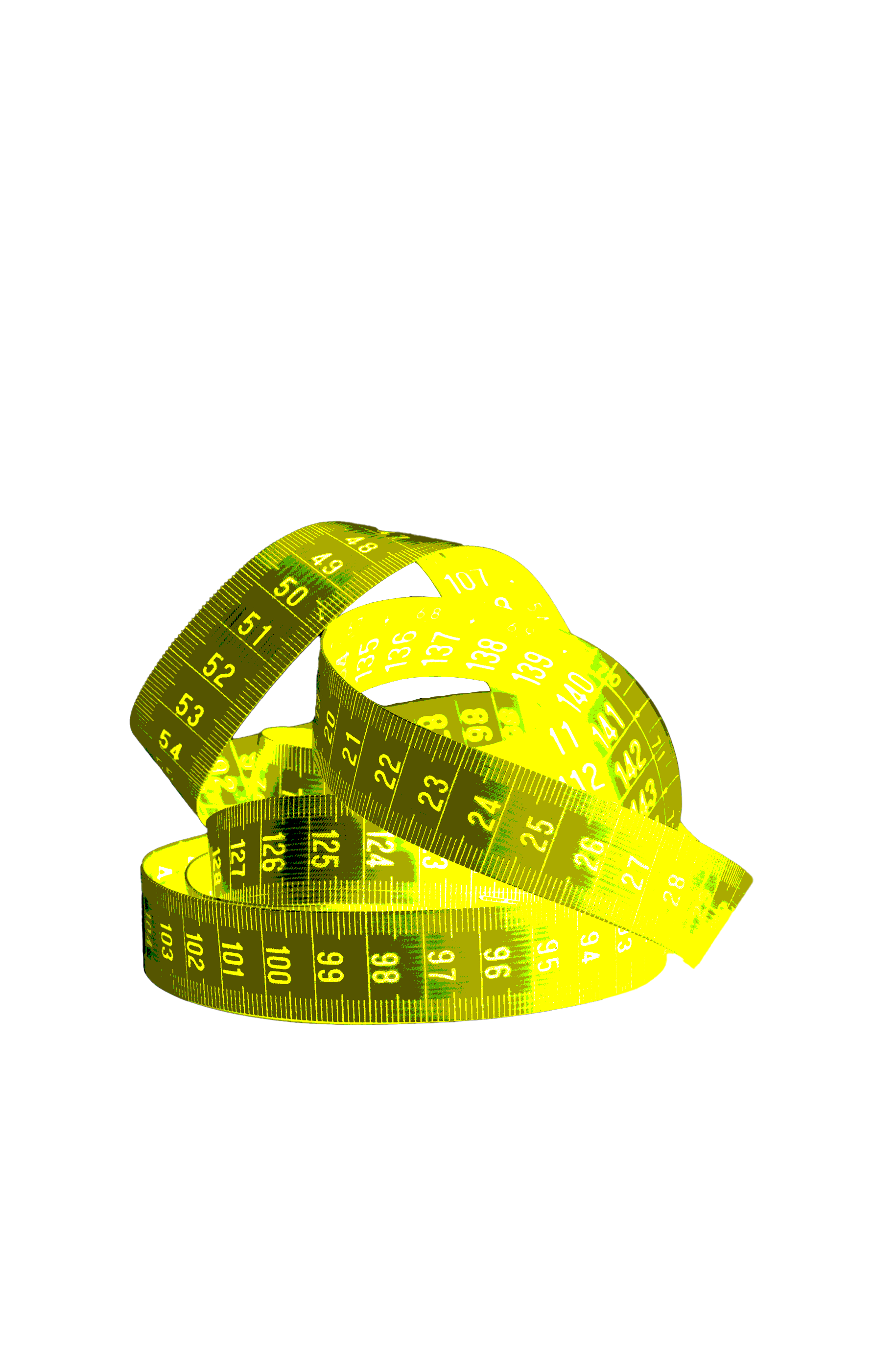
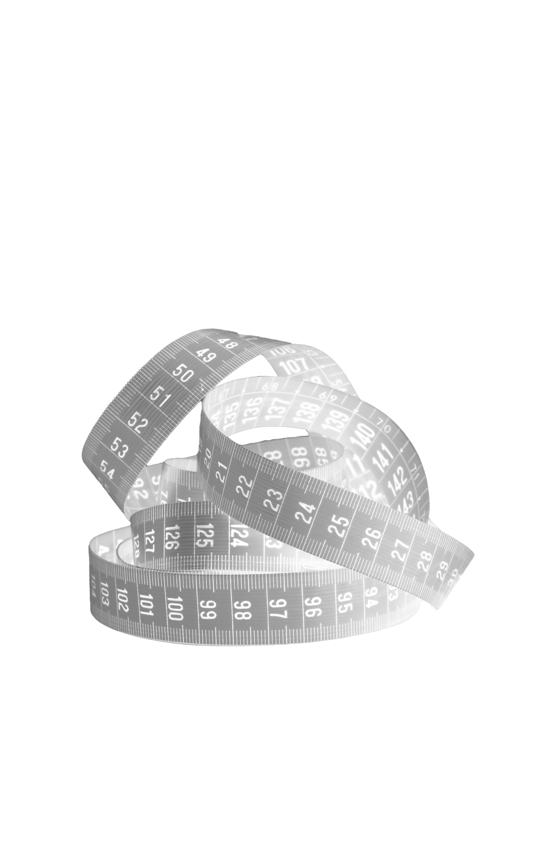
Additionally, I wanted to push the issue of body weight within the fashion industry. So I used a measuring tape, which is often used as a tool within fashion for measuring garments but on the other hand, it can also be used to measure the body – thus giving it a double meaning. I then edited its appearance within Photoshop by using the same editing tools and achieved a matching appearance.
Spread 3:
This spread’s heading was ‘product design’ and within the text’s contents, I discuss how Barbie dolls play a part in creating body image ideals for women and children. With this in mind, I wanted the main focus of this spreads to be Barbie, I thought about how girls are brought up comparing themselves to Barbie and tried to represent this within the imagery. By taking a seemingly normal image of a woman, I attempted to combine her physique with Barbie’s face. I made sure to edit both images differently in order to create a stark difference between the two and convey how Barbie is an unrealistic standard of beauty within women. I felt that this image’s outcome was very successful as it allows viewers to understand the spread’s context before reading this section of the editorial.
Extra Imagery used:
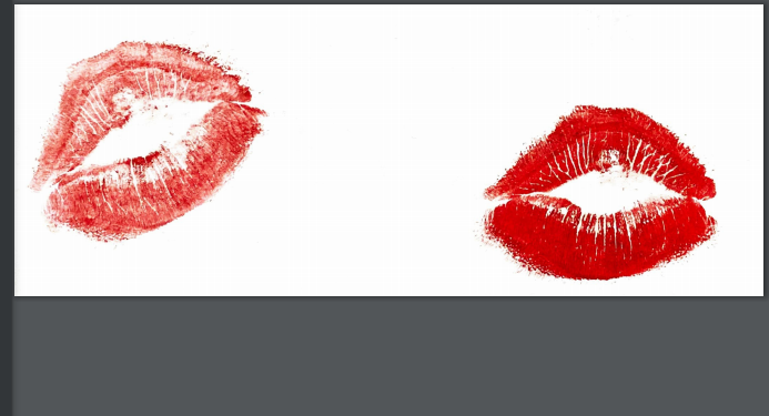
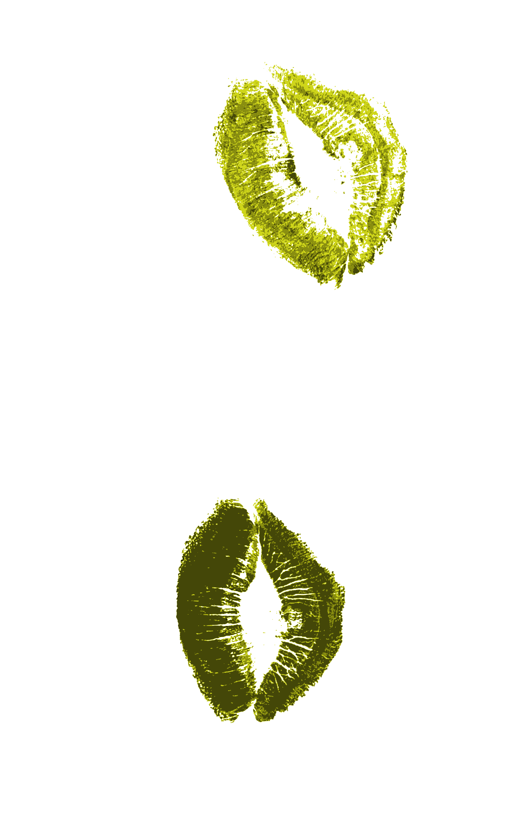
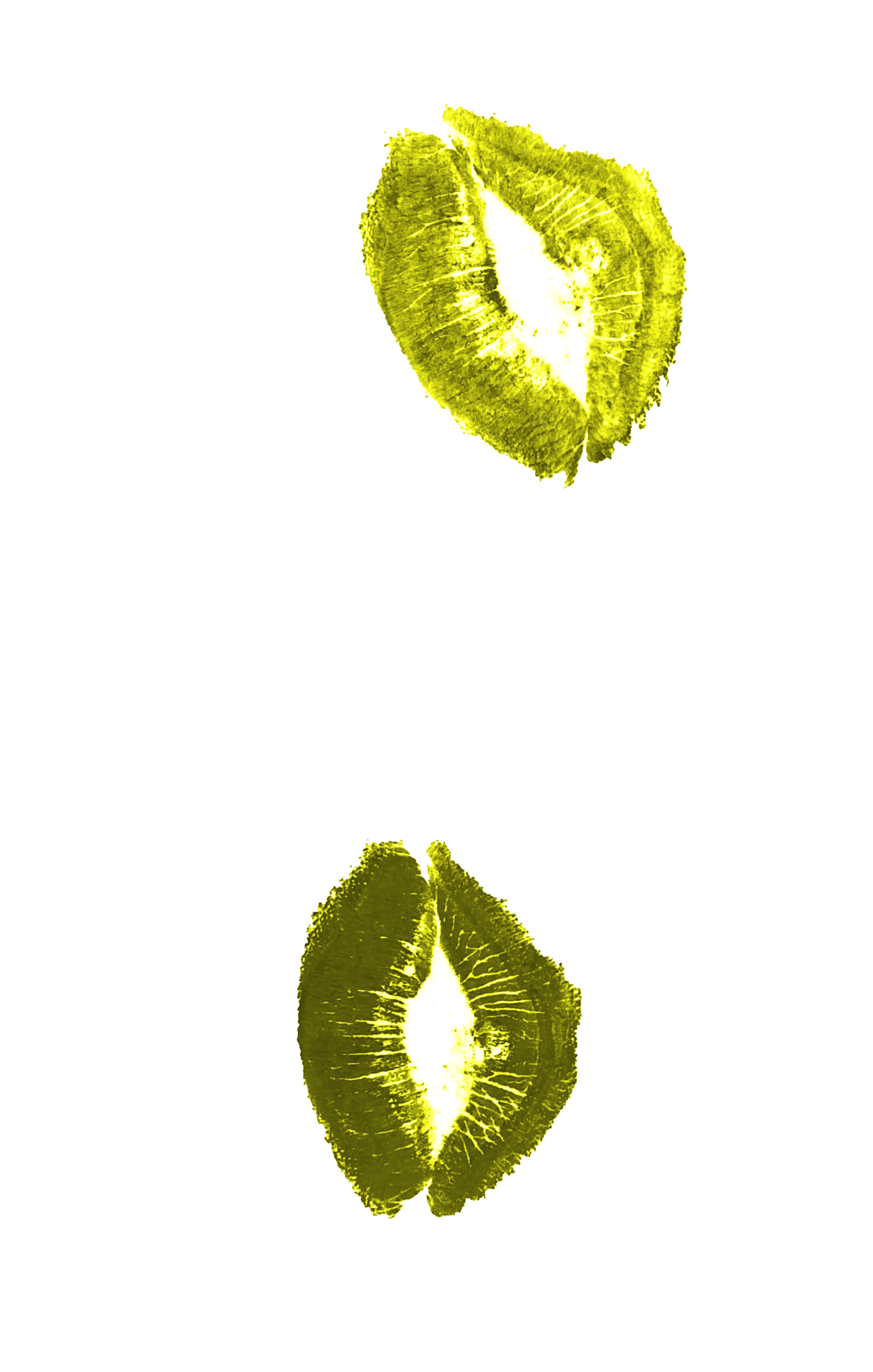
In order to add a personal element into the design, I created some hand drawn visuals of the lyrics from the ‘Barbie song’ and of a pull out quote I had selected from the page’s text. I felt that these images would add a sense of chaos into the design – which represents society’s decreasing mental state and panic over their bodies. In addition, I used my own ‘kiss marks’ by kissing a piece of paper and scanning the results into my computer. I was then able to edit these on Photoshop to adjust the to the design’s colour palette/theme. Doing this was very spontaneous (which I really enjoyed), and added another personal element into the spread – allowing it to appear handmade and helped emphasising the subject of cosmetics and physical appearance.


Spread 4
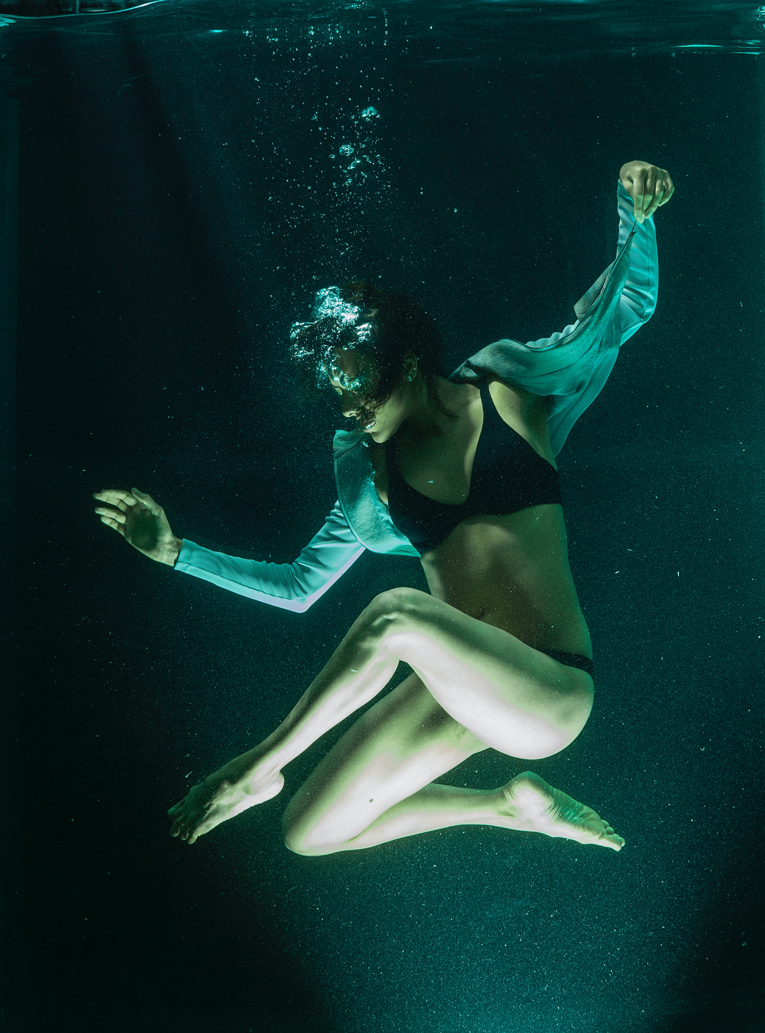
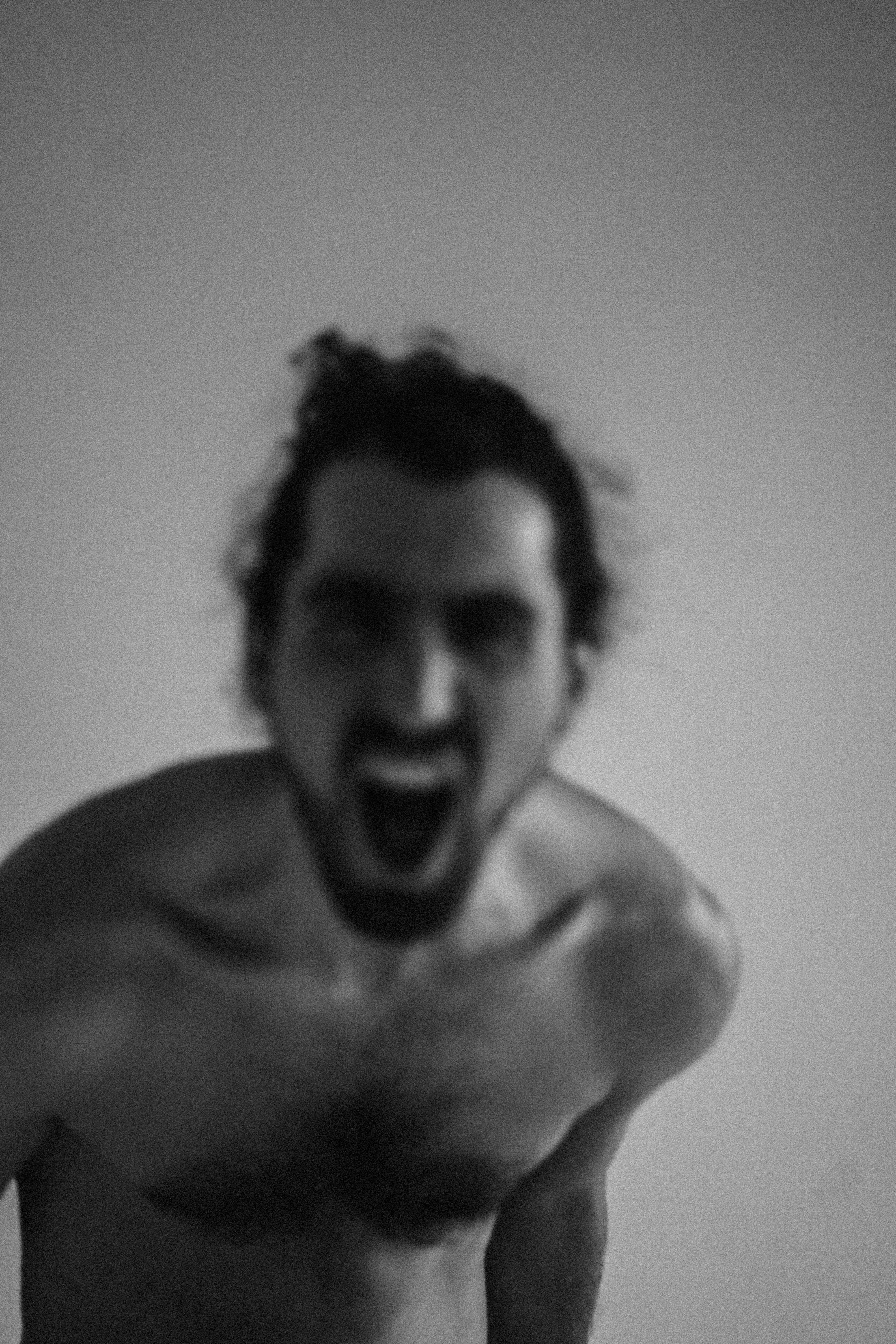
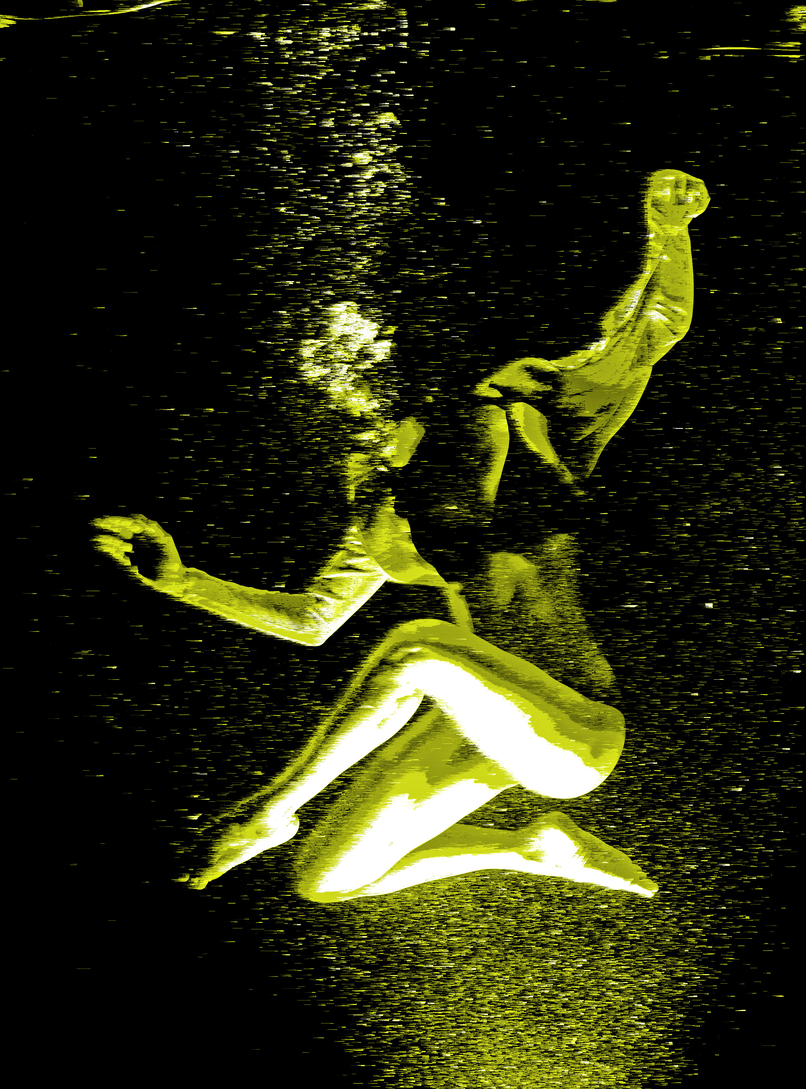
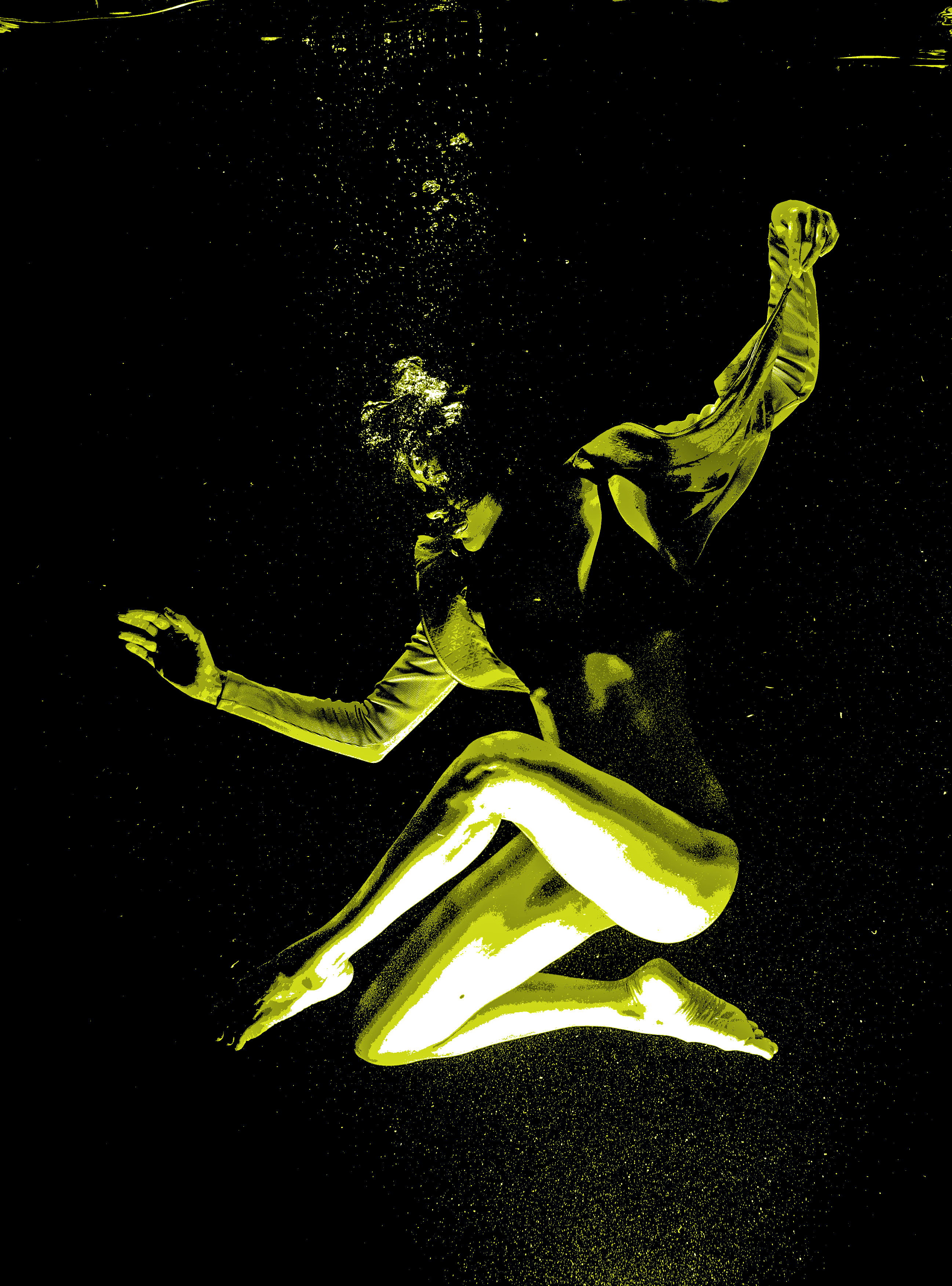
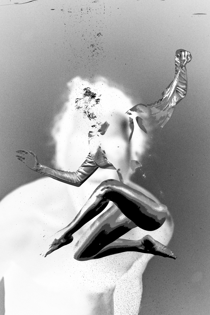
As this spread discusses and focusses on mental health, I knew that these were themes I needed to represent within my imagery. I personally struggle with mental health, so I took a moment to think about how it feels and how I may visualise it within my work. I come to the conclusion that sometimes, poor mental health can make you feel like your drowning in thoughts. I believed that this idea of drowning could be an interesting visual to convey this issue within the spread, therefore I retrieved an image of a woman underwater. I liked this image as the model didn’t appear to be struggling, she was actually posing in the water. This again relates to the idea that society will often do anything to conform to body image ideals, even if they may be dangerous. In addition to this image, I found a picture of a man screaming. I wanted to use this image as the background as it will help convey the stress this issue may cause to society.
Again, for both images I used the same methods of editing to achieve a matching appearance to the other visuals within the editorial. I experimented a lot with these images as I wanted it to appear more avant-garde. I did this in order create a more interesting visual which readers can interoperate its meaning for themselves.

Extra imagery used:
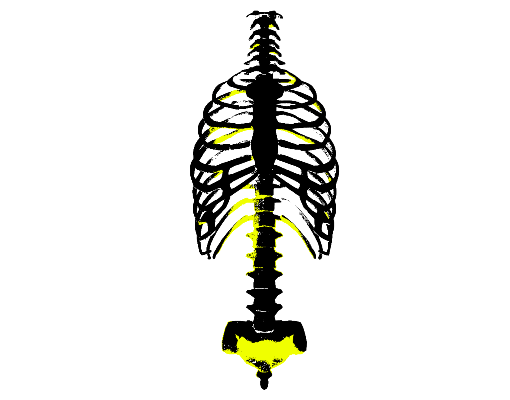
This spread also discusses issues such as eating disorders, therefore I believed it was important that I include a representation of that within the spread’s design. To do so, I took an image of human ribs/spine to convey the subject of anorexia. Anorexic people are often seen to be ‘boney’ and the result of this condition can often lead to death. With this in mind I felt that the inclusion of this visual was extremely relevant. Again, the original image was then edited to achieve the harshly edited visual you see below.
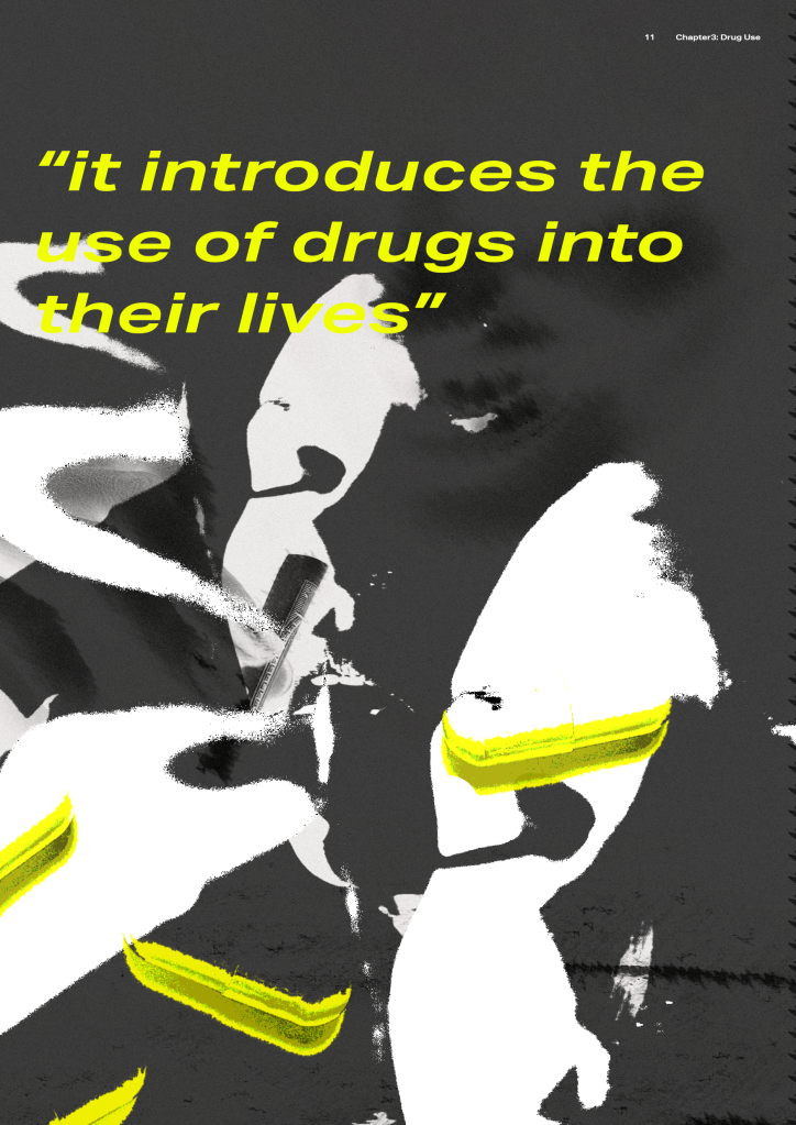
Spread 5
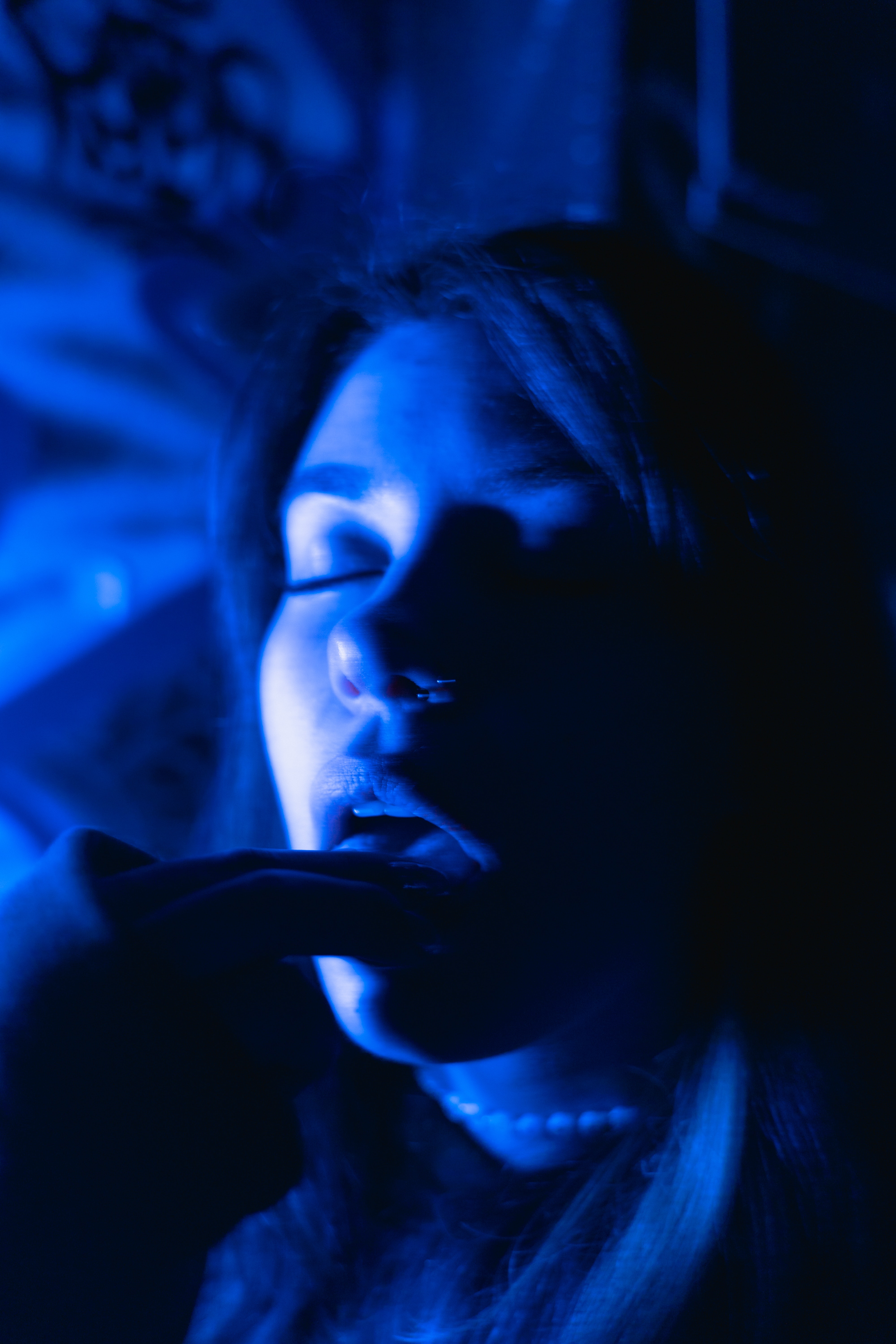
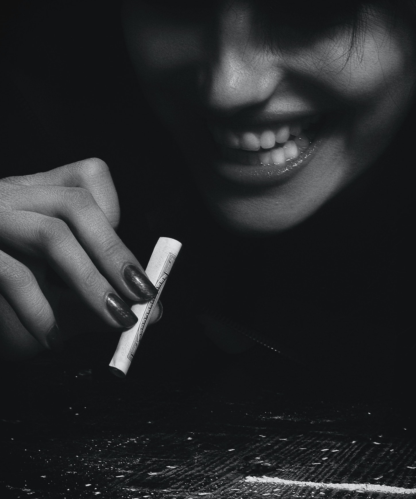
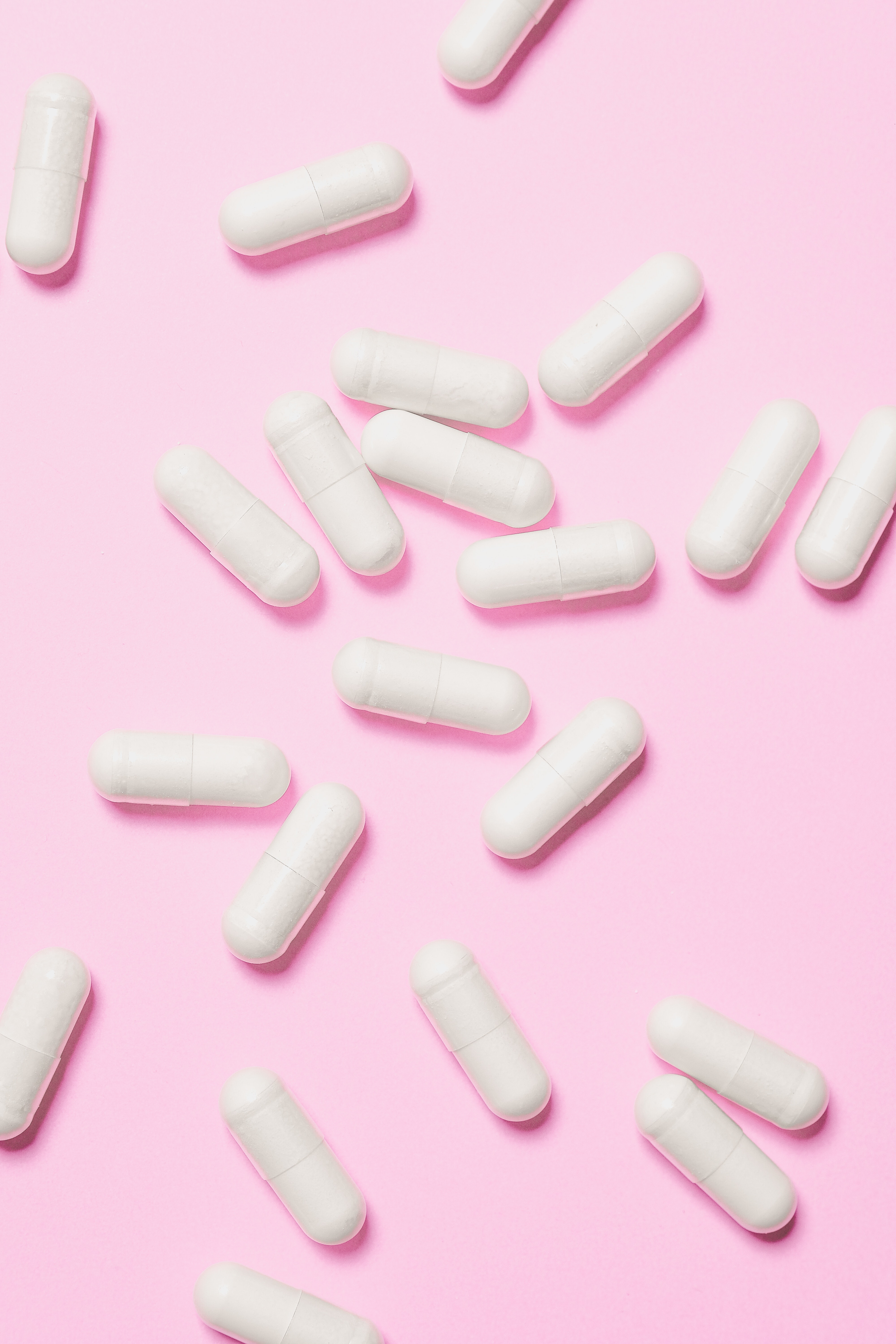
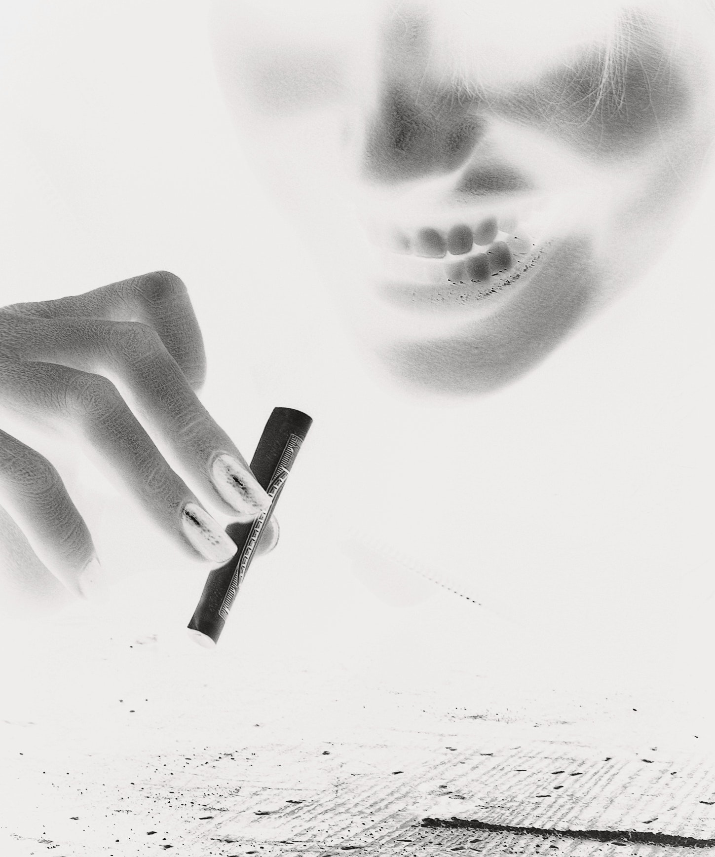
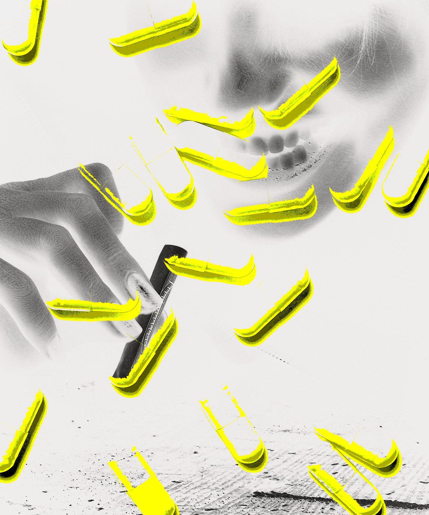
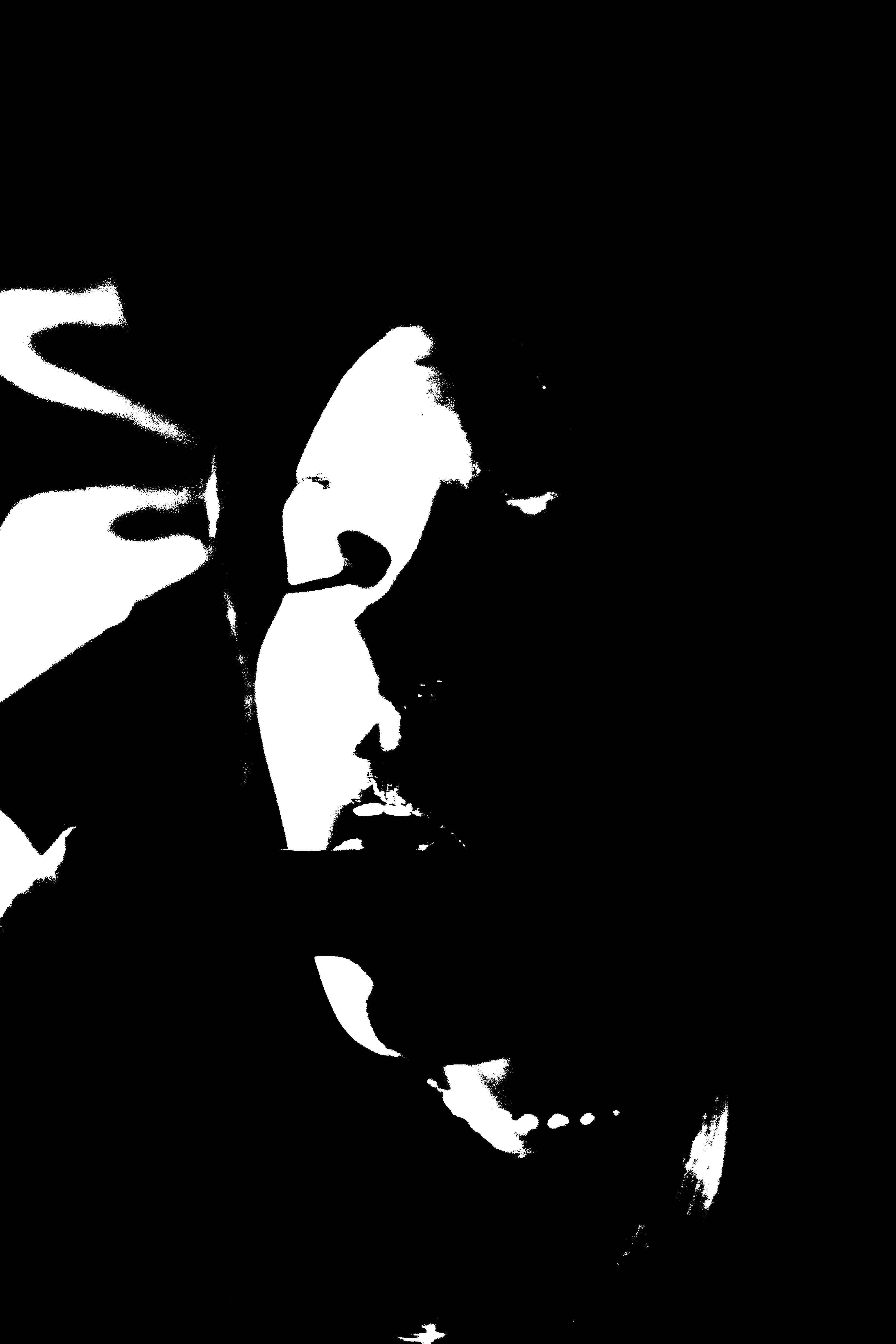
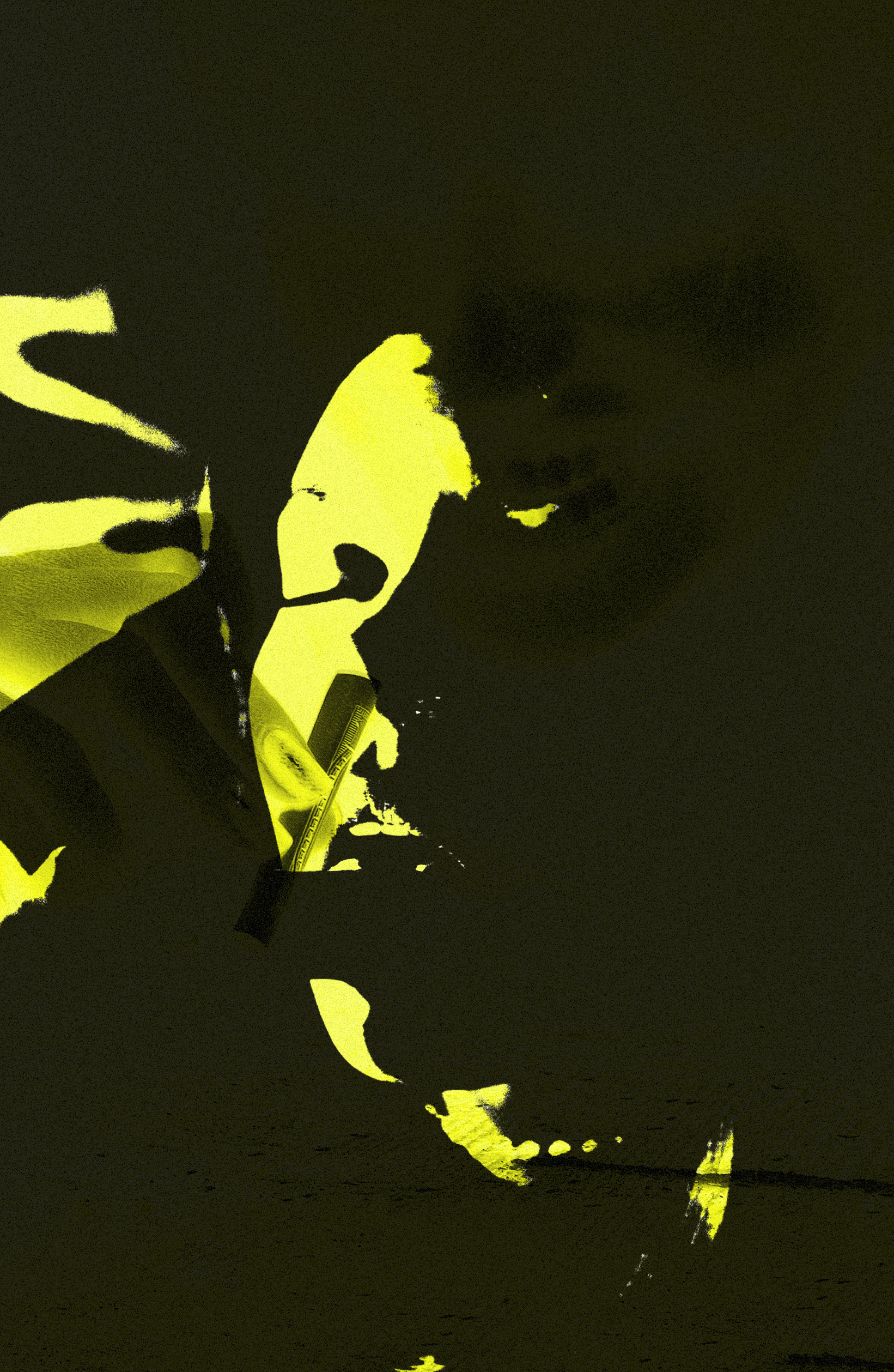
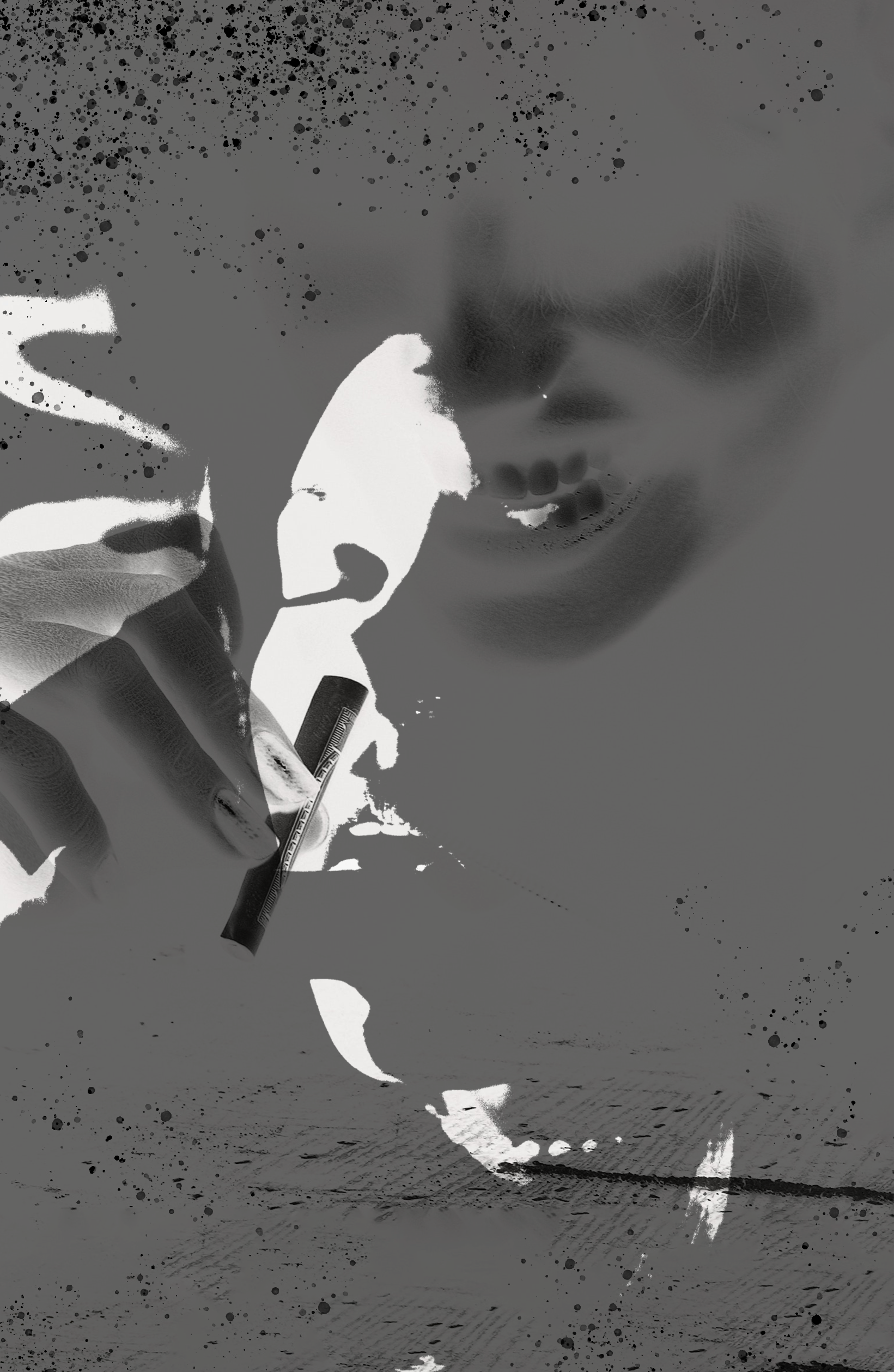
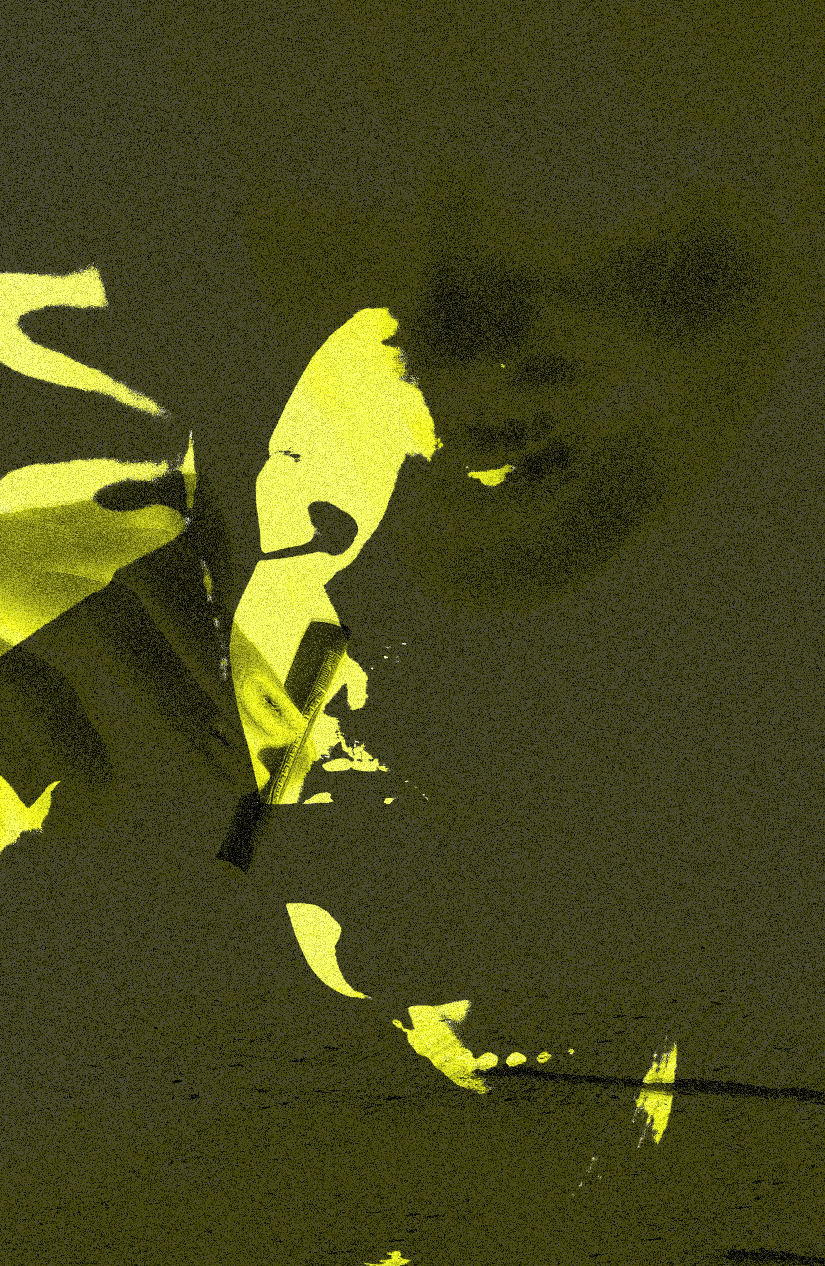
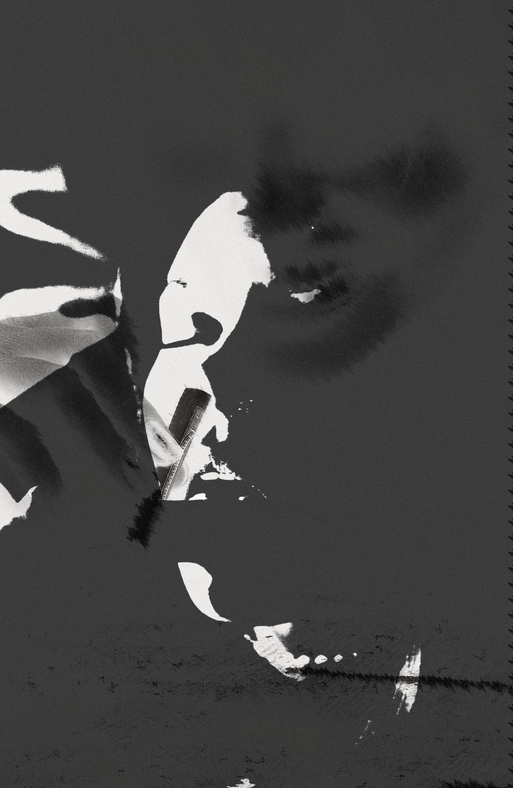
The heading of this final spread was ‘Drug use’ – with this in mind I was aware that it was important to demonstrate the theme of drugs within the visuals. Similarly to spread 4, I was very experimental with this imagery. I took an array of photography based images (which displayed drug use) and combined them to achieve another avant-garde design. I wanted this visual to appear as though it had layers as I wanted to convey the addiction that drugs can cause. Additionally, layering the images with each other created a more chaotic design – which allows the reader to recognise the distressing effects of drug use. Similarly to the other visuals within the editorial, I used the exact same editing methods to achieve a cohesive style.
Extra imagery used:
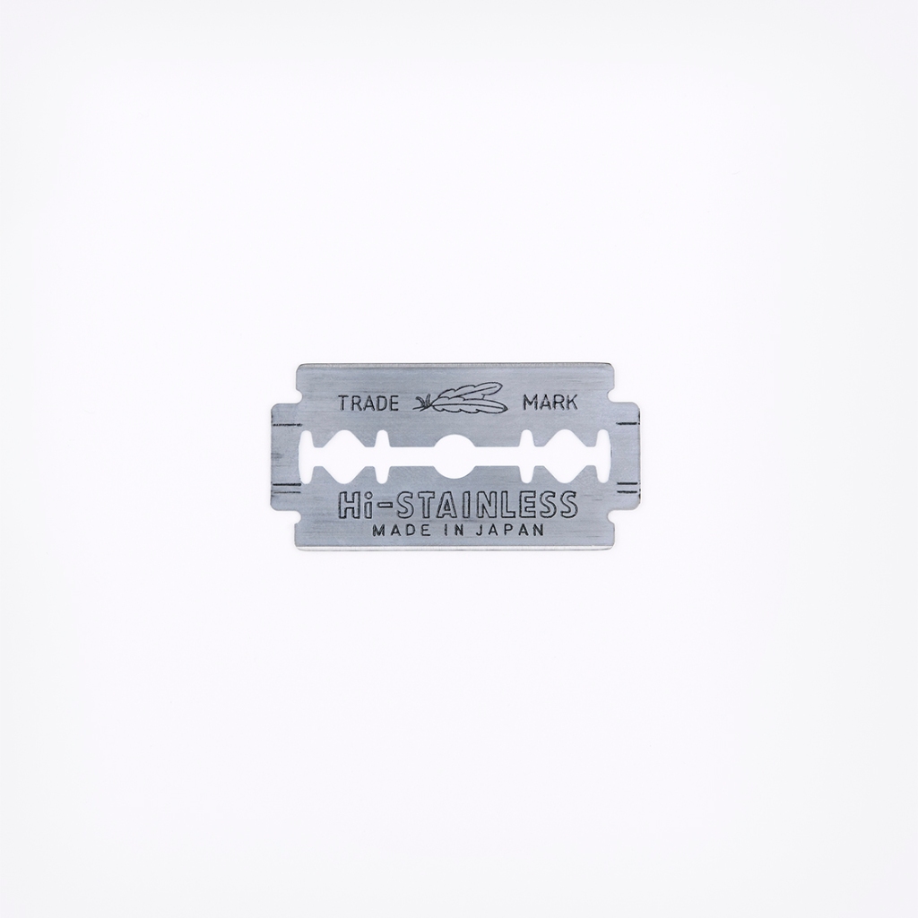
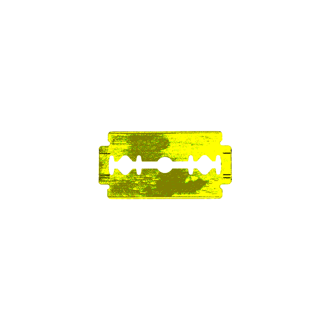
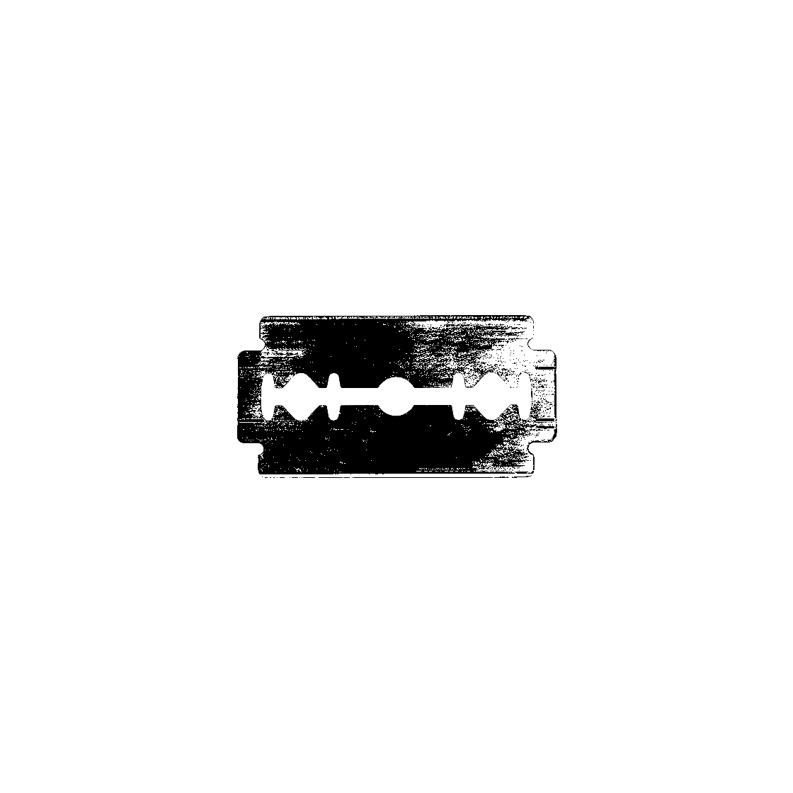
Razor blades are a symbol of both mental health issues and drug use – as the blades are often used to separate cocaine. I decided to use this imagery as a nod to cocaine use and felt that it could be a stand alone image within the spread due to its serious connotations.