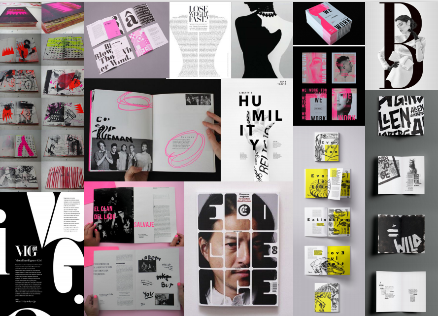
Moodboard
As I usually do at the start of a project, I created a moodboard in order to bring my themes, design styles, colours and content exploration together. I also used these images to help familiarise myself with variations of formats and layouts – this would later benefit me when searching for inspiration. I collected these particular images as I found that they could all connect to my dissertation topic in some ways. I liked that each of them illustrated form and shapes through the use of text and imagery. Within the images used, it is clear to see that there is a heavy communication of visual metaphors. This is something I knew that I wanted to incorporate within my editorial as I believed it would really help connect all elements together in a professional and effective way. Visual metaphors can add narrative to seemingly straight-forward content, and that’s exactly what I wanted to achieve.
As you can see within the moodboard, I was particularly fond of ‘highlighted’ effects. I thought that this idea of ‘highlighting’ was extremely interesting visually and contextually. By using this effect, I could use visual metaphor to demonstrate how the design industry often draws attention to body features and what are considered to be attractive/unattractive. I felt that this would be interesting and was would be worth exploring further within my design development.
Themes to consider:
- Shapes – to represent the body
- Body parts which are commonly associated with ideals
- Dark undertones – to represent the seriousness of the topic
- Manipulation – in imagery and text to represent the manipulation of the body
- Highlighting – bringing attention something, similarly to the design industry does with the body
- Mental health – focussing on eating disorders and use of drugs
- Conformity – to represent how society follow the ideas conveyed by the design industry
- Exploitation – individuals in minimal clothing = being exposed
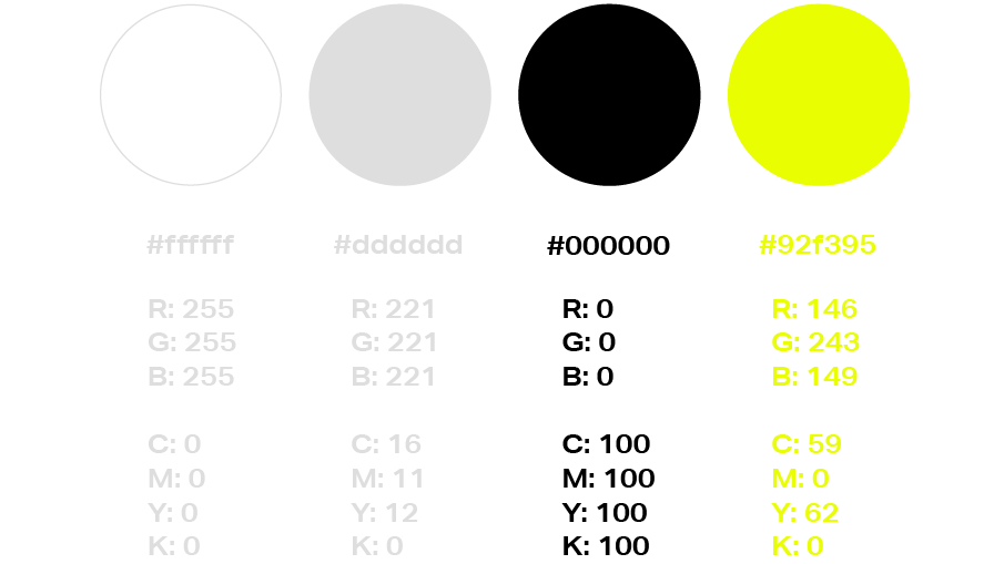
Selected colour palette:
Selected Typefaces:
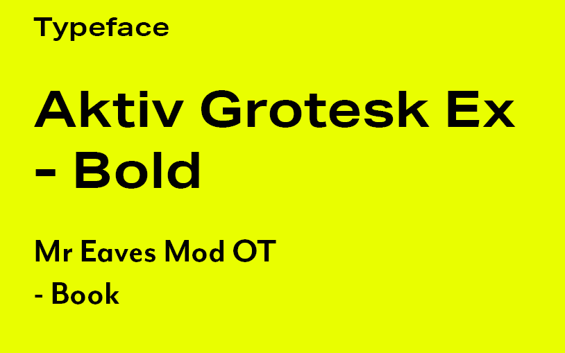
I chose to use the sans-serif Aktiv Grotesk Ex as it’s straight blocky lines and pointed edges appear harsh and exudes an aggressive visual. I felt that this was perfect for conveying an issue as forceful as this. This effect also juxtaposes the imagery of the soft looking feminine models.
For the body text I chose a more classic typeface as it’s appearance is less aggressive and more neutral. This allows for an easier read for the viewer but still matches the tone of the editorial’s content and other visuals/text.
Design tutorial (first attempt at first spread)
For my second tutorial with my lecturer, we were asked to prepare and present the first draft of our first spread. We did this relatively early within the creative process, therefore I had to create this design rather quickly. As you can see, I closely followed the design styles I found through my research and moodboard design. I selected the black, white and neon yellow colour palette in order to keep its design modern yet bold. The neon yellow plays a significant part within this design as I wanted to convey a ‘highlighted’ effect throughout. Additionally, this effect can be seen within the main body of text. Here, I used it to draw attention to the most relevant words (mainly the ones associated with negativity). For the form of the text, I once again used my research as inspiration as I wanted to manipulate its shape. Creating a curve with the text was done to represent how women’s bodies are often manipulated to conform to body image ideals. I really liked this effect and wanted to continue to use it throughout.
As for my main visual, I used a picture of a minimally dressed woman. I did this as I wanted to convey the theme of exploitation. I had found when writing my dissertation that design industries are guilty of exploiting societies insecurities, therefore I felt it was necessary to represent within this design.
Feedback: Within my tutorial with David, I was extremely pleased to hear how happy he was with my outcome. He really admired the use of visual metaphor, especially through my use of form and shapes. He also commented on the main visual (seen on the left page) and stated that he really liked how the repetition of the image brings focus to the the visual. David also approved of my typeface selection – which was ‘Aktiv grotesk’ for the titles and ‘Mr Eaves OT’ for the body text. Furthermore, he approved of the type’s setting as he felt that the sizing would be accurate for printing. The only things he mentioned that I include next time were pull out quotations, page numbers and running heads.

