
In order to spark some inspiration, I decided it would be a good idea to take a look at the editorials which were created by previous students.
Karlis Kah
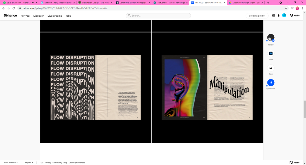
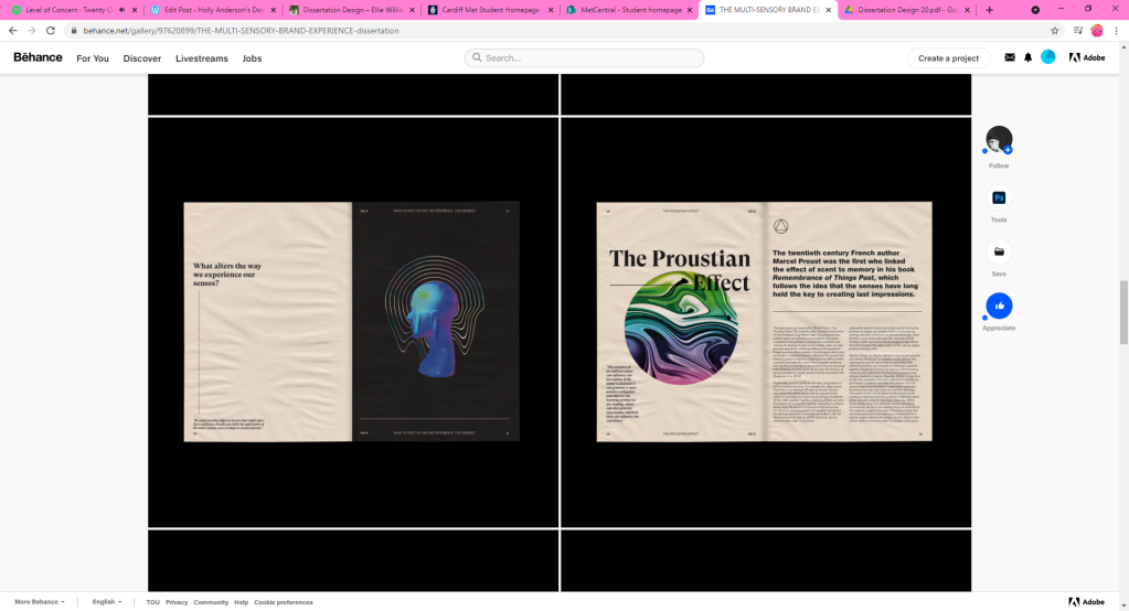
By looking at Karlis’s work, it is clear to see that they like to be very experimental with their imagery and allow them to become the main visual element of the editorial. I admire this because they weren’t afraid to demonstrate their creativity within such a serious piece of work. Using such large images is also great for breaking up a design and for giving the text some room to breathe. All of their images also relate to the subject matter. For example, their editorial discusses manipulation, therefore Karlis demonstrates this through distorted imagery. I like this attention to detail as it gives the visuals some context. It also allows the editorial’s content to reflect through the work in a more creative way. Furthermore, I admire how Karlis was not afraid of stepping outside of design limitations – this is demonstrated through the overlapping of text. I hope to apply similar design methods within my own work as I believe I too would like to create an outcome close to this.
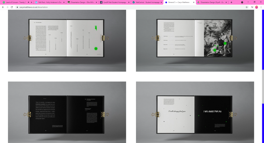
Carys Matthews
Carys’ work, is minimalistic by her use of colour palette and little imagery – this style is one of my personal favourites and I often gravitate towards it within my own designs. Using a more minimalistic style allows her editorial to appear clean and very sophisticated. It is clear to see that she isn’t afraid to use smaller amounts of text with large spacing. I admire this a lot as it helps to keep the editorials content legible. I too hope to achieve a similar effect with my own design, as I do not wish to overwhelm the reader with information. Similarly, Carys uses imagery which closely relates to her textual content. She also uses visual metaphor to convey the editorial’s overall message – which I intend on using within my own work as I believe it would create better flow from text to imagery. In her colouring, Carys uses a very minimal palette of black, white and green. The use of this type of colour palette is extremely effective as the bright pop of green allows certain elements of the design to stand out. This is something else I would like to demonstrate within my own editorial.
Bibliography of images
https://www.behance.net/gallery/97620899/THE-MULTI-SENSORY-BRAND-EXPERIENCE-dissertation
