Introduction to the brief
Using our writings and musings from our dissertation, for this brief we were asked to create a design which takes the dissertation’s content and uses it to showcase our editorial design skillset. We are able to do so in whatever format size and scale that we see fit. Overall, we were asked to submit our digital dissertation designed PDF consisting of a single page cover and at least 5 double page spreads.
My dissertation title was “An investigation into the representations of body image ideals; To what extent does the design industry have a negative impact on society?”. Within my thesis I wanted to explore the subject of body image as I have always been passionate about representing body positivity and acceptance. During my time as a junior graphic designer, I have come to recognise the issues within the design industry regarding the many unrealistic body image ideals they portray to society. This concerns me greatly, as I have discovered through research how the public can form an array of negative responses to the display of these ideals. As a result, I felt that it was necessary that I discuss this subject matter within my dissertation.
First Tutorial (group work)
To introduce us to the project, our lecturer David ran a type and layout workshop where we worked in small groups via Teams. The challenge was to design an A3 double page spread using a body copy which was provided. This tutorial was put in place in order to helps us explore setting text and expressing different hierarchies.
Constraints:
1 – One typeface, one weight, one size, one size leading, multiple colours (11:15am) D&U
2 – One typeface, multiple weights, one size, one size leading, multiple colours (12pm) D&U
3 – One typeface, multiple weights, multiple sizes, multiple sized leading, multiple colours (1pm) D&U
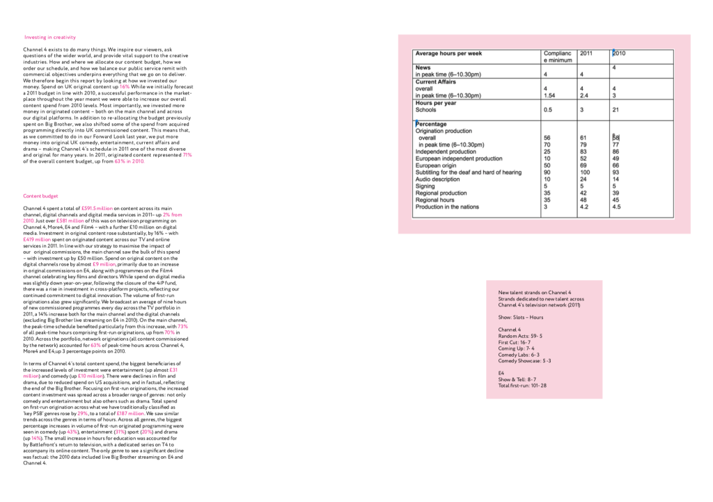
This was my group’s first outcome:
He also liked how the subtle hints of pink (mainly used for the statistics) made the information easier to break down and that this made the path for the eye really clear. Additionally, he noted that the rag was a rather untidy and that it would need a little more work if there was more time to do so. But overall he was really pleased with this the outcome considering we were under a time constraint.
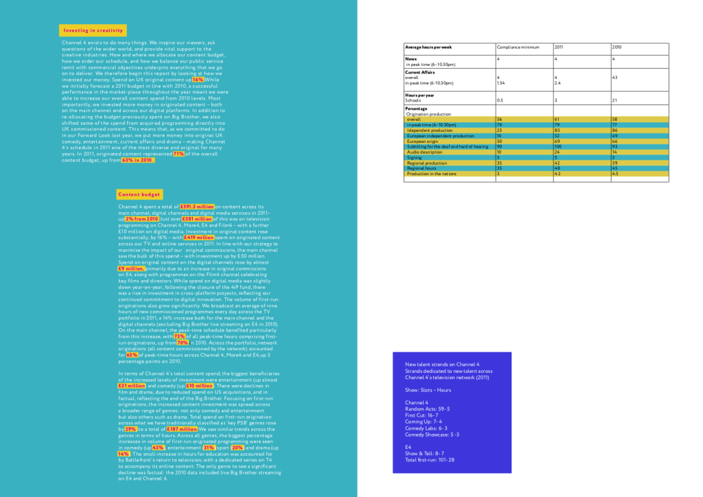
Our second outcome:
The feedback for our second outcome was that David (our lecturer) thought that this development was actually a step back from the first outcome. In his opinion, there were too many colours involved, and that the use of yellow and pink for the statistics didn’t really work on the teal background. However, he did like the blocks of yellow for the headings of each paragraph as he stated that this helped them stand out more. In addition, he liked the use of colours to separate the table – as it broke up the information and made the table easier to follow.
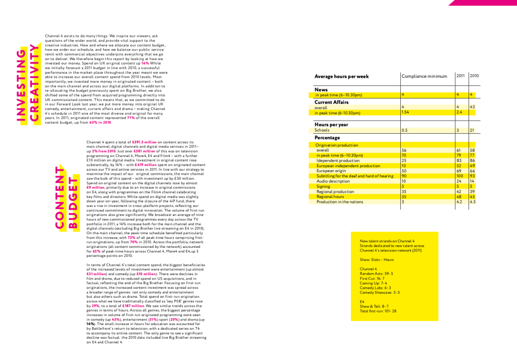
Our third outcome:
By looking at this final outcome, David really liked it and said that the titles worked really well as they demonstrated hierarchy and allowed the design to appear more visually interesting. Something he noted was that the table didn’t need the black lines separating the figures because the colours did this adequately enough on their own. At this point we had incorporated all of the admired elements from our previous designs which led us to achieve a more successful outcome (which our lecturer approved of).
Final thoughts
Overall, I really enjoyed this workshop as it allowed us to work together as a team (which we haven’t had the opportunity to do much this year). As a group we were able to learn how to apply our designs quickly – to produce some really interesting pieces of type. Doing this tutorial also really helped to refresh my memory of editorial design, as I hadn’t created any of these since our first year on the course. It was really important that we develop this skillset again in preparation for the upcoming dissertation design brief. By completing this tutorial, I was able to refresh my memory of important factors of typesetting, such as a clean rag, no rivers in justified text, no orphans, correct point size, and ensuring a legible design. I will keep what I have learned within this tutorial in mind and I plan to apply this knowledge throughout this project.
