Being aware that my software is quite complex, I decided the best way to convey how it works and why individuals should download is through a video demonstration/advertisement. Not only would this help show off the software, but creating a video would help further demonstrate my design skills. I have only ever created one other video using After Effects (which i designed for my Criticality project), however that was an animation. Due to my lack of experience with After Effects, creating a video as long as this was a real risk, especially for something as important as FMP. I didn’t want this to stop me though, as I was keen to show my lecturers how I have learned new skills this year. Completing this video would also be great to include in my design portfolio.
At the start of creating this video, I was very overwhelmed. I am still learning about After Effects every day and so I knew that I would also still be learning during this process. I knew that I would need to cover all areas of my software, ensuring that all viewers would get a better understanding of the software and its purpose was key. As you can see in the image below, I had used 107 different layers within this video.
What I wanted to achieve/include:
A full demonstration of the software
An inside look into the issue of online abuse – to give instant context to the viewer
An upbeat message – to ensure that viewers are aware of the aim (which is positivity)
Fun and visually stimulating features i.e. music, visuals – to ensure that the audience doesn’t get bored and watches the entire video
Brand continuity i.e. colours, style, visual elements – so viewers would be able to easily connect the video to the brand at any point within the video
The list of platforms in partnership – as this will demonstrate how the software is supported by popular gaming platforms, thus promoting it to users
The Final Video
Overall, I was over the moon with the final result of the video. Looking back at my video which I had created for the ‘Criticality’ project, I noticed how much I really have developed my skills within After Effects. In order to ensure that the demonstration/message was clear, I asked friends and family to watch the video so they could give me their opinions. This was really important to have as it would allow me to know how successful the video was in communicating the information correctly. I was pleased to discover that all of those people found my video to be extremely effective. They commented on how believable the concept was and how they fully understood the function of the software through the use of this medium. I also made sure to ask older audiences what they thought of the video and whether they understood, and once again I was pleased to hear that each of them were fully aware of the software’s purpose. This was due to my inclusion of TikTok videos at the start of the advertisement – as they demonstrate the many occasions where gamers have been abused online.
I believe that the design of this video displayed an understanding of the target audience and how advertisements are used within society. Its fast pace and bold aesthetic keeps the attention of the viewer and is visually stimulating. In addition, all of the visuals connected to the brand well and demonstrates a cohesive design.
(All Credits are available and can be found in the video’s description on Youtube).
At this point within the creative process it was time to begin designing the Modifyx software. I was aware that I wouldn’t be able to create a fully functioning software, but after discussing this idea with my lecturer Carol, she advised that I simply create screenshot style designs – as this would still allow me to demonstrate how the software could function/appear. Truthfully, I found this part of the process quite daunting, as I have never designed something like this before (which was a risky choice for FMP). But I knew that attempting to create a software was the right choice as it would challenge me and help me develop new skills along the way. To get me started, I referred back to my list of pages/features which I wanted to ensure I include within the software. These were:
Home page
Friends list – in order to keep friendly gamers connected
User profile page – includes log of strikes, reasons for strikes, reviews
Player log – to allow the user to keep track of each player they had previously gamed with (this will help them to track any past abusers to then block/mute/report them
Settings page – where users can adjust their language preferences (here they will have the ability to create their own filtered words to avoid within games)
Contact page
Many of these features can already be seen within gaming softwares. I wanted to ensure that I wasn’t too adventurous with pages/features as I wanted my software to come across as realistic as possible in order to achieve believability. For inspiration, I took a look at Steam and Battle.net’s current platforms.
Steam
Steam’s software design appears very sophisticated and that the platform takes itself very seriously. Overall, it appears simple yet confident and very technological. I can see this due to their continuation of their dark colour scheme and simple text/visuals. Their software’s simplicity suggests once again that they are a software which provide straight forward applications for their users. I admire how Steam have not cluttered their design as it appears more modern and elegant.
It is clear to see that the branding has been carried throughout due to its simplistic design. Each page is straight forward and therefore easier to navigate. There is not an excessive amount of unnecessary pages or pages cluttered with visuals. This adds to the professionalism of the software and creates a more excisable platform. I would like to incorporate similar elements into my own software design as I admire how minimalistic the layout is. I also intend to display the same amount of brand continuity that steam displays across its software. I wish to apply a similar level of simplicity within my own software. I also intend to display the same amount of brand continuity that steam displays across its software.
Battle.net
Through their software design, it is clear to see that Battle.net is a youthful gaming software which appears modern but also lively. I can see this due to their bold and bright colour scheme with decorative text/visuals. Overall, their software appears confident due to their minimalistic style. Keeping a simple design demonstrates how they are a professional software which provide straight forward applications for their users.
Looking at the software, I admire how the branding has been carried throughout due to its modern yet simplistic design. Each page is bold and straight forward, therefore making it easier to navigate. The visuals are kept to a minimum in order to avoid cluttering of each page. Furthermore, the software demonstrates a small amount of pages as it only displays what is required – which adds to the professionalism of the software and creates a more accessible platform. I intend on incorporating similar elements into my own software design as I admire how simple and bold the layout is.
A list of common features I found from analysing software design:
List of pages in a horizontal line located at the top of the page (remains to appear on every page)
User icon is located at the top right corner of the page (remains to appear on every page)
Overall design is kept simple
Use of a dark coloured theme for the backgrounds, with inclusion of bold accent colours – this must match the branding (remains the same throughout)
Main information is located in the centre of the pages – draws attention and allows the page to feel balanced
Minimal visual elements included (almost no imagery except ones which relate to the branding
Friends list is located to the right side of the page (only appears on the home page)
Logos/brand name is usually located on the top left corner
I created this list in order to aid me during my own design process as I believed following these features would allow me to create a more realistic outcome.
User Journey For My Software
Software Design Development
I found the most tricky part of the process to be designing the home page. I believe this was due to the fact that it was more intimidating to me – as it would be the forefront of the software, I needed to ensure its success. With the homepage being the first thing that greets the user, I needed to make sure that its appearance was visually stimulating, thus drawing the attention of the user.
Usually in gaming softwares, they would display popular games on the home page. However, I was not providing games to my users, so I needed to come up with something different to display here. I thought about what needed to be communicated at first glance. What I came up with was to convey the software’s message – which is to eliminate any online abuse. In my opinion, it was important to share this message to viewers straight away to ensure that they understood the purpose of the software. This is when I came up with the brands slogan “fyx the…”. This slogan had major potential as it would be reusable for a long time – as the follow up words such as “hate, abuse, sexism, etc” could be interchangeable. To design this slogan, I used the logo’s ‘fyx’ section to represent the word ‘fix’. This made a more quirky slogan and visual which connected well with the current branding – this helps with brand continuity.
After including this onto the page, it was clear to see that something was missing. Although I wanted to keep a simplistic design, this visual felt almost too basic and didn’t capture my attention. I figured that it needed some type of imagery, therefore I decided to include my main illustration of the brand – which was the open mouth. I selected this image as it would convey how the software focusses on communication. This is something that needed to be represented within the homepage in order to inform the user of the software’s purpose.
At this point within the process, I had edited the mouth to give it a new appearance by adding a longer tong. At the time I was under the impression that this would add a new and quirky way to convey how the image. However, I quickly realised that the illustration looked too odd this way and didn’t appear professional enough. Professionalism was key for the software as I wanted to ensure its realism and that viewers could trust the platform. Due to this, the new illustration was then scrapped.
During my experiment with the new mouth illustration, I still found that the home page felt flat. Of course, it had enough interesting content but it didn’t quite spark my interest yet and it didn’t feel like it connected to the branding quite well enough. I looked back at the branding and what I had previously done for the login page and landing page. An aspect which I liked a lot within my landing page was the flowing gradient lines. I decided that wanted to incorporate this within the software too, but I wanted to avoid it being too repetitive. To combat this, I designed a new set of gradient lines which varied in width and flow style. The result of these were excellent and appeared different but remained true to the brand – which I really liked. I knew that adding these the the software’s pages would add depth and dimension, therefore I made sure to implicate them where I saw fit.
The inclusion of these lines really did improve the home page’s appearance and really fit with the modern, bold and youthful style I was going for. After adding the new gradient flowing lines, I reintroduced the original mouth illustration to balance out the slogan (located on the left). This time around, I tried experimenting with the type’s weight, form and overall appearance. I wanted to ensure that my final result accurately represented the brand and what it stood for in an effective way and in the end I believe I achieved that.
The Final Outcome Of My Software Design
Overall I felt that the software’s design achieved exactly what I wanted. I was able to push myself out of my comfort zone and go beyond what I had expected for the final outcome. Its layout and dark colour theme mirrors that of the softwares which are currently available online – taking inspiration from Steam and Battle.net. The creative style and aesthetic appears modern and youthful, which connects with the target audience I was aiming to attract. This is similar to the platform Twitch as I also took their current branding as design inspiration. As for the slogan displayed, it is catchy and memorable (which is desirable for any brand) and greets the user with the platform’s core message. At the bottom of the front page, users will notice the inclusion of ‘partners’ such as twitch, steam, battle.net and riot games. I felt that this would be an important element of the design and overall idea as it would insinuate that large gaming companies support a software which ultimately helps their community. This would work as a market strategy for all platforms and thus help encourage users to download.
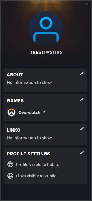
Home Page
By creating a player log, I give the user the ability to track any abusers who appeared in previous games – thus allowing them to block/mute/report/review them after finding them. This would then help the user avoid this player in future. (This feature is demonstrated in the design below.)
Player page
As previously mentioned, the software would include a log of strikes, strike reasons and reviews on the players profile. This would help players be more cautions of others and allow them to be more aware of abusive players. The inclusion of these features were very important as they were very popular amongst my lecturers and peers during tutorials – therefore, I knew that this would add an interesting and helpful element which people like to the software. (These features are demonstrated in the design below).
Profile pageOptions page – Account Details
Another important feature included within the software is the language preferences. This feature would allow users to take control of their gameplay, giving them the opportunity to filter words which they deem to be abusive language. Sentences like “Get back into the kitchen” would not usually be recognised by other platform. However, the inclusion of this feature would ensure that remarks like this would be recognised and eliminated. (This feature can be seen in the two design below).
A login pop-up appears instantly when an individual logs onto their computer. I personally experience this when signing into my own computer as I have Steam and Battle.net downloaded. Due to the fact that I have never designed something like this before, I looked for inspiration in how the gaming software ‘Steam’ designs its own login pop-up.
It is clear to see that steam uses a very basic layout for their login as it is clear and straight-forward. I like this as it allows the user to easily navigate the login section of the software. Steam ensure to include their logo as the stand out element of the design by using basic hierarchy techniques. This is something I too did this within my login page as it represents the brand clearer to the user at first glance. For the information provided, Steam uses their usual typeface, including their uppercase style text. I also used this method of brand continuity within my own login page but i made sure to avoid all uppercase text as I feel that it comes across as too aggressive.
Modifyx’s Login pop-up (Final design)
Overall, I designed my login pop-up rather quickly as I wanted to keep its design as simple as possible. People often make the mistake of complicating their designs for the sake of making it ‘interesting’. However, I was aware that a page such as this does not require much to achieve a professional result. Due to its small size, all text must be large enough to see and therefore takes up the majority of space – so keeping the design elements to a minimum is key. In other words, “less is more”. For brand continuity, I ensured that I include the logo as the largest visual feature on the page, along with the use of brand colours.
Software landing page
Inspiration:
In order to help spark ideas for layouts and visuals within my landing page, I took a look at examples I found online. A couple of things I noticed about landing page designs were:
They include a list of extra pages at the top of the page incl. about, contact, support
The logo is usually used twice within the design – one in small on the top corner of the page and a larger version as the main visual feature
Underneath the main logo should be a brief description of the software
A download button will usually be placed underneath that description
Visuals are usually located to the right of the screen
There should also be an option to ‘login’ somewhere on the page
I noted all of these elements as I wanted to remind myself of key features to include during my landing page’s design. Looking at the examples I found, it was interesting to see how simple they all were and how they each followed a similar layout. I did later create a design which closely followed these examples as I wanted my outcome to appear as real and professional as possible. I have also always struggled with the use of hierarchy within my designs, therefore reffering back to these examples during my creative process helped me greatly.
(I do not own this image, it can be found online or on pinterest) (I do not own this image, it can be found online or on pinterest) (I do not own this image, it can be found online or on pinterest)
The Final Landing Page Design
Within my design I wanted a visual to help break up the page and create a contrast between the side which included imagery and the side for text. To achieve this, I designed a flowing image of repeated small lines. My reasoning behind this was to reference soundwaves – as my software is about communication. The colour gradient and lines also reference back to the brand logo which promotes brand consistency. I was very fond of this visual as it added texture and depth to the page. Without it, the illustration would have felt isolated and disconnected from the rest of the pages content.
The Final Landing page
I believe the final outcome of the landing page was very successful as I was able to accurately replicate a real download page. Although I closely followed the layout of landing page examples I have found through research, I was still able to make it unique. On my page, I included information regarding how many users are currently online. I felt that this was necessary as it would display the software’s popularity to new users – thus drawing them in. I also included a visual of the software’s icon as I wanted it to be recognisable to all new users. For the main imagery, I used the software’s main illustration (the mouth) due to the fact that it instantly conveys to the audience that the software focusses on communication. In addition, I added speech bubbles which depict the ‘typing’ dots and asterix (which represent the elimination of abusive language). In regards to hierarchy, the landing page uses this method effectively by ensuring that the logo and installation button are the forefront of the design.
An example of how the landing page would look in action
After looking at Twitch’s branding during my research, I came to admire their style and how they had managed to create a youthful brand which connects to the target audience. Within my findings, I discovered that they often use a visual feature which look like stickers. I believe this is one of the elements that brings their youthful appearance forward as I associate stickers with a younger audience. This feature could easily appear childish, however they manage to still achieve a sophisticated look by keeping these stickers simple. Another reason why they use this as a design element is due to their inclusion of ’emotes’ on their platform. Emotes are similar to emojis and are used within live stream chats on Twitch.
I really admired their use of the sticker effect, and thought about how I may include a similar aspect into my own design (so I too would be able to attract a young and fun gamer audience). Looking over my current body of work from third year, I recognised that I had not yet demonstrated many illustrations within my designs. I wanted to fill this gap and demonstrate my abilities within this type of design, therefore I decided that my stickers would be in the form of illustrations. Creating these illustrations would also give me an opportunity to add visuals within my software and campaign – thus allowing it to appear more friendly. Achieving a friendly feel to my branding was a goal of mine as I wanted to ensure that users trusted the software and recognise that its is supposed to be a positive platform.
To generate more ideas, I searched for inspiration online. Each one of the illustrations below display visuals that I found the most interesting. The style appears like those found in skater shops – as they are commonly used as stickers for their skateboards. This style is something I wanted to try and keep within my own illustrations as a large portion individuals within the gaming community are also skaters. Using a similar style would therefore help me attract the target audience due to these references.
I mostly admired the characters included within these illustrations as they convey a more fun and friendly appearance. This is something I would aim to include when creating my own illustrations because, again, I would like to communicate a positive atmosphere within the software and campaign.
(None of the images above are my own. They can all be found online and on pinterest)
My final illustrations
For my main illustration (which I would use as the face of the brand), I created an open mouth. I selected this as the main illustration as the mouth represents communication – which is the main topic of the software. This image would be used repeatedly across the branding/campaign as I wanted to ensure that audiences were aware of the software’s purpose and context straight away.
In order to create brand continuity, I designed each illustration using the same colour palette. The use of these colours also added to their quirky nature as it seems unnatural to see a green and purple mouth, monitor, brain, etc.
The illustration below displays two keyboard keys – which are ‘ctrl’ and ‘z’. The combination of these keys acts as a ‘revert’/’go back’ shortcut. I selected this shortcut as I wanted to subtly communicate that the hate can be taken back and erased by the software. The software itself is somewhat of a ‘ctl z’. In order to give this visual some life, I added legs to the keys as a way to personify them. This adds character and narrative to the visual, which overall creates a more interesting illustration.
The illustration below is rather self-explanatory – it is simply a monitor personified. Again adding eyes and a mouth adds to it’s friendly appearance, thus drawing in users. I designed this illustration in order to use when describing the software itself. The happy looking monitor represents the feeling of content and joy which will now be restored when gaming with the help of the software.
The skull illustration below wears a headset and displays lighting coming from the earphones. This is to subtly represent the experience of receiving hate and abuse online – as it can really negatively effect how a person feels. I created this illustration with the intention of using it in some way when an abuser is guilty of being hateful online. It could potentially be used as a visual during strikes.
Finally, I designed this illustration of two individuals below with exposed brains. The idea behind this was to try and represent individuals who are respectful when gaming and insinuate that they have greater brain power. This was mean as a subtle dig at the abusers. However, I realised that this isn’t the type of message I’d like to covey within my branding as I did not want to “fight fire with fire” and insult abusers. For this reason, this illustration was left out of the final outcomes.
The Stickers
As previously mentioned, in order to add a fun and youthful element to the advertisement of the software, I decided to create stickers out of the illustrations displayed in many of the brands campaign. This allows gamers to stick them on their PCs, laptops, desk, skateboard, anywhere! By distributing stickers, Modifyx will be able to take their promotions to almost any location.
After receiving helpful feedback from my lecturers and peers, I considered their thoughts on my old ‘X’ logo and progressed by developing new logo ideas. Throughout this process, I have experimented with an array of methods by using visual metaphor, narrative, iconography, etc. So far, none of those methods had truly helped me represent my software/the gaming community effectively. From this, I have come to realise that a ‘visual’ logo may not be worth having as it does not help communicate my software’s brand accurately. By looking at gaming softwares during my research, it was clear that they too felt it was unnecessary to include a visual logo (except Twitch).
I began experimenting with the ‘textual’ approach by simply typing out the brand name using the selected typeface. From there, I tried out a variety of creative features. Looking back at my previous design, I wanted to keep the gradient effect within this new iteration as I felt that its result was very effective and demonstrated an understanding of the gaming aesthetic. I thought about how it is popular for gamers to place LEDs at the back of their desks – creating a line of colourful flowing colours. I tried to replicate this within the logo’s design by underlining the text. Although this looked nice and conveyed the idea well, it being overlapped by the tail of the ‘y’ appeared unprofessional. To combat this, I created an elongated tail which underlined the text itself. I felt that this looked much better, however something still felt off. By using a colour gradient, I coloured the word ‘fyx’ as I wanted to create a visible difference between it and the ‘modi’. This would help viewers recognise that the name was a combination of two different words. I felt that this what the most effective and I was extremely happy with its result. The final logo was clean, modern, bold and professional while still appearing fun and connecting with the community. These are elements I always intended on achieving. I liked how the word was completely underlined except the ‘x’ as it also helped with highlighting the word ‘modify’ -which is something I aimed for as I wanted the word to be the forefront of the brand, in order to covey the software’s purpose at first glance.
At this point within the creative process, we were asked to present our current ideas and development to receive feedback from our lecturers and peers.
Feedback: Displaying my ideas and developments to my lecturers/peers, they had a couple of elements which they admired and elements they thought that could change. Some of the elements they admired were my ideas for what the software would provide for players and how it would function overall. They believed that this idea helped the community in a positive way by creating a solution which could ease the issue rather than attack the abusers too much (as that would be “fighting fire with fire”). In addition they approved of my colour palette and found that it was bold and dynamic. They also liked how it was gender neutral. As for my logo, it was a love/hate reaction as some individuals were fond of it and others didn’t feel like it connected enough with the concept of the software. I believe this was due to the fact that it was “just an X”. Moving forward I knew that the logo would be something I would have to develop further.
At the point where I began to experiment with logo’s, I was still not yet set on a name for my software. As you can see in my logo development, I switch from name to name as I wanted to see if any visuals would make the decision for me. Mostly I used my favourite name ideas, which were ctrl, alt and modifyx. At the beginning, I like to illustrate my initial ideas with my ipad as I am able to draw them out quicker than I would when using my computer. It is clear to see through my first ideas, that I was more drawn to logos which included text. I believe I was taking inspiration from the software logos I analysed within my research (as they too were all textual). In my opinion, although visuals using iconography within logos are interesting, textual logos are more superior as they allow the viewers to quickly and clearly identify the brand better.
Within my experiments, I created a simple ‘MF’ visual which was designed in order to represent the name ‘Modifyx’ (clearly highlighting the initials of the words ‘modify’ and ‘fyx’. I felt that this visual looked clean and bold with its smooth curves and heavy weight. By initially being so drawn to this visual, I decided to try experimenting with it on illustrator. This would allow me to test its potential as a logo and see how the colour palette could work with it. At first, I was really pleased with the results as it proved to work and appear lovely. However, I didn’t feel that it communicated anything about the brand/software. It simply demonstrated its initials and colour palette. I was missing any context/narrative. Due to these issues, I quickly scrapped this idea.
Due to the lack of narrative within my last logo attempt, I decided to try and focus on that element more within my next experimentations. I began by thinking about what I wanted to communicate to others about my software – which was that the software would modify speech/text and help players to game in peace. With this in mind, I thought about how I could use quotation marks as a visual somehow (because they represent communication). From there, I came up with the idea of turning these quotation marks into eyes and creating a jolly character of some kind – taking inspiration from Twitch’s visual logo. To start I created a few variations of quotation mark eyes in order to establish which would suit the aesthetic I was trying to achieve.
These results were very adorable and portrayed a more positive message – which is something I wanted to communicate as I didn’t want the subject to be too harsh/depressing. Moving forward, I tested how it would look within a square and circular border, along with the colour palette also. Overall, the variations I had made were great but something felt missing. Although I was aiming for simplicity within my logo, I felt that these logos were just a bit too simple. Furthermore, considering I focussed on narrative during this experiment, I still wasn’t happy with the results as the logos didn’t connect with the software’s name enough. As I had mentioned before, I was keen on trying to incorporate the name itself within the logo as much as possible. With these issues, I had to also scrap these attempts.
As previously mentioned, I wanted to focus on trying to include the name of the software within the logo. However, I still wanted to see if a more visual logo (like an icon) would be better suited first. By finally selecting ‘modifyx’ as the final software name at this point within the process, I tried to think of how I could convert the word into an icon of some kind. I thought about the fact that the name displays the word ‘modify’ and the ‘x’ is the extra element which brings ‘modify’ and ‘fyx’ together. With this in mind, I considered how this idea of the ‘x’ bwing a symbol of ‘bringing together’ and how it could apply to my software – as I would be enabling players to join together in peace. From this idea, I went ahead and created a variation of ‘x’ icons – trying to capture the essence of the gaming community within. I thought back to my research and how LED lights were a trend within the community. Often set to flow from one colour to the next, I tried replicating this within my designs by using a colour gradient.
At this point, my favourite logos were the ones conveyed below as they were simple yet visually interesting. I admired the form of the ‘x’ and how it had a nice flow from one end to another. I also liked how it appeared modern and almost futuristic – which matched with the cyberpunk style I saw during my research into the gaming community. From here, I had a tutorial scheduled with my lecturers and peers to show them what we had so far. This logo is what I decided to bring forward to that meeting as I was eager to hear their thoughts.
As you can see below, I designed a textual logo to match as I wanted to be able to swap between the two in different elements of the softwares design and campaign. To get the two different marks to match, I added the designed ‘x’ as into the textual logo. Doing so helped with brand continuity.
Making a decision on a colour palette wasn’t difficult. From my research, I was able to analyse the gamer aesthetic and discover which were the most common colours to appear throughout. These colours were; purple, blue and pink. I didn’t want to settle on that specific trio as my final colour palette though, as I knew it could appear too cliché. Instead I aimed to include only one or two of these colours within my palette with other accent colours to mix up the combination for a new modern look. Due to the fact that purple was the most common colour I saw within my research into the gaming community, I focussed on trying to incorporate it within the palette as much as possible. In order, to help me establish which combinations worked best, I experimented with a variety of colour options (specifically focussing on trios).
From first glance, my favourites of the options were the second from the left, top right and fourth right. Each of these palettes were bright, bold, striking and youthful – which is what I wanted to convey in order to attract the correct target audience. The black, pink and green combination was great but I decided to eliminate it as an option later as I felt that the pink could come across as too feminine. As for the black, purple and blue combination, I liked it but in the end I decided not to go ahead with it as I thought that the palette was too cold. Overall, the (second on the left) black, purple and green was my favourite as the colours complimented each other well and appeared modern and fun. However, I was unsure of the shade of green and decided to swap it for the shade seen on the third left side. This felt more balanced and demonstrated a colour combination I had not seen very often.
The final colour palette I selected was:
Establishing a typeface
As I do with every project, I formed a list of typefaces that I felt best suited the aesthetic I was trying to achieve. From my research into other gaming softwares, I noticed a trend of using bold sans serif typefaces for their logos. Each of which were also very simple and rarely demonstrated any decorative accents. Due to the fact that I wanted to closely replicate these softwares, I too wanted to follow these features within my logo and text. Overall, when scanning the list I had made, I could identify that I was more drawn to bolder typefaces as they attracted my eye the most. A bold type would also allow the logo to stand out up against almost any other visuals I may wish to include later on in the creative process. In the end, I found that my favourite typeface was ‘Neue Haas Grotesk Display Pro’ – this was because of its simplicity and vast selection of weights. I also felt that this typeface closely replicated that of a standard computer typeface – including ones seen on a common keyboard. These factors matched the best with the branding I wanted to achieve and therefore became my selected typeface.
I chose the sans-serif typeface Neue Haas Grotesk Display Pro specifically in ‘Black italic’ and ‘Black’ as their heavy, blocky appearance allowed the branding to translate as more modern and would stand out on any design due to its bold form. In addition, I felt that a simpler typeface would create a more neutral tone and thus come across as a friendly brand to viewers. This idea of ‘friendliness’ also applies to the use of italics as it adds an element of fun. For the body text, I would use the same typeface but in ‘Black’ and would remove the italic effect. This would ensure that the body text would be more easily legible and create a contrast between the logo and standard information.
At this point in my FMP’s development, I had not yet established what I wish the software to do. I knew what I wanted to achieve – which was to try and ease online abuse for gamers. In general, I was aware that the issue couldn’t necessarily be solved, but I knew that it could be eased. With this in mind, I thought about how I should attempt to apply ‘Nudge theory’ within my work by making it more difficult for abusers to communicate their hate.
What is Nudge theory?
A method that has recently come to prominence in the last decade to influence behaviour change is Nudge Theory. The concept was introduced by Richard Thaler and Cass Sunstein in their book: ‘Nudge: Improving Decisions about Health, Wealth, and Happiness’ in 2008.
Nudge Theory is based upon the idea that by shaping the environment, also known as the choice architecture, one can influence the likelihood that one option is chosen over another by individuals. A key factor of Nudge Theory is the ability for an individual to maintain freedom of choice and to feel in control of the decisions they make.
Simply put, nudges aim to influence the choices we make, but without taking away the power to choose. Nudges are beneficial as we don’t always think and decide logically and consciously, weighing up all of the costs and benefits. Actually, the majority of our decisions are made instinctively and unconsciously. Therefore, in order to drive a positive change in people’s behaviour, we need to tap in to that instinctive way of thinking.
An example of nudge theory can be seen from the UK government. They even have a Behavioural Insights Team, also known as the Nudge Unit. One of their most successful pieces of work has been the workplace pension scheme, Nest. This scheme changed the workplace pension to something that you opt out of (as you are now automatically enrolled), rather than something you have to opt into. The thinking behind this is that most people want to put money aside for their retirement but didn’t opt in because setting up a pension is seen as too much time and effort. And it’s worked. Since auto-enrollment began in 2012, active membership of private sector pension schemes has jumped from 47% to 77% of UK employees in 2019.
As mentioned already, nudges aren’t just applicable to behavioural economics. The psychology behind the theory can be applied to any situation where you’re looking to enable change in people and shift behaviour.
How would the use of Nudge theory help ease abuse within the gaming community through my FMP?
By using Nudge theory, I would be able to make the act of abuse far more difficult for abusers to achieve. I would do so by putting features in place which perhaps eliminate or disguise hateful language to ensure that they do not reach the innocent player. Furthermore, I could create consequences such as strikes or disabling their keyboard/mouse for a period of time – which abusers would have to endure if recognised to be giving out hate. All of which would complicate the abusers gaming experience and thus forcing them to behave if they wish to continue gaming in peace. I believe using this method would be the most effective as it has been my goal to promote change for the abusers, not the innocent players. It has been my opinion that the innocent players should not have to go to lengths just avoid hate as it isn’t fair. It should really be the abusers who must adapt their behaviour.
Generating the features of my software
As I always do, I decided to create a mindmap in order to establish what features I wished my software to include. Doing so, helped me illustrate how I wanted my software to function and its contents. Using the method of mindmapping is by far my favourite to use as it allows me to clearly note my ideas and view how they may possibly connect/relate.
My ideas were:
When an individual types abuse the software will automatically erase it
When recognising abuse the software would disable all but the necessary keys needed (WASD, enter, space, esc, etc.) on the keyboard
When an individual abuses over mic, they are informed that they have been temporarily muted
Abusers would receive strikes for abusive behaviour – three strikes would initiate consequences
The software would have profile pages which show a report of strikes – the report would also display the reason behind each strike
Players would have the ability to leave reviews for other players
The software could apply filters over the screens of abusers who are streaming – thus disrupting their stream
Generating the software’s name
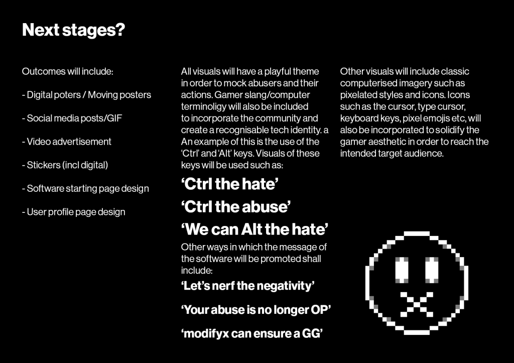
When generating the softweare’s name, I made sure to use relevant language such as gamer/computer based terminology. My aim for the name was to try and create an easily recognisable brand by its name being able to be associated with the gaming community. Taking inspiration form other gaming softwares when taking a look at them within my research, I knew I wanted my software to demonstrate its purpose/features through its name. This too would ensure that viewers were able to identify its function from first glance.
Key words I used were:
Edit
Modify
Chat
Text
Talk
Speech
Communicate
Speak
(along with gamer slang such as ‘EZ’, ‘Nerf’, ‘GG’, ‘AFK’
After creating the mind map, my favourite names were;
Ctrl – as it referenced the control key while also representing the innocent gamers taking back control of their gaming experience.
Alt – as it referenced the alt key (which allows users to modify things) while also referencing how the software will be modifying the abuse
TLKR – as it replicated gamer slang in the way that it was spelled while also communicating that the software’s focus would be on speech
Editext – as it’s combination of words is interesting and communicates the software’s main purpose
Modifyx – as it’s combination of words is interesting and catchy while also communicating how the software would ‘fyx’ the issue by ‘modifying’ the text.
After asking my peers and friends/family, the most effective name for the software was ‘modifyx’ – which I ended up choosing as the final name. I liked how it was catchy and flowed easily from the mouth. I also admired how it’s combination of words perfectly describe the software’s purpose as this would allow it to be easily identifiable to others. The ‘fyx’ part of the name uses a ‘Y’ instead of an ‘I’ not only because it appears more quirky but also because it allows the word ‘modify’ to be fully and accurately legible. I liked this as it creates emphasis on the element of modification which would be the main feature of the software.
At this point within the process, I had looked back on my previous ideas for the project, the feedback I received from my lecturers/peers and research and made a final decision on which direction I wanted to take my FMP. In the end, I decided to try and create a hypothetical software of my own as I believed this would relate the most to my subject matter. When this idea was discussed in tutorials with my lectures/peers, they all seemed very keen for me to explore its possibilities. Personally, I knew committing to this idea was a risk but ultimately a step in the right direction – as I had never attempted something like this before, however I was aware of its overall potential to demonstrate my skills in a new and challenging way. At this point I hadn’t quite decided the real functions of the software but I was more focusing on its overall purpose – which would be to help average players avoid online abuse. I realise that this is quite far from what I had originally planned within my creative brief, but I felt that this idea would not only benefit the issue and its solution, but it would also benefit myself in regards to showing/developing my creative abilities.
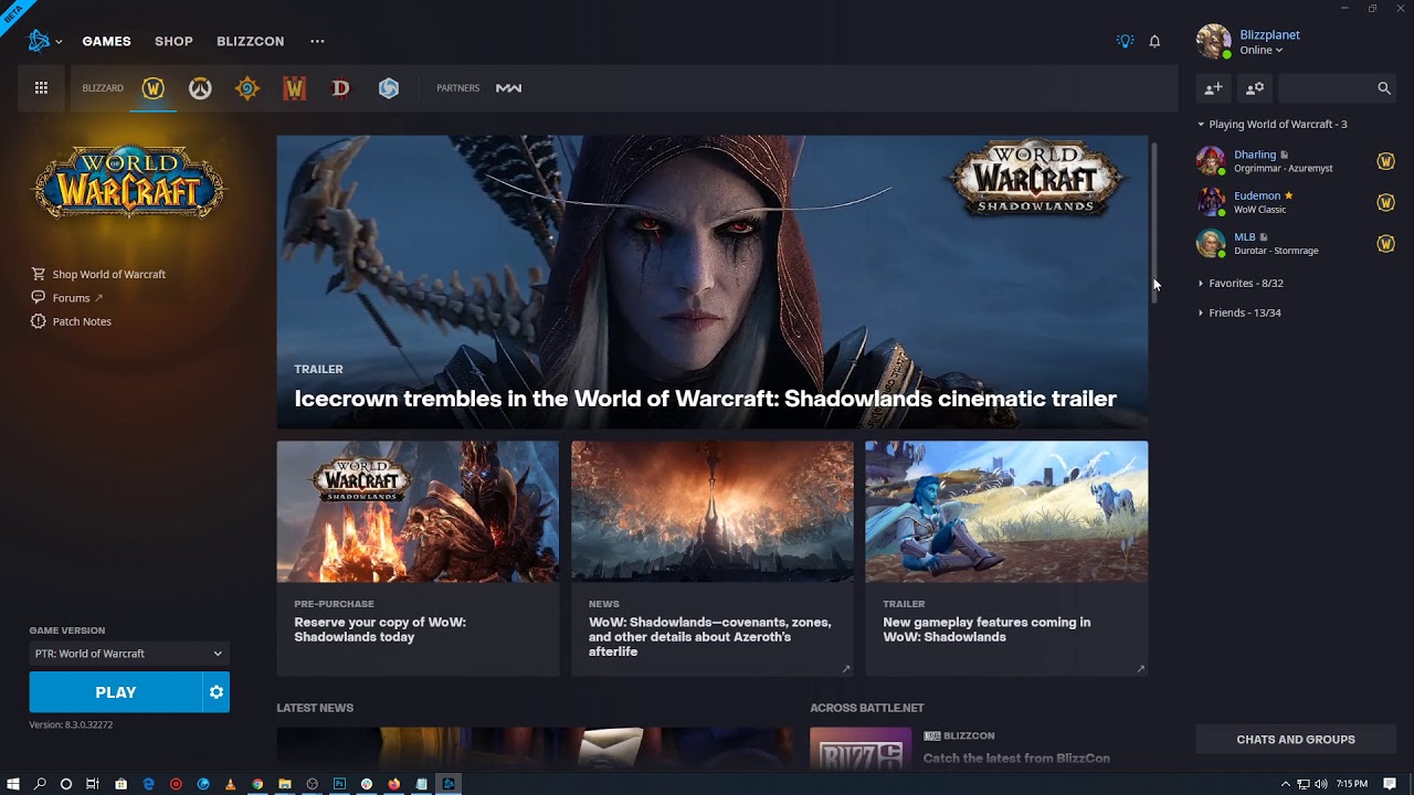
After establishing this, I decided to take a closer look into gaming softwares as I knew I would be attempting to replicate some of their functions and visuals. Doing so would allow me to achieve a better understanding of how these softwares work, appear and communicate with users as I would need this knowledge to attract the right audience and seem realistic. As previously mentioned within my research, some of the most popular gaming softwares include; Steam, Twitch, Battle.net, Riot Games, Playstation store and Microsoft store.
Steam
Steam is a video game digital distribution service by ‘Valve’. Steam has expanded into an online web-based and mobile digital storefront. Steam offers digital rights management (DRM), server hosting, video streaming, and social networking services. It also provides the user with installation and automatic updating of games, and community features such as friends lists and groups, cloud storage, and in-game voice and chat functionality.
The software provides a freely available application programming interface (API) called ‘Steamworks’, which developers can use to integrate many of Steam’s functions into their products, including in-game achievements, microtransactions, and support for user-created content through Steam Workshop. Though initially developed for use on Microsoft Windows operating systems, versions for macOS and Linux were later released. The platform also offers a small selection of other content, including design software, hardware, game soundtracks, anime, and films.
The Steam platform is the largest digital distribution platform for PC gaming, holding around 75% of the market space in 2013. By 2017, users purchasing games through Steam totalled roughly $4.3 billion, representing at least 18% of global PC game sales. By 2019, the service had over 34,000 games with over 95 million monthly active users.
Why is Steam so popular?
I believe the reason the software is so popular is because you can go to any computer, download the Steam, load it up, log in with your username and password, and you can play the games that you own. You don’t need to carry discs, or worry about activation codes or limits on how many times you can install something, etc. You log in, download the game from your library that you want to play, and play it. In other words it’s your games, wherever you want them.
Furthermore the software is cheap. You get the games at the prices they sell at, or for less. Steam has tons of sales, and many of them are 75% off sales. Steam also has an array of good free-to-play games. Steam has big titles, but there is no membership fee to use Steam.
Additionally, it is expanding. Steam isn’t just a library of your games. It allows you to play your games, on computers that wouldn’t normally run your games. You can Streamplay your game. Essentially, the game starts up and uses the muscle of your gaming computer, but it streams the input and output of the game to another Steam client running on a different computer i.e. your weaker laptop. So it means you can be playing a game such as Fallout 4 on your surfing laptop, while you are in the living room, without moving your gaming computer from the bedroom.
Steam’s branding
Due to the fact that I will be expected to brand my own hypothetical software, I went ahead and looked at Steam’s current branding to help with inspiration.
From first impressions, it is clear to see that Steam is a professional gaming software which takes itself very seriously. The Steam wordmark looks simple yet confident and very technological. I can see this due to their dark colour scheme and simple text/visuals. The colour palette of the Steam logo varies from gradient blue with white to monochrome. The dark blue evokes a sense of mystery and creativity, while the black and white combination reflects the company’s stability and confidence. The Steam logo is in a sans serif typeface in all caps, which suggests once again that they are a software which provide straight forward applications for their users. Their logo is basic yet effective as it communicates the name of the software accurately by displaying one of the most famous locomotive parts — the connecting rod and crankshaft. These are the parts, that transform locomotive’s heat energy into a mechanical one, which gives the movement to its wheels. Both the name and visual logo of the brand connect with the overall purpose of the software – as Steam is a gaming ‘engine’, their branding communicates this through the use of locomotive terminology and iconography. Overall, the Steam logo is modern and elegant, it has a unique element as its core, which makes the company stand out from the list of its competitors.
I wish to apply a similar level of connection within my own branding as I admire how Steam has assured that users would be able to easily associate their name with their branding. This in turn explains its purpose to users quickly and effectively. I also like how simple the design of their visual/textual logo is as it is easily legible and appears more professional. This is something I also wish to demonstrate within my own outcomes.
Inside the software:
By looking at at the software itself, it is clear to see that the branding has been carried throughout due to its simplistic design. Each page is straight forward and therefore easier to navigate. There is not an excessive amount of unnecessary pages or pages cluttered with visuals. This adds to the professionalism of the software and creates a more excisable platform. I would like to incorporate similar elements into my own software design as I admire how minimalistic the layout is. I also intend to display the same amount of brand continuity that steam displays across its sofware.
Steam’s current marketing
At the moment, Steam does not have any marketing. This is unusual for any company, especially a gaming company. I believe this is due to the fact that TV ad campaigns are really expensive, it’s a hard sell to convince consumers to buy a gaming PC and abandon consoles. Plus, they’re actively trying to migrate the PC gaming ecosystem from Windows to Linux right now; now would be pretty much the absolute worst time for a company like Valve (who own steam) to spend their money convincing customers to buy Windows PCs for gaming, but the Linux side of things isn’t attractive enough yet. Once Steam Boxes become a mass-marketed reality, Valve will have a lot more incentive to see themselves as a competitor in the game platform wars.
Despite them not having any form of marketing, Steam is still one of the leading gaming softwares available and continues to attract more and more users. However, I would have no choice to make some sort of advertising campaign for my own software as it would be brand new to society and therefore require promotional designs in order to attract and convince the target audience to download.
Battle.net
Battle.net is an internet-based online game, social networking service, digital distribution, and digital rights management platform developed by Blizzard Entertainment. The service was launched on December 31, 1996, followed a few days later with the release of Blizzard’s action-role-playing video game ‘Diablo’ on January 3, 1997. Battle.net was officially renamed to “Blizzard Battle.net” in August 2017.
Battle.net was the first online gaming service incorporated directly into the games that make use of it, in contrast to the external interfaces used by the other online services at the time. This feature, along with ease of account creations and the absence of member fees, caused Battle.net to become popular among gamers and became a major selling point for Diablo and subsequent Blizzard games. Since the successful launch of Battle.net, many companies have created online game services mimicking Blizzard’s service package and the user interface.
The platform currently supports storefront actions, social interactions, and matchmaking for all of Blizzard’s modern PC games including Hearthstone, Heroes of the Storm,Overwatch, and StarCraft: Remastered, as well as various Call of Duty games, and Crash Bandicoot 4: It’s About Time from corporate sibling of Blizzard Entertainment, ‘Activision’. The platform provides cross-game instant messaging and voice chat service.
Why isBattle.net so popular?
Battle.net’s secret, in the early days, was how simple it really was. It was easy for gamers, but more importantly, it was cheap. Diablo, launched in December 1996, used peer-to-peer networking. One player’s system would be host, and the rest would be clients – a common setup that’s now largely (though not entirely) been replaced by dedicated servers. Battle.net was, more or less, a fancy IRC chatroom. There were no accounts. You could log in with one username, log out, and jump right back on with another. But with no dedicated servers, it was also an incredibly lean platform. Since then the platform has developed massively and has drawn in users for its array of popular games such as Diablo, World of Warcraft , Overwatch, etc. Such games each have a large following and would have attracted a mass of dedicated users over the years.
Battle.net’s branding
By looking at their current branding, it is clear to see that Battle.net is a narratively driven gaming software which appears modern but also lively. The Battle.net wordmark looks youthful yet confident. I can see this due to their bold and bright colour scheme with decorative text/visuals. The colour palette of the logo varies from gradients of bright blue with white to monochrome. The bright blue evokes a sense of creativity – as its cold appearance somewhat references to the word ‘Blizzard’ – thus achieving a cohesive brand. The remainder of the logo is in a sans serif typeface in all caps, which suggests that they are a professional software which provide straight forward applications for their users. This choice of typeface also balances out the highly decorative used in the rest of the logo.
Similarly to Steam, I wish to apply a similar level of connection within my own branding as I admire how Battle.net has assured that users would be able to easily associate their name with their branding. This in turn explains its purpose to users quickly and effectively. I also like the creativity they display within the logo as it creates a more fun appearance – thus allowing users to associate the software with enjoyment. This is something I also wish to demonstrate within my own outcomes.
Inside the software:
After analysing the software itself, it is clear to see that the branding has been carried throughout due to its modern yet simplistic design. Each page is bold and straight forward, therefore making it easier to navigate. The visuals are kept to a minimum in order to avoid cluttering of each page. Furthermore, the software demonstrates a small amount of pages as it only displays what is required – which adds to the professionalism of the software and creates a more excisable platform. I intend on incorporating similar elements into my own software design as I admire how simple and bold the layout is. I also intend to display the same amount of personal elements Battle.net include within their software such as their continuously visible friends list.
Battle.net’s current marketing
Similarly to Steam, Battle.net does not currently have any marketing. I believe this is due to the fact that the platform relies on attracting users through the advertisement of the games included within their platform. For example, a game such as Overwatch would have their own advertisements, and due to the fact that this game is exclusive to Battle.net, users would have no choice but to download the software if they wished to play that game. As my software would not have such a strategy to gain users through games, I would have no choice to make some sort of advertising campaign for my own software.
Twitch
Twitch is an American video live streaming service that focuses on video game live streaming, including broadcasts of esports competitions. In addition, it offers music broadcasts, creative content, and more recently, “real life” streams. It is operated by Twitch Interactive, a subsidiary of Amazon.com, Inc. It was introduced in June 2011 as a spin-off of the general-interest streaming platform Justin.tv. Content on the site can be viewed either live or via video on demand.
In October 2013, the website had 45 million unique viewers, and by February 2014, it was considered the fourth largest source of peak Internet traffic in the United States. That month, the service was acquired by Amazon for US$970 million, which later led to the introduction of synergies with the company’s subscription service Amazon Prime. Twitch acquired ‘Curse’ in 2016, an operator of online video gaming communities and introduced means to purchase games through links on streams along with a program allowing streamers to receive commissions on the sales of games that they play.
By 2015, Twitch had more than 100 million viewers per month. As of 2017, Twitch remained the leading live streaming video service for video games in the US, and had an advantage over YouTube Gaming. As of February 2020, it had 3 million broadcasters monthly and 15 million daily active users, with 1.4 million average concurrent users.
Why isTwitch so popular?
The first thing that keeps Twitch above the noise is the fact that it’s streamed live, making the experience between the viewer and the streamer as authentic as possible. In these conditions, it’s impossible to make videos rehearsed and perfect and it turns out that this aspect is actually one of the most appealing. People today, especially millennials, highly appreciate when streamers are keep things real. Twitch puts viewers in the perspective of watching their friends play from their home, which means that all campaigns are unfiltered and unpolished. That way they’re able to see unique personalities and quirks, which leads to the most authentic game preview on the web. Of course, this approach is much more successful in encouraging subscribers to try out the streamed games themselves. In addition, the main reason why people enjoy watching games even if they’re not playing them is the chance to learn a few tricks from the gaming pros. There are many gamers for whom streaming is a full-time job and spending so much time playing inevitably makes them an authority in the field.
Live-chat also allows you to communicate with other viewers, which leads us to another reason it is so popular – building communities. Twitch, with its incredible amount of monthly users, is the perfect place to meet others with similar interests. And not all communities revolve around gaming. If you like religion, cooking, yoga – you’re also in the right place. Whatever your interests are, you’ll find a community around it. Furthermore, another thing on Twitch that gets people together is gaming tournaments that can be hosted by brands, developers, creators, etc.
One more thing that sets Twitch apart from the competition is the huge selection of streamed games. We’re talking about hundreds of thousands of games every month, streamed from anywhere in the world. The variety is unmatched, and it’s not all about gaming.
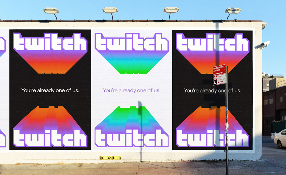
Twitch’s branding
Analysing Twitch’s current branding, it is clear to see that it is a fun streaming software which appears youthful but also sophisticated and modern. I can see this due to their bold and bright colour scheme with heavily outlined text/icon. The colour palette of the logo remains consistent throughout all of their designs with their (almost neon) purple, white and black. The bright purple evokes a youthful sense while also being gender neutral – thus achieving a brand which attracts all types of young users.
Similarly to Battle.net, I wish to apply a similar level of youthfulness within my own branding as I admire how Twitch has managed to capture the essence of their audience within their designs. This in turn allows the site to be easily identifiable and attract a large amount of like-minded individuals. I also like the simplicity of the logo and the creativity they display within the branding as it creates a more fun appearance – thus allowing users to associate the site with enjoyment. In addition, the brand’s visual logo is interesting and quirky – it being personified appears friendly to viewers and draws them in. This is something I also wish to demonstrate within my own outcomes.
Twitch’s current marketing
Unlike Steam and Battle.net, Twitch rely on their marketing strategies a lot more. The site are extremely active on social media, and create posts of intricate modern designs. They also often advertise using campaigns by creating billboards, posters and video ads. I believe Twitch are more active in promoting their site than the other softwares discussed as they are a newer platform to arise in recent years. Steam and Battle.net have had years of building a strong following therefore they are less likely needing to follow such marketing strategies. Due to the fact that my software would also be new, I believe that it would NEED some forms of advertisement. Doing so would also allow me to expand my body of outcomes and test my ability to keep the content consistent.
Personally, Twitch has the best branding and marketing as they are both designed for the young gamers of today’s society. Moving forward I will be looking closely at their content, taking inspiration for my own work, which would allow me to replicate their vibe. I would love to demonstrate this within my own software as I think it would attract the audience I am aiming for in the most effective way.